Lemon Juice Orange Drink Fruit Beverages
Topics
Details
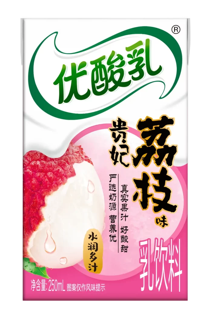
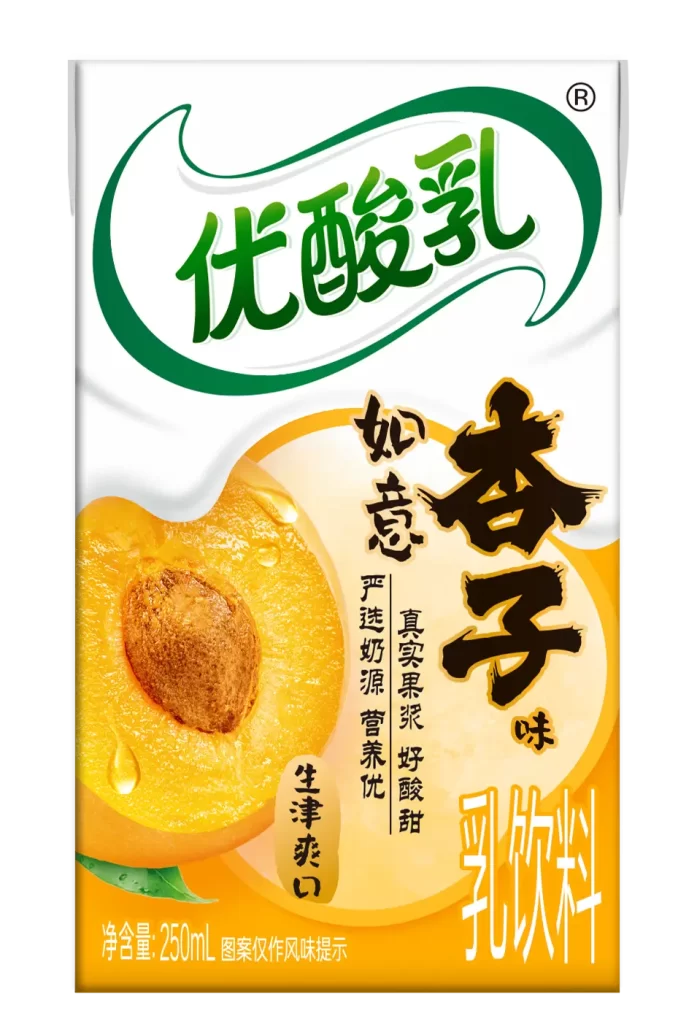
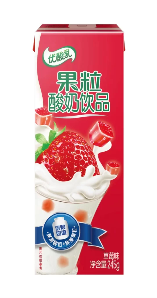
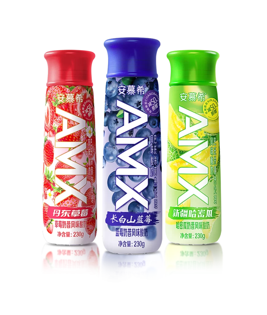
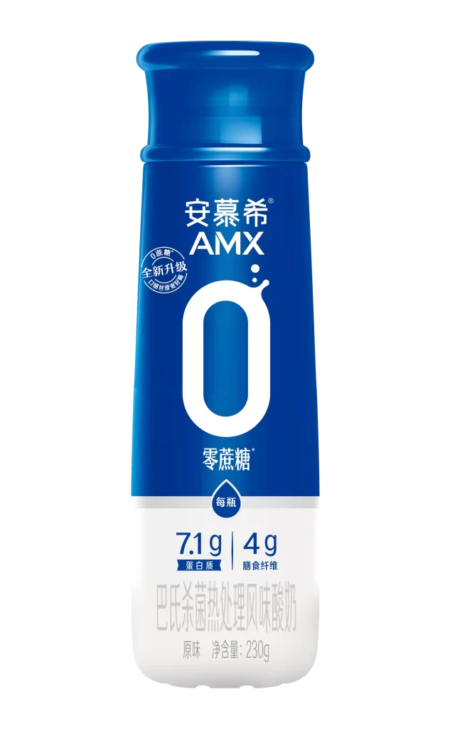
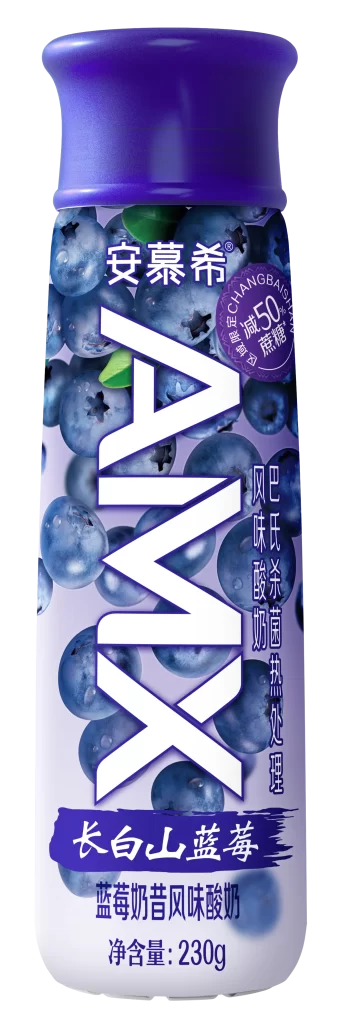
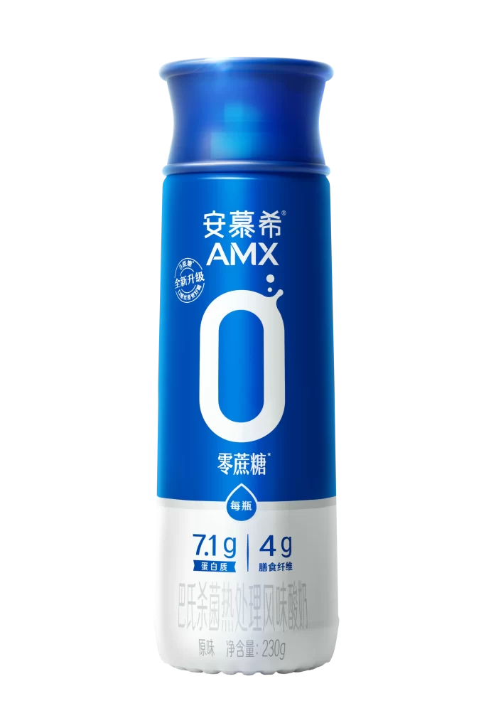
Three cartons of Yoplait-branded beverages stand in a staggered row, showcasing a mix of dairy and juice products. The left and center packages feature vibrant blue headers with the brand name '优酸乳' in white script, while the right carton displays a clean white top with green accents. Bold red banners announce fruit varieties like '双柚果粒' (Double Pomelo Pulp) and '杨梅·雪莲果粒' (Bayberry & Snow Lotus Fruit), contrasting sharply with the large green characters for '嚼!柠檬' (Chew! Lemon) on the third item.
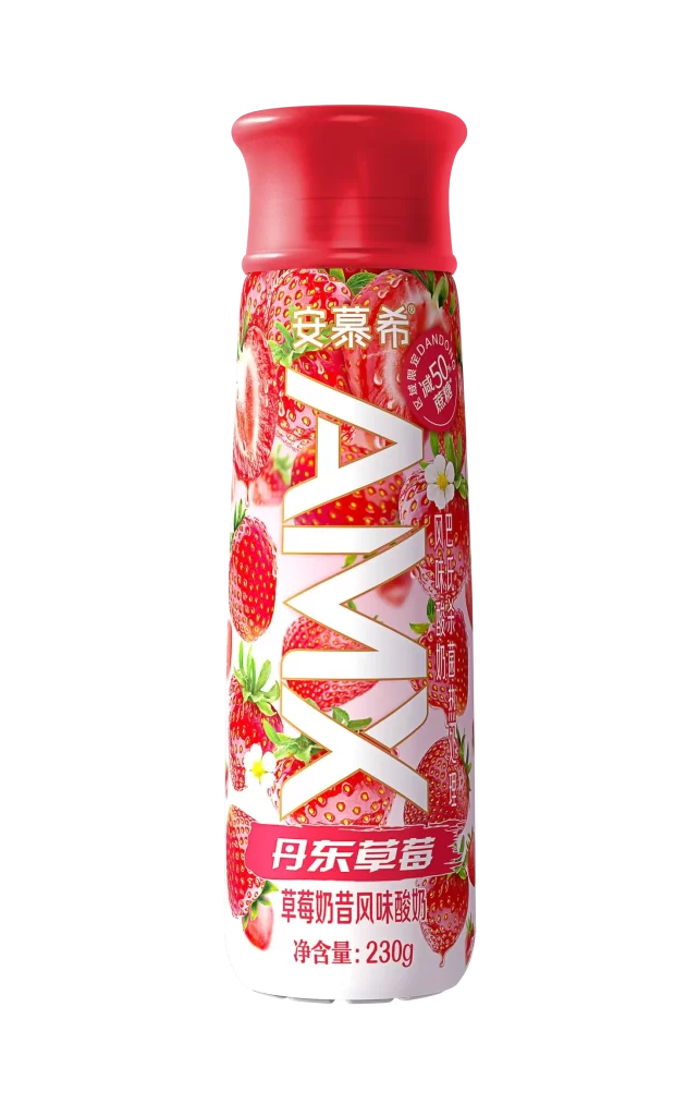
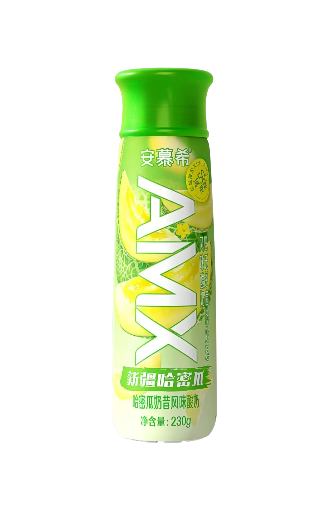
Visual hierarchy is established through oversized fruit photography that dominates each package face, from the juicy cross-section of a yellow lemon to the textured surface of a sliced strawberry. The typography employs dynamic, slanted fonts for flavor names to convey energy and freshness, while circular badges highlight specific selling points like '100% 草莓果肉' (100% Strawberry Flesh). This combination of realistic food imagery with playful graphic elements creates an appetizing yet modern aesthetic typical of contemporary Asian beverage marketing.
Packaging designers studying color theory in consumer goods will find this arrangement useful for analyzing how complementary hues like lemon yellow and lime green attract attention on shelves. Marketing teams developing campaigns for fruit-infused drinks can reference the layout strategies used here to balance nutritional information with mouth-watering visuals. Illustrators looking to practice rendering translucent liquid effects or glossy fruit textures have excellent source material in the detailed depictions of citrus slices and berry surfaces.