Blue Bottle Amx Zero Sugar Protein
Topics
Details
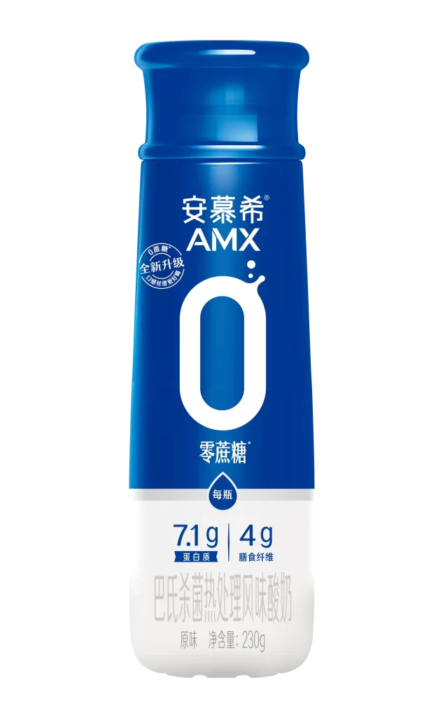
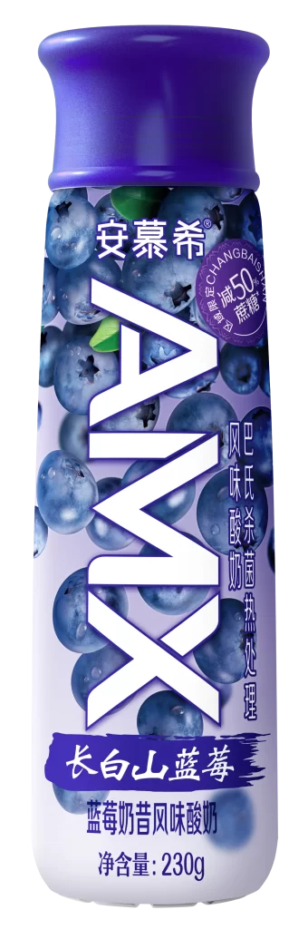
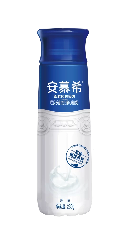
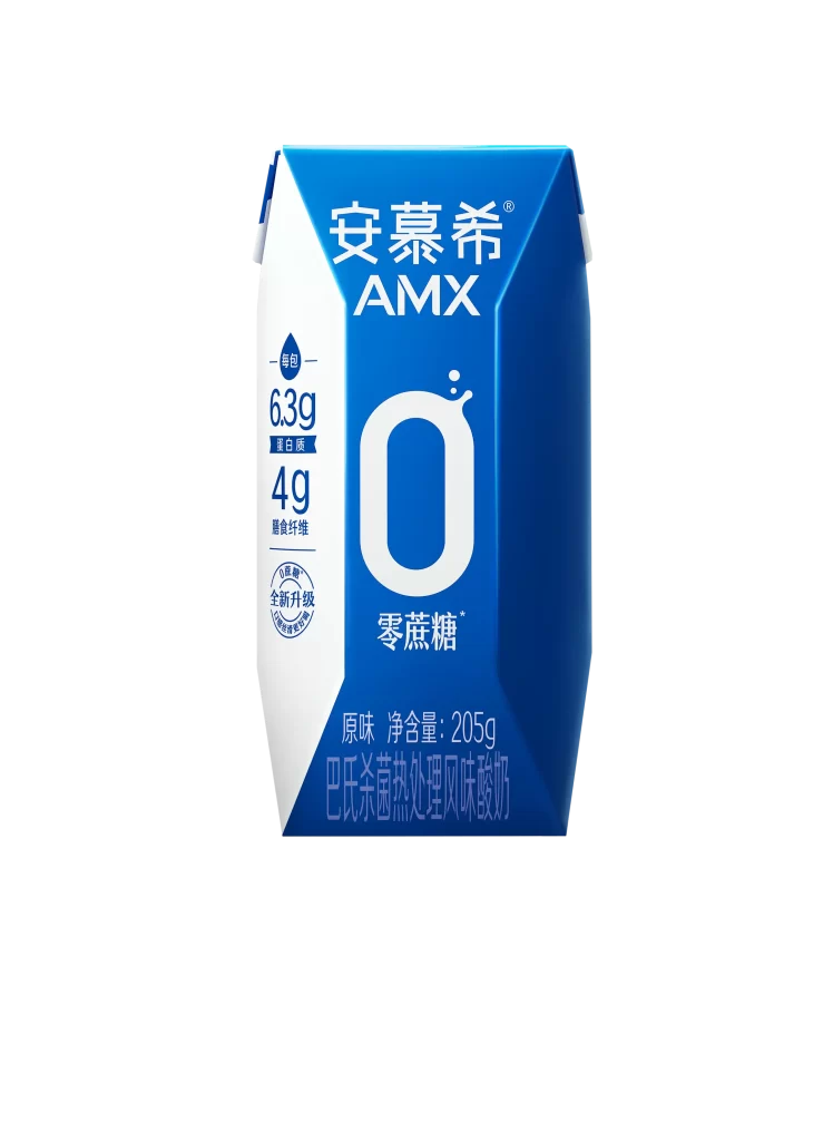
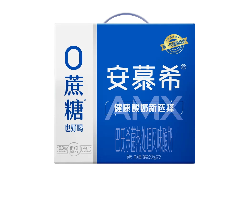
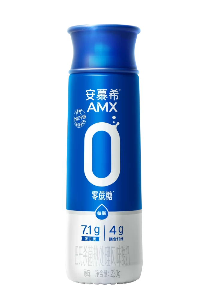
A cylindrical blue bottle with a flared neck dominates the frame, its surface divided into a deep cobalt upper section and a white lower band. Large white typography spells out "AMX" above a prominent rounded-zero symbol, while smaller Chinese characters for zero sugar sit beneath the numeral. The composition isolates the container against a neutral backdrop, with studio lighting creating soft highlights along the glossy plastic curves and a subtle shadow grounding the base.
Visual hierarchy relies on the oversized zero glyph to communicate the sugar-free proposition instantly, functioning as both typographic element and icon. The dual-tone color blocking creates a natural division between brand identity and nutritional data, where the white band displays specific metrics like 7.1g protein and 4g dietary fiber. This particular iteration uses a "new upgrade" badge near the cap, signaling product evolution through minor graphic insertions that don't disrupt the core layout.
Packaging designers studying dairy-alternative branding would examine how the zero-symbol balances negative space against dense nutritional information. Marketing teams could reference this layout when positioning health-focused beverages in competitive retail environments, particularly for translating Chinese labeling into global visual systems. 3D artists modeling consumer goods might use the shoulder curvature and label proportions as dimensional benchmarks for similar drink containers.