Glad Natural Bulgarian Style Yogurt Tub Packaging
Topics
Details
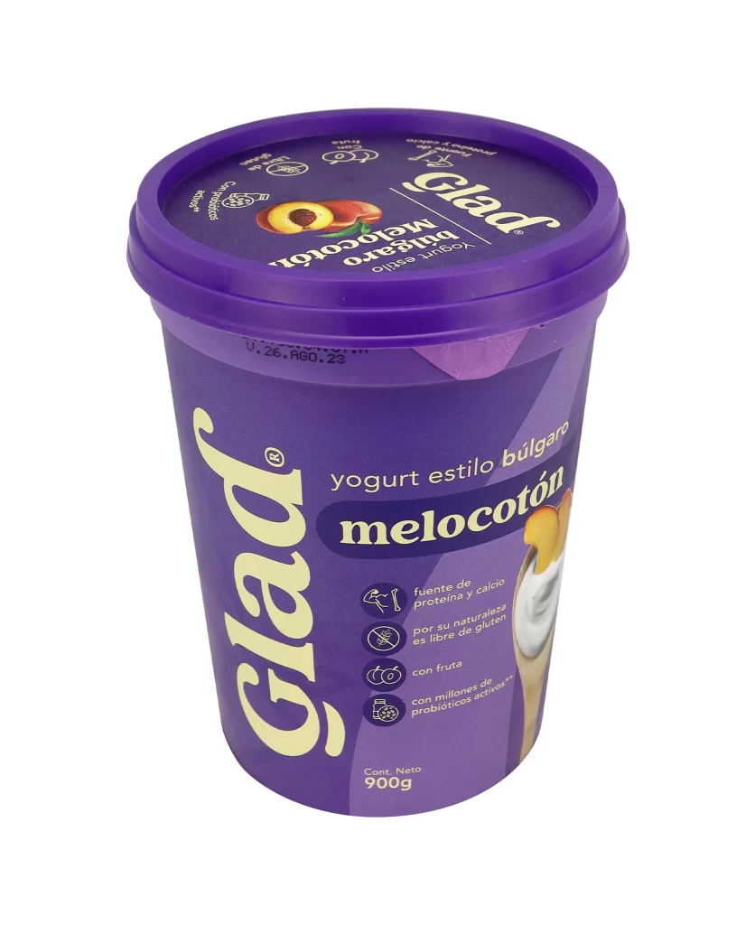
A cylindrical plastic tub of Glad natural Bulgarian-style yogurt stands in direct frontal view, featuring a deep violet body and a matching purple lid. A cream-colored band encircles the upper rim, displaying large bold typography that spells out '1kilo · 1kil' in the same pale hue. The container rests on a white surface with the brand name 'Glad' rendered vertically in oversized cream letters along the left side of the purple main panel.
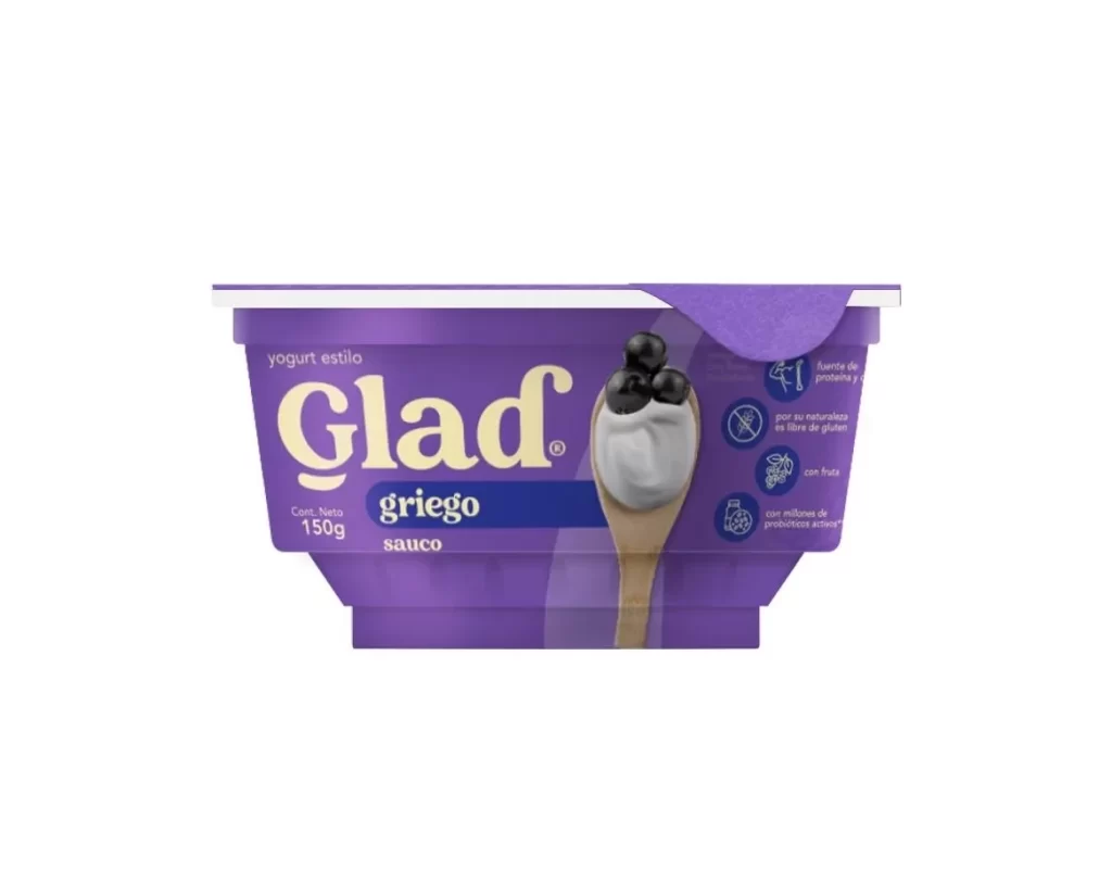
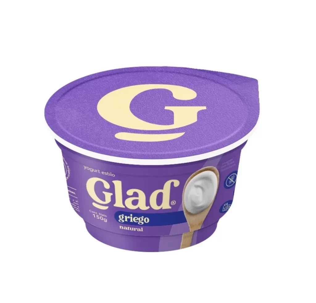
Visual hierarchy is established through the strategic use of scale and color blocking, drawing the eye immediately to the weight declaration and the product type. A photographic element on the right side displays the white yogurt texture on a wooden spoon, providing a tactile contrast to the flat graphic elements. Four distinct circular icons with line-art illustrations neatly summarize the product’s health benefits, including being sugar-free and a source of protein.
Packaging designers analyzing dairy market trends would utilize this visual to study effective color psychology in food branding. Marketing teams could reference the layout when planning campaigns for natural or health-focused food products requiring clear nutritional communication. Furthermore, 3D artists modeling consumer goods might employ this as a baseline for understanding standard tub proportions and label application techniques.