Glad Natural Greek Style Yogurt Cup Packaging
Topics
Details
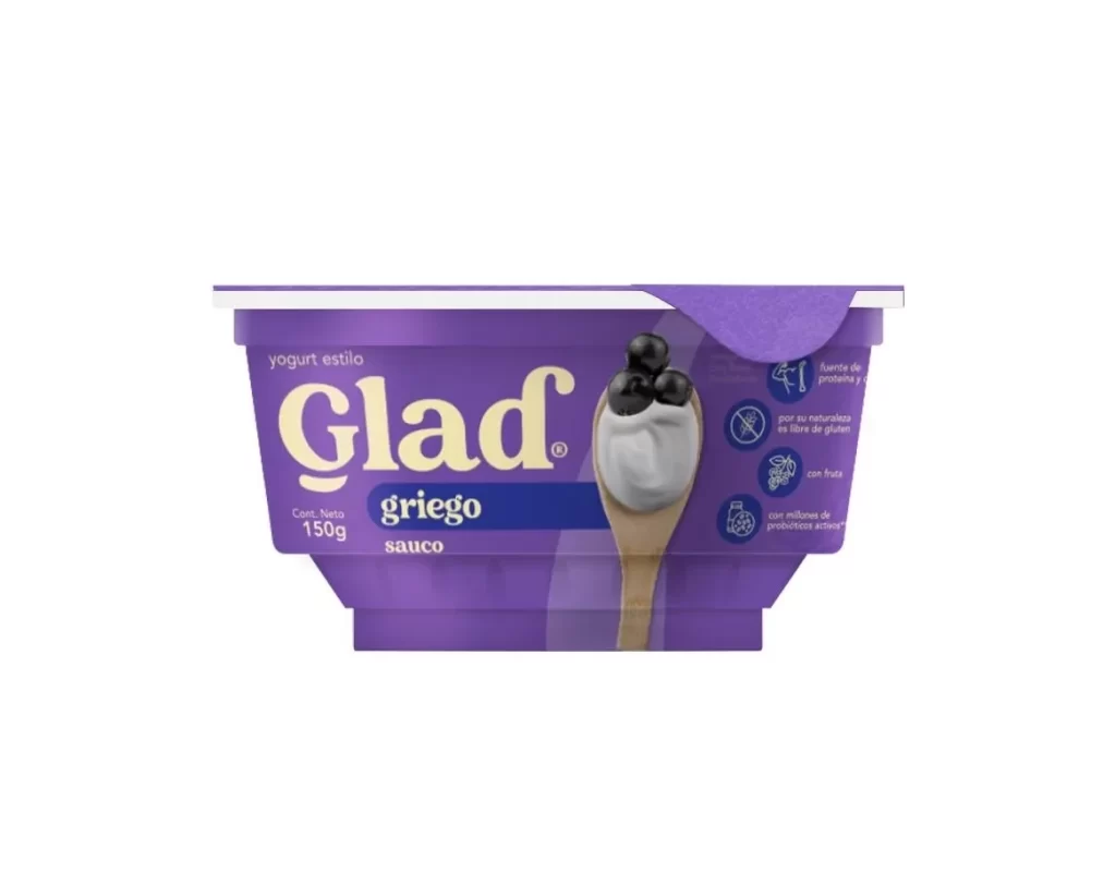
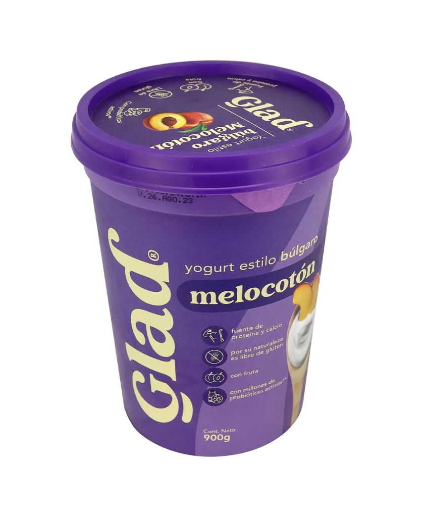
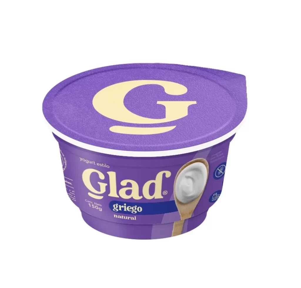
A vibrant purple plastic tub dominates the frame, topped with a matching lid that creates a bold, monochromatic silhouette. The brand name 'Glad' appears in large, white, rounded serif lettering along the left edge, while the product type 'yogurt estilo griego natural' sits to the right in a mix of clean sans-serif fonts. Four circular icons line the lower right, each illustrating key benefits like being unsweetened, a source of protein and calcium, gluten-free, and containing active probiotics, all set against the deep violet background.
What makes this packaging visually striking is the confident use of a single, saturated color family that immediately signals the product's natural and wholesome positioning. The typographic hierarchy cleverly balances the playful, oversized logo with the more restrained informational text, creating a modern yet approachable aesthetic. Additionally, the photographic element of a wooden spoon filled with creamy yogurt adds a tactile, appetizing quality that breaks up the graphic elements and grounds the design in reality.
Food packaging designers might study this example to understand how to effectively communicate nutritional benefits through iconography without cluttering the label. Brand strategists could analyze the color psychology behind choosing such a distinctive purple for a dairy product in a market often dominated by whites and blues. Furthermore, 3D artists working on commercial visualizations would find this a perfect case study for rendering translucent plastics and matte label finishes under studio lighting conditions.