Glad griego sauco Yogurt Packaging
Topics
Details
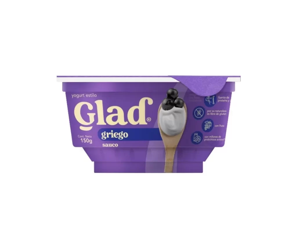
A vibrant purple plastic body with a contrasting white rim defines this 150g yogurt container, which sits on a white surface. Large, cream-colored serif lettering spells out the brand name 'Glad' above a dark blue horizontal band containing 'griego' and 'sauco'. A wooden spoon holding a dollop of white yogurt and three dark berries dominates the right side of the composition.
Visual hierarchy is established through the bold contrast between the saturated violet packaging and the pale typography. The photographic element of the spoon creates a tactile, appetizing focal point that breaks up the flat graphic areas of the label. Specific typographic choices, such as the mix of script-like branding and clean sans-serif nutritional information, create a modern yet approachable aesthetic for the dairy product.
Brand strategists might examine this layout to understand how color coding differentiates flavor variants within a product line. Packaging engineers could reference the structural shape of the tub and the placement of the foil seal for similar dairy applications. Food photographers may study the lighting on the spoon’s texture and the berry placement to replicate this style of appetizing product visualization.