Lemon Juice Drink Packaging
Topics
Details
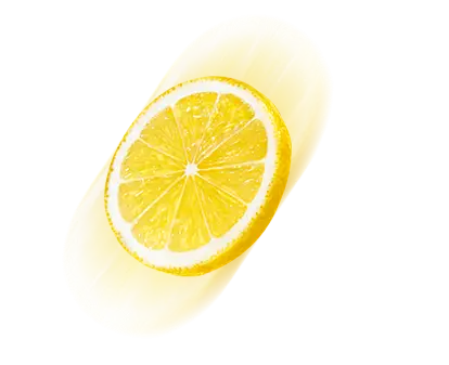
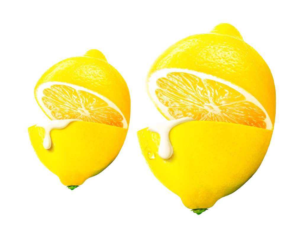
A rectangular carton of Yousuanru lemon juice drink stands upright, its surface dominated by a crisp white field that transitions into a vibrant lime-green base. Bold emerald characters spell out "嚼!柠檬" (Chew! Lemon) across the upper-middle section, positioned just below the brand's oval green logo. A photorealistic illustration of a sliced yellow lemon with visible pulp texture and juice droplets anchors the center-right composition, while smaller text at the bottom indicates a 240g net weight and identifies the product as a light milk fruit juice beverage.
Visual energy radiates from the dynamic diagonal slash marks in bright green that cut behind the citrus imagery, suggesting motion and freshness without overwhelming the primary subject. The circular badge declaring "带皮整榨" (whole crushed with peel) adds an authenticating detail that reinforces the product's natural positioning. Color blocking between the white upper portion and the saturated green lower section creates a clean visual hierarchy that guides the eye from the brand name down to the flavor promise.
Packaging designers studying Asian beverage markets would find this carton useful for analyzing how typography scale interacts with photographic elements in dairy-fruit hybrid categories. Marketing teams developing citrus-flavored drink lines could reference the specific balance between realistic fruit rendering and graphic accent shapes when briefing their own creative assets. Students of commercial illustration might examine the lighting treatment on the lemon's surface to understand how highlights communicate juiciness within constrained packaging real estate.