Gatorade Electrolyte Drink Lemon Flavor
DownloadTopics
Details
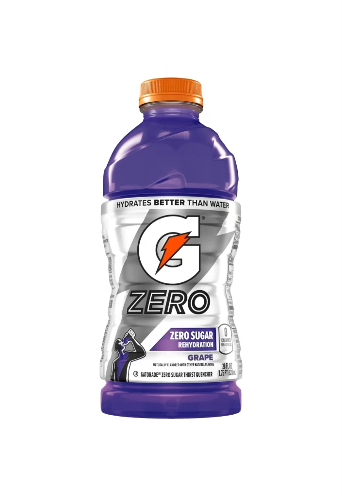
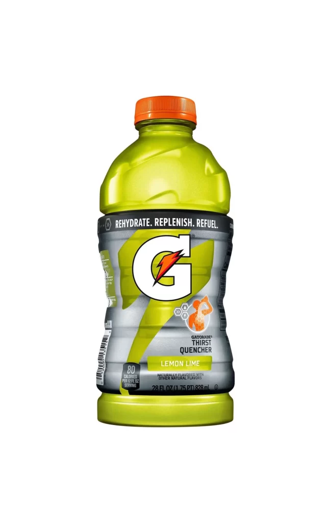
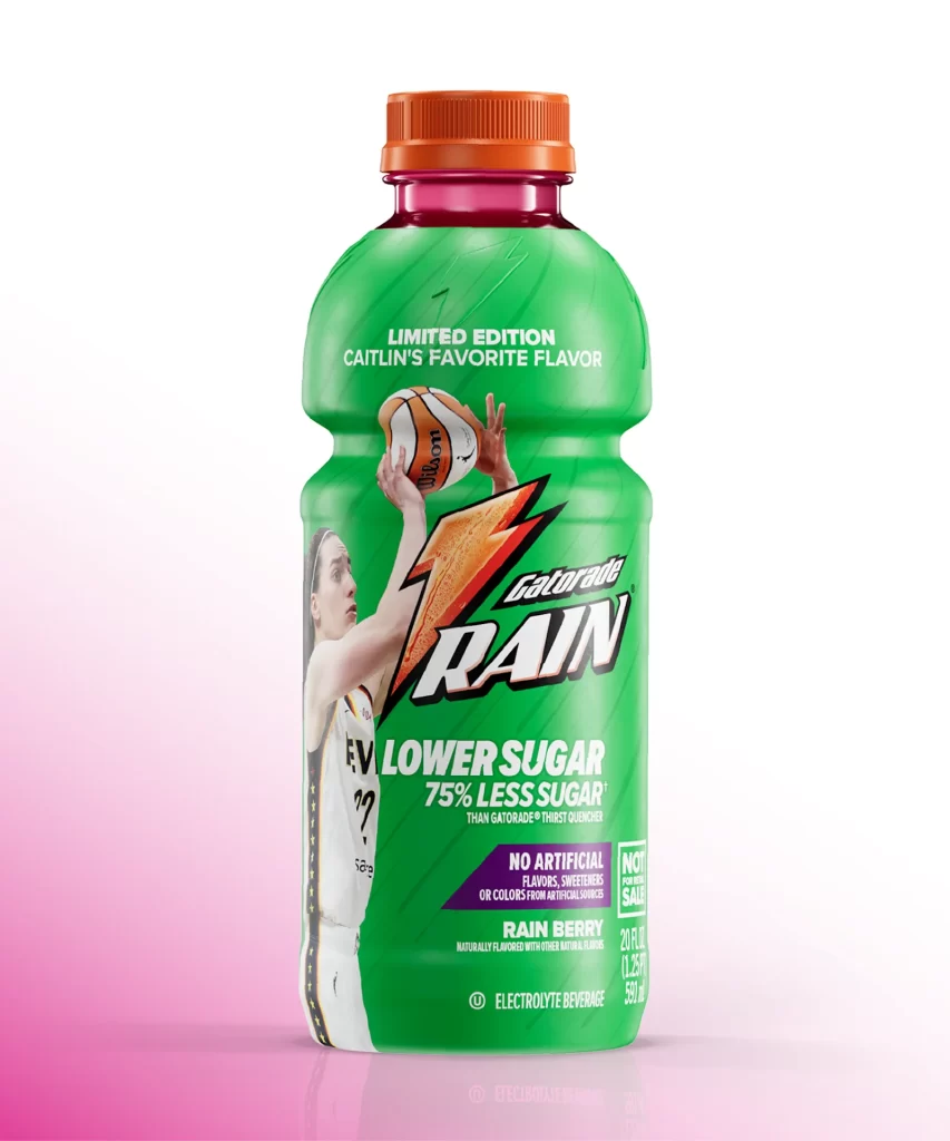
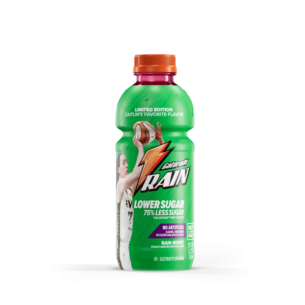
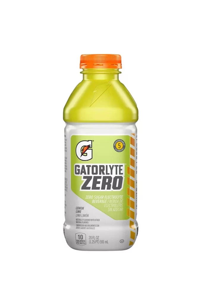
A translucent yellow plastic bottle filled with pale green liquid stands as the central figure, capped by a bright orange screw-top that provides a sharp color contrast. The label wraps around the lower half in a clean white and lime-green palette, featuring the bold Gatorade 'G' logo above the heavy, blocky typography of 'GATORLYTE ZERO'. Subtle text below identifies the flavor as Lemon Lime and notes the 20 fluid ounce volume, while a small circular badge on the right side displays the number 5.
Visual hierarchy here relies on the interplay between the saturated cap color and the muted beverage hue, drawing the eye upward before settling on the brand mark. The diagonal orange stripes along the right edge of the label introduce dynamic movement to an otherwise static product shot. Designers studying packaging composition will appreciate how the limited color palette prevents visual clutter while maintaining strong brand recognition. You can grab the full-resolution file at no cost if you need to examine these details closely.
Product photographers might study this shot for its even lighting distribution across curved plastic surfaces without creating distracting glare. Packaging specialists could reference the typographic weight choices when laying out their own nutritional beverage labels. 3D artists building digital assets for sports drink campaigns would find the material properties of both the liquid and container particularly useful for texture mapping.