Gatorade Rain Bottle Green Background
Topics
Details
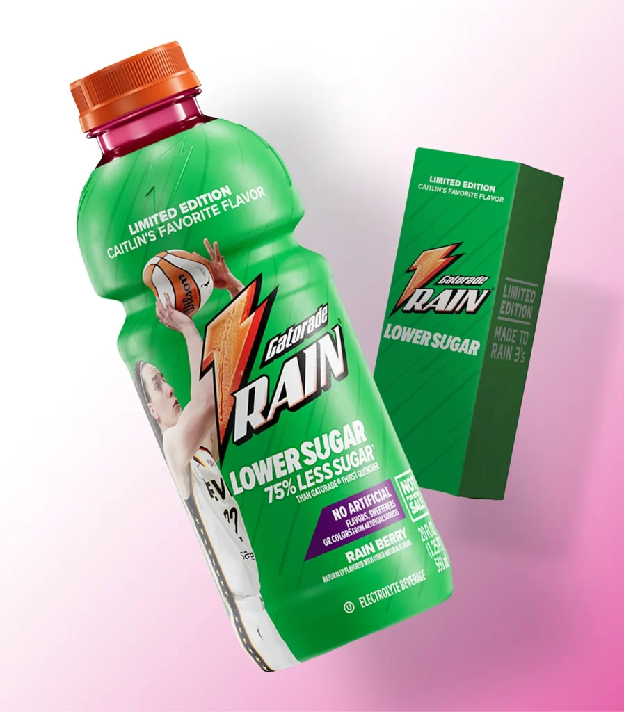
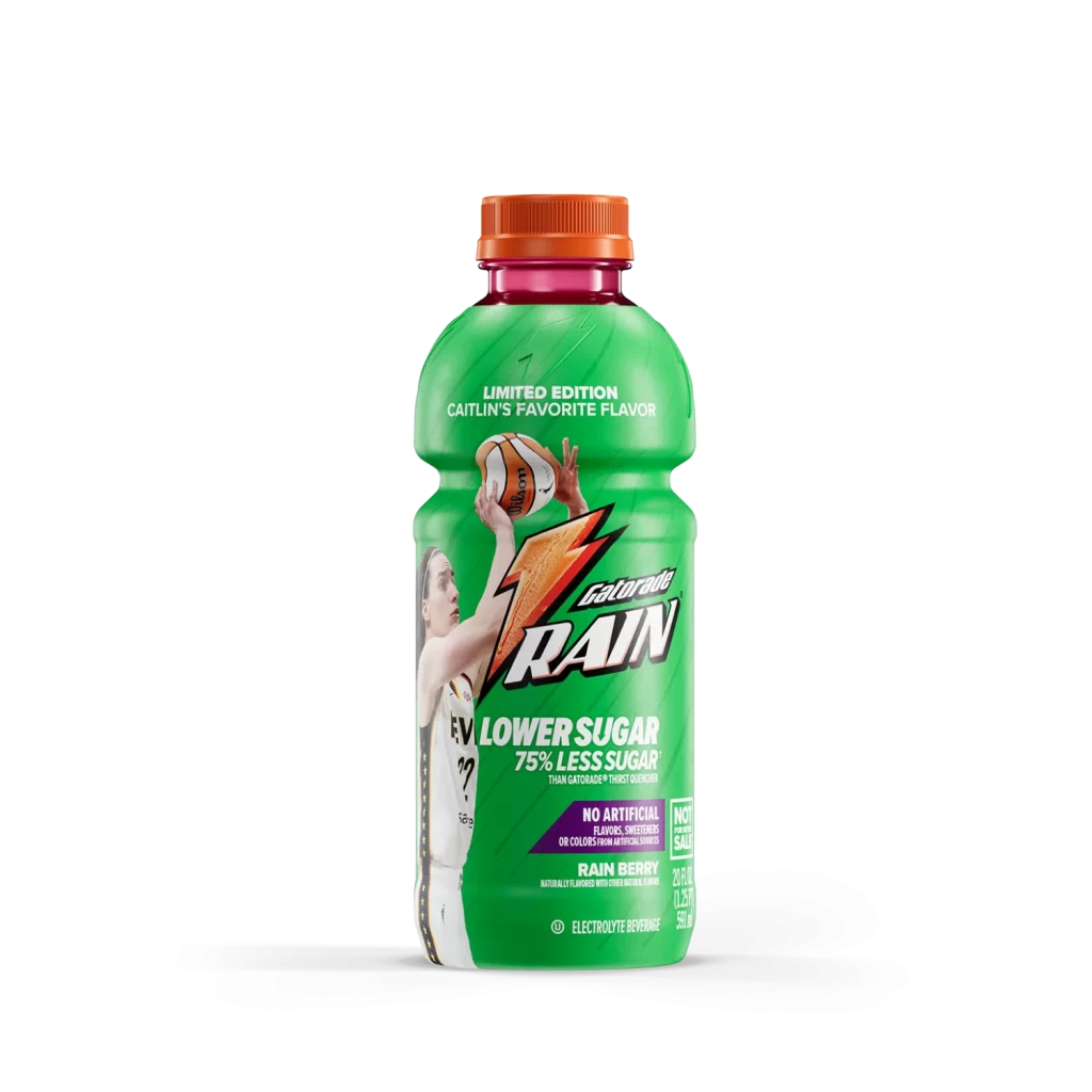
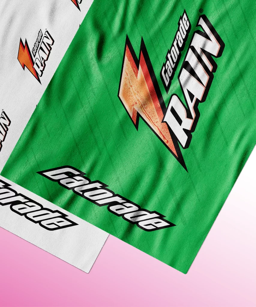
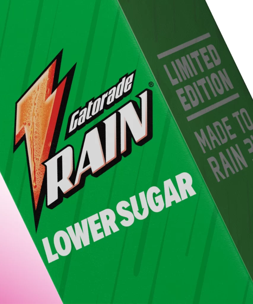
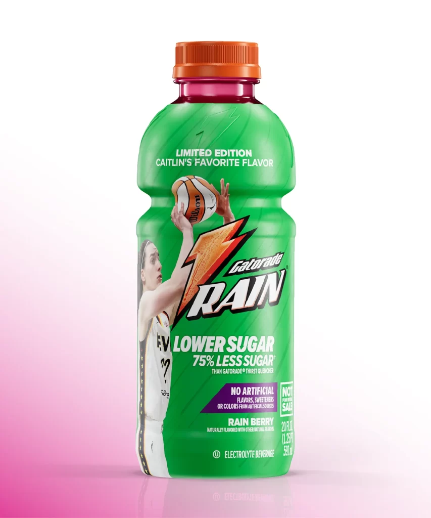
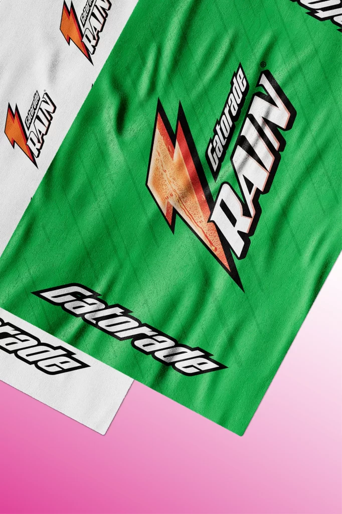
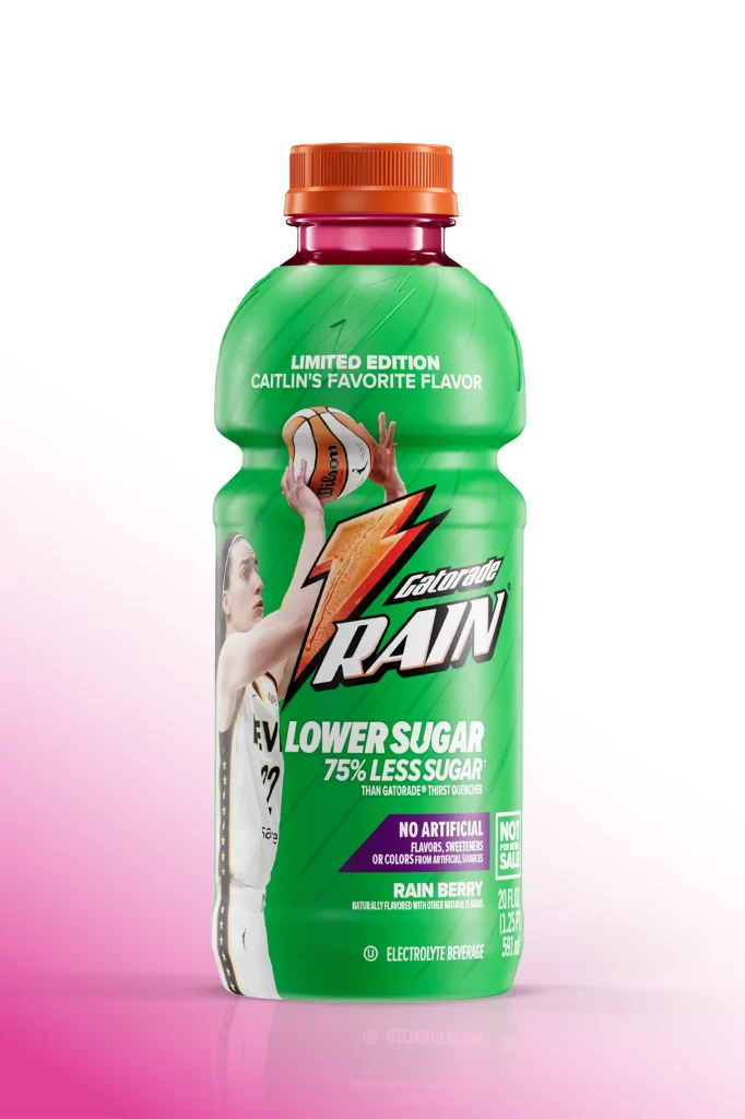
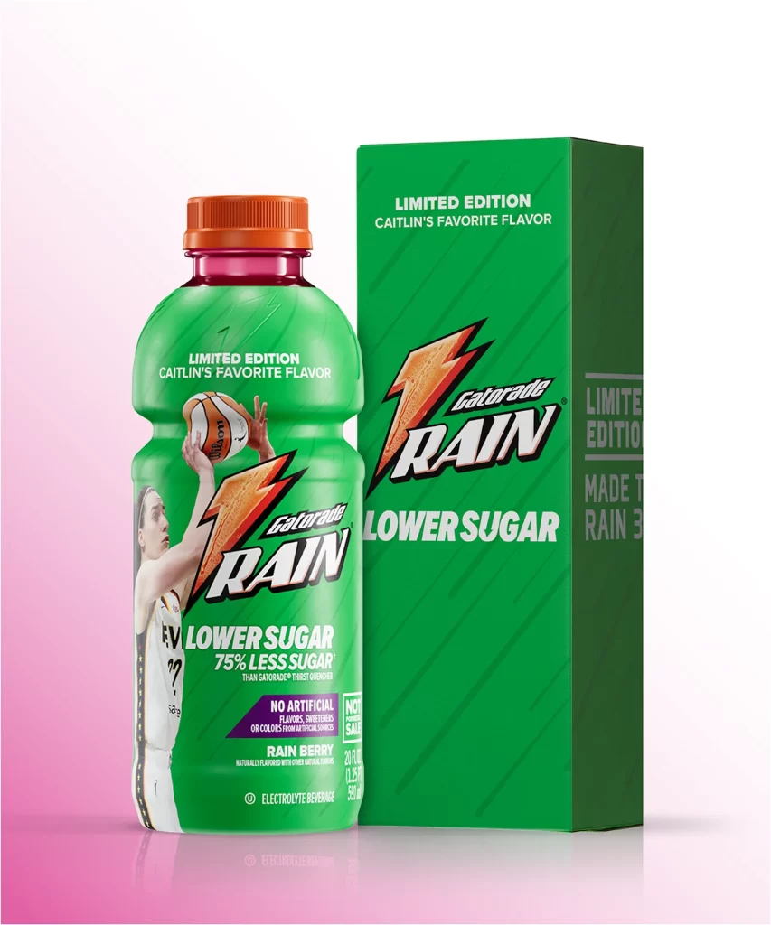
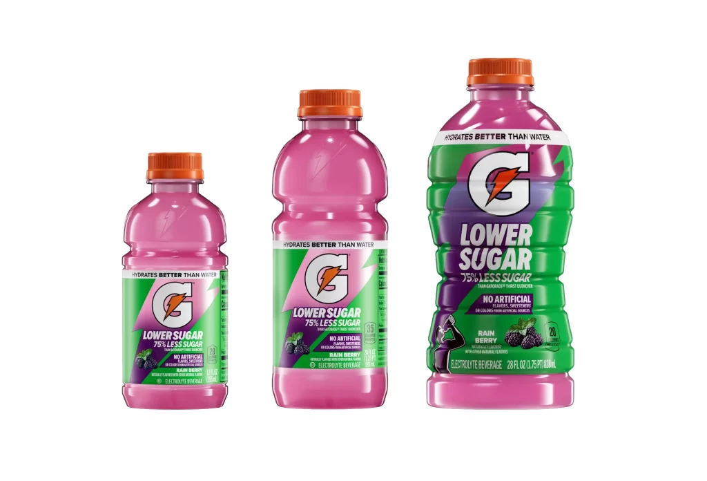
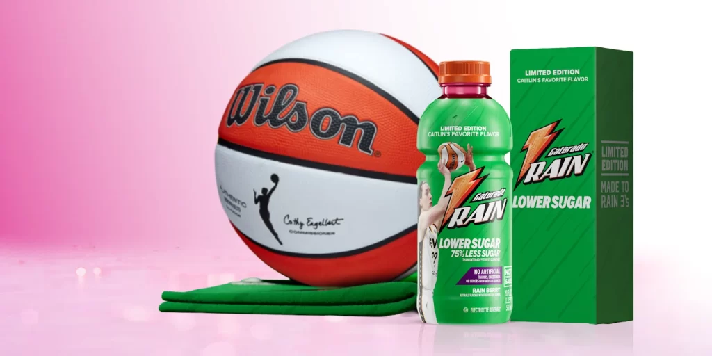
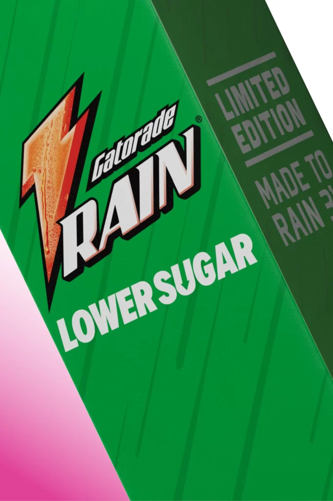
The image displays a Gatorade Rain package set against a vibrant green background with subtle vertical pinstripes. A bold, stylized lightning bolt logo in orange and red sits prominently to the left of the 'Gatorade RAIN' wordmark, which uses a mix of italicized script and heavy block lettering. Below this, 'LOWER SUGAR' is printed in large, clean white sans-serif font, while a dark green side panel features the text 'LIMITED EDITION' and 'MADE TO RAIN'.
Positioned as a lighter, more refreshing alternative to standard sports drinks, this product targets health-conscious athletes who want hydration without excessive sweetness. The 'Rain' branding evokes a sense of crispness and purity, appealing to consumers looking for a subtle flavor profile during physical activity. Its limited edition status adds a layer of exclusivity, encouraging trial among loyal Gatorade fans and curious newcomers alike.
Packaging designers can learn from the effective use of high-contrast typography and iconic branding elements that ensure instant shelf recognition. The strategic placement of key nutritional benefits, like lower sugar content, demonstrates how to communicate value propositions clearly without cluttering the visual field. Furthermore, the integration of a distinct color palette and texture helps differentiate product lines within a larger brand ecosystem.