Gatorade Zero Sugar Fruit Punch
DownloadTopics
Details
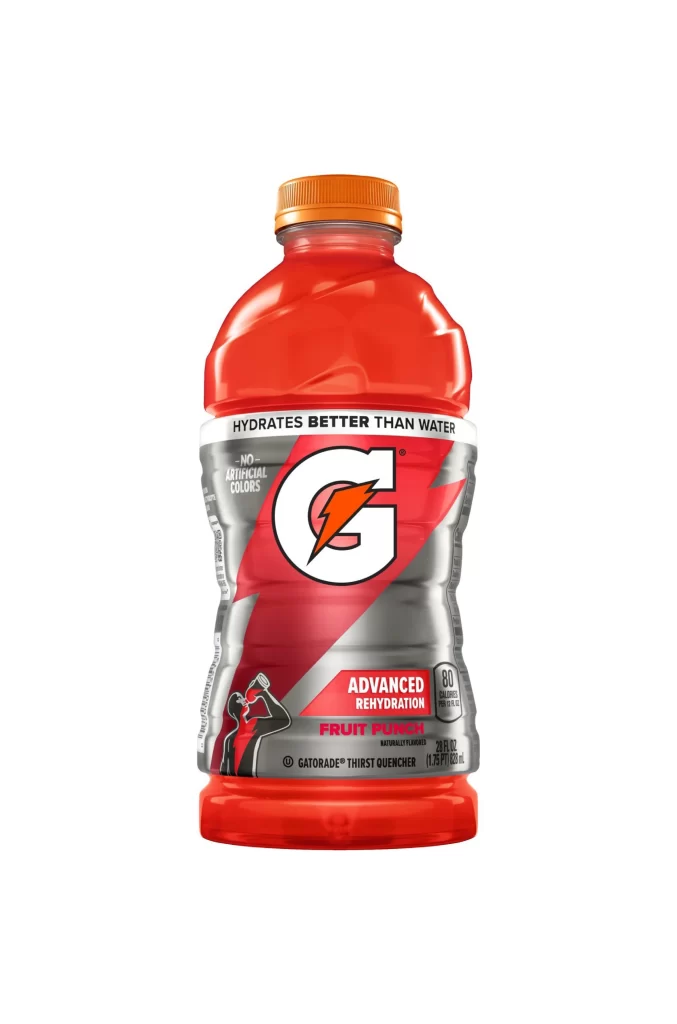
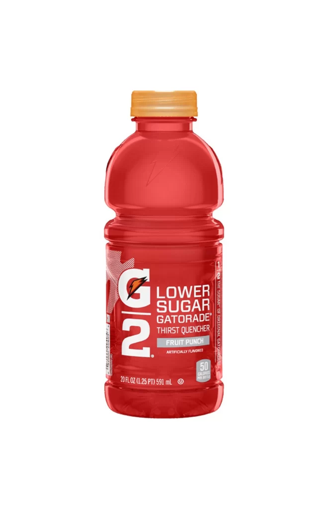
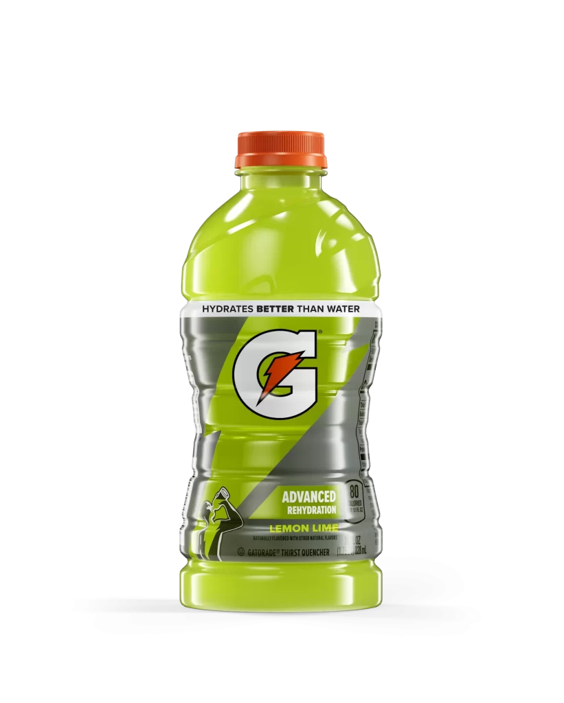
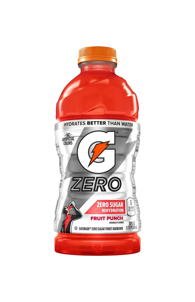
A contoured 28-ounce plastic bottle filled with translucent red liquid stands upright, sealed with an orange screw cap. The label wraps the midsection in silver, black, and white graphics featuring a bold 'G' logo with an orange lightning bolt above the word ZERO in heavy sans-serif type. A small silhouette of an athlete drinking appears at lower left, while red banners announce zero sugar rehydration and fruit punch flavor against a neutral light backdrop.
Visual distinction emerges from the high-contrast palette pairing vibrant crimson contents with metallic silver labeling and saturated orange accents. The diagonal gray stripe slicing behind the central logo creates dynamic tension across the cylindrical form, while the absence of artificial colors claim occupies prominent vertical space. Designers studying beverage packaging can access the full-resolution file for detailed typographic and color analysis without cost.
Product photographers might employ this shot to study studio lighting techniques on curved reflective surfaces and saturated liquid translucency. Brand strategists could reference the hierarchy between the master logo, variant descriptor, and flavor callout when developing sports drink line extensions. 3D modelers seeking accurate bottle proportions and label wrap geometry will find the orthogonal perspective particularly useful for texture mapping.