Gatorade Mashups Cool Blue Fruit Punch Thirst Quencher
DownloadTopics
Details
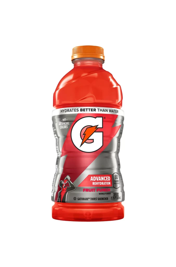
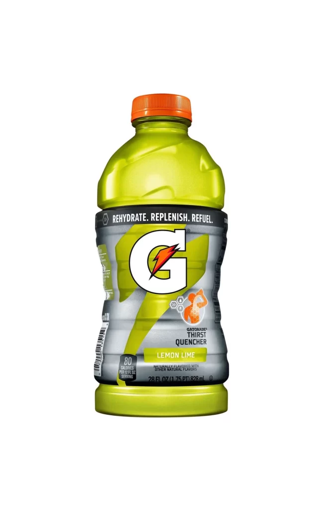
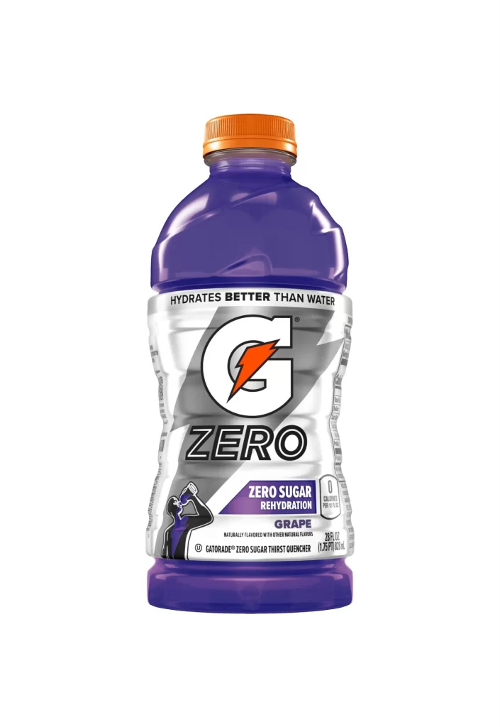
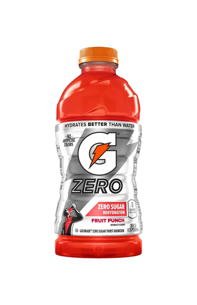
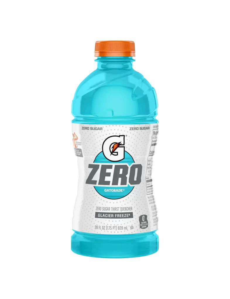
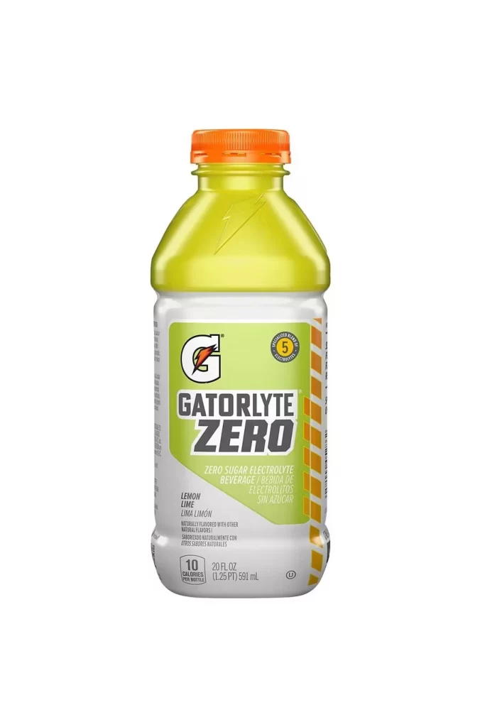
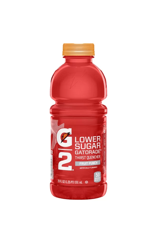
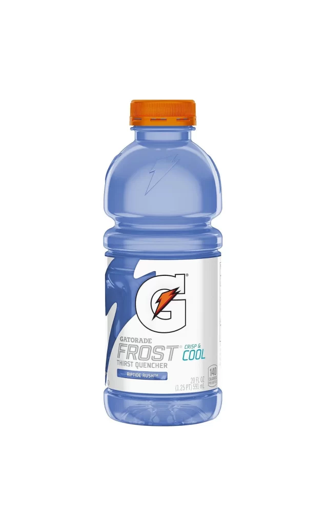
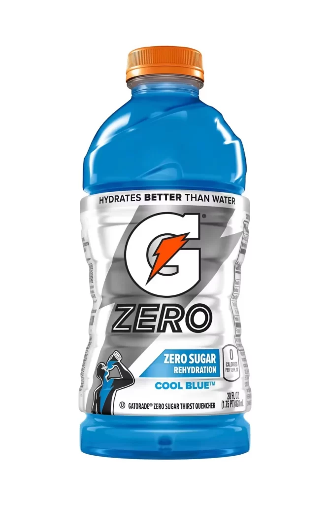
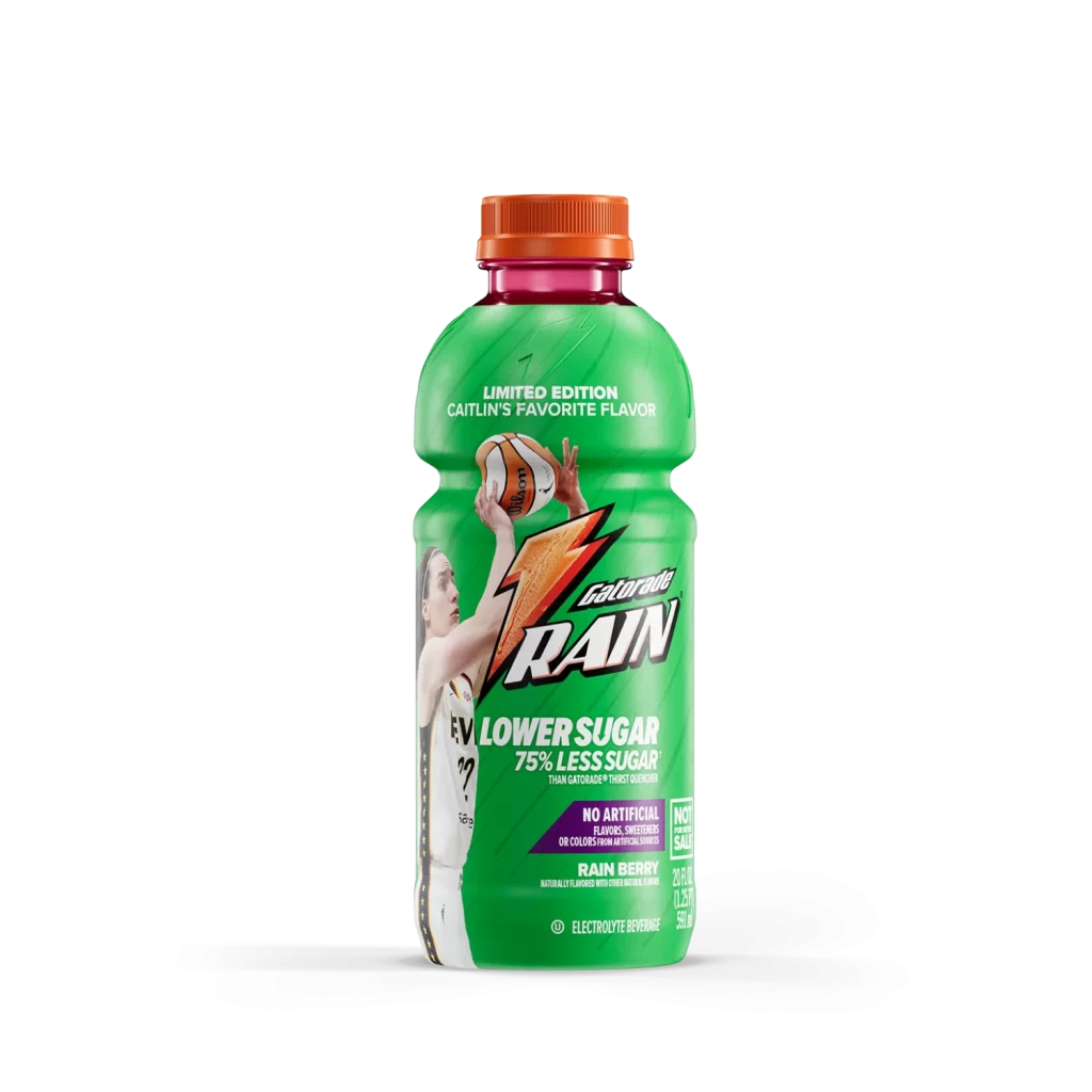
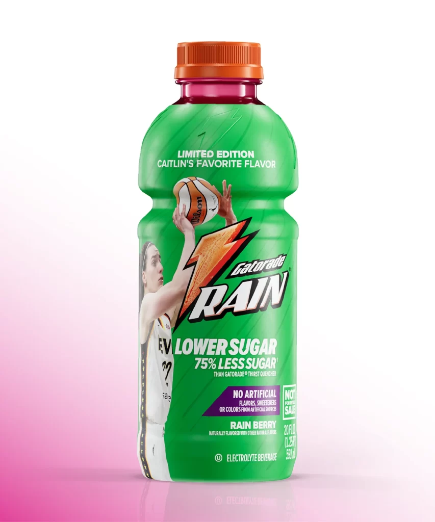
A contoured 28-ounce Gatorade bottle stands with an orange screw cap sealing the top, its body split between a cool blue upper half and a vibrant red lower section. The iconic white lightning bolt slashes diagonally across the label, partially obscuring water-splash graphics and the 'G' logo beneath. Text elements include 'GATORADE MASHUPS' in bold silver lettering above the bolt, while dual flavor badges for 'COOL BLUE' and 'FRUIT PUNCH' anchor the lower third alongside 'THIRST QUENCHER' in white sans-serif type.
Visual tension emerges from the binary color scheme, where cyan and crimson meet at an irregular boundary mimicking liquid collision rather than a clean graphic divide. The mashup concept manifests physically through layered translucent inks that suggest depth when light passes through the PET plastic, creating a chromatic interplay absent from single-flavor variants. Designers studying beverage packaging will note how the diagonal bolt orientation disrupts vertical symmetry to imply motion and energy.
Product photographers might analyze this composition to understand how studio lighting eliminates specular glare on curved plastic surfaces while maintaining color fidelity across high-contrast zones. Brand strategists could reference the typographic hierarchy when developing limited-edition labeling systems that combine established visual equity with novelty elements. The complete high-fidelity asset can be accessed without cost for immediate integration into mood boards or packaging audits.