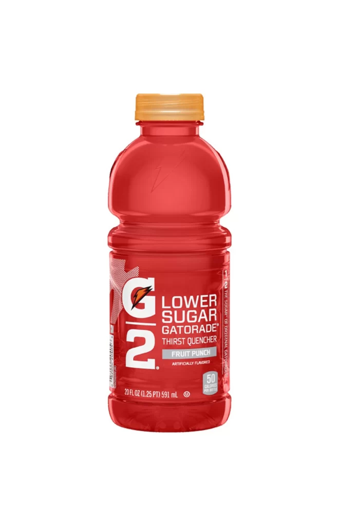
Gatorade G2 Fruit Punch Bottle Packaging
DownloadTopics
Details
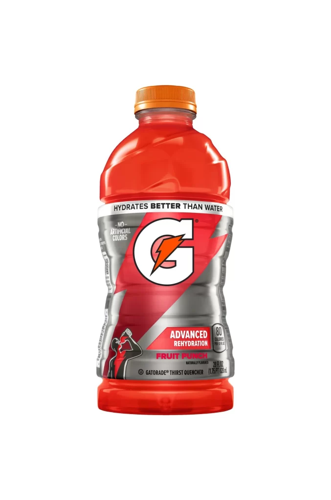
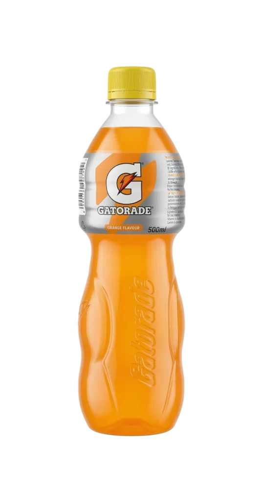
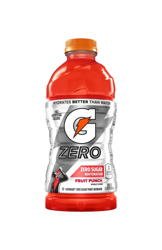
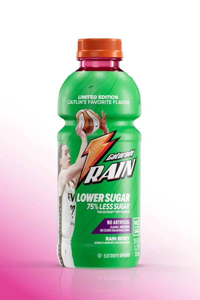
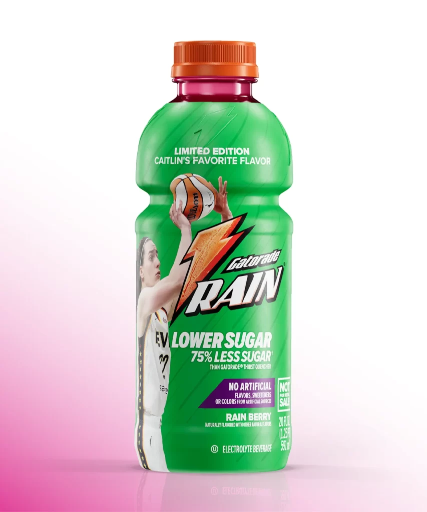
A translucent red plastic bottle filled with Fruit Punch Gatorade G2 stands upright, capped with a bright orange screw-top that matches the liquid's vibrant hue. The label features a bold white 'G' with a lightning bolt above a large numeral '2', followed by the text 'LOWER SUGAR GATORADE THIRST QUENCHER' in clean sans-serif typography. Soft studio lighting creates subtle highlights along the bottle's contoured shoulders and ribbed grip section, while the entire product sits on an uncluttered white surface that keeps focus entirely on the packaging details.
What distinguishes this particular variant is its emphasis on reduced-sugar branding, prominently displayed through the stacked text hierarchy and the '50 CALORIES PER BOTTLE' badge positioned near the bottom right. The color palette—dominated by that punchy red-orange spectrum—creates immediate visual recognition for the fruit punch flavor while differentiating it from standard full-sugar versions. Designers studying beverage packaging will appreciate how the label's geometric patterns and weight distribution balance nutritional messaging with athletic performance positioning.
Product photographers and packaging students can utilize this shot to analyze how condensation-free studio lighting affects transparent polymer materials without creating distracting glare. Brand identity researchers might compare this G2 labeling system against original Gatorade designs to understand visual shorthand for health-conscious product lines. Anyone needing crisp source material for texture studies or color-matching exercises can grab the full-resolution file directly from our library without cost.