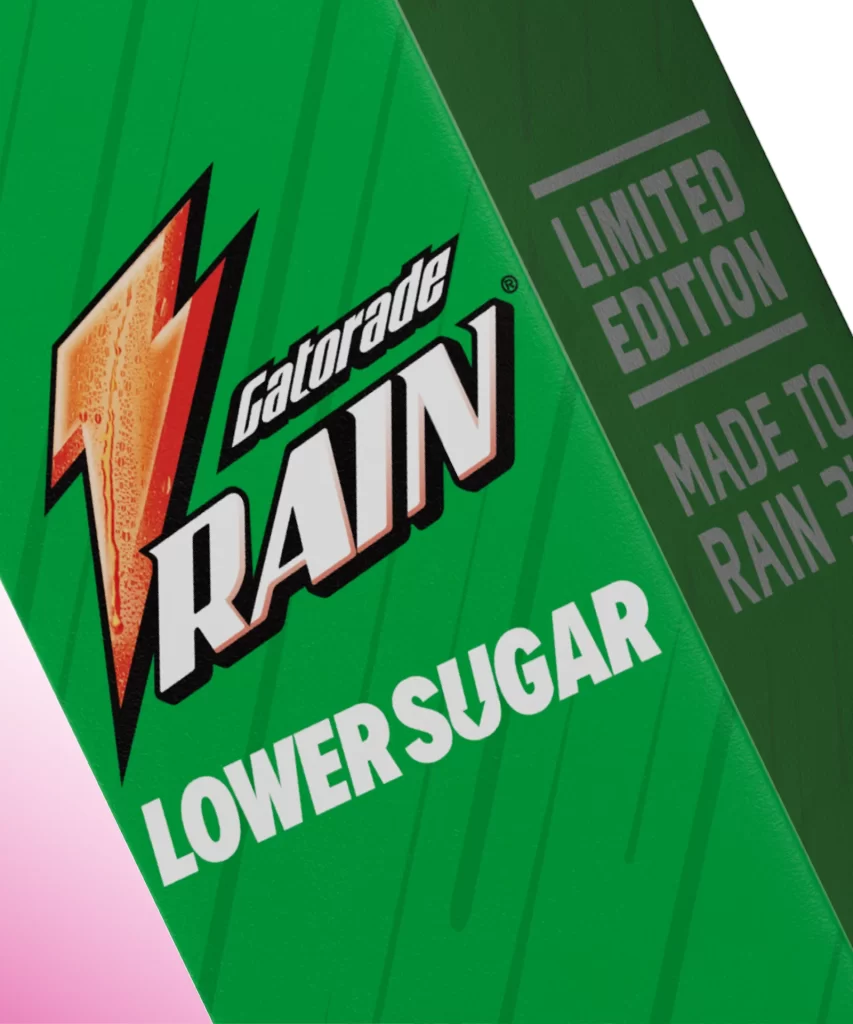
Gatorade Rain Bottle Label Close Up
Topics
Details
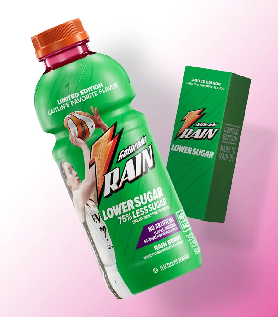
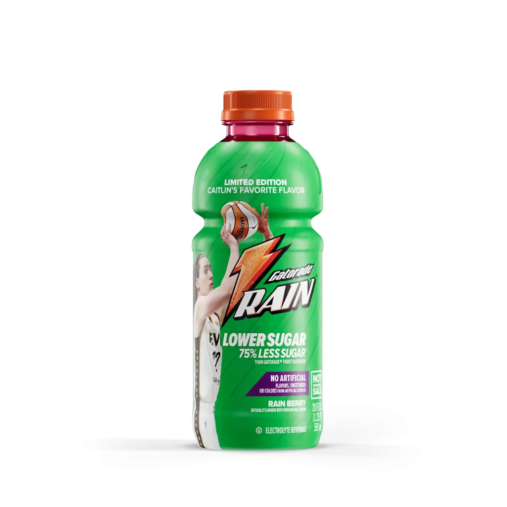
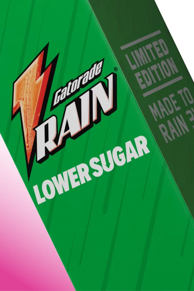
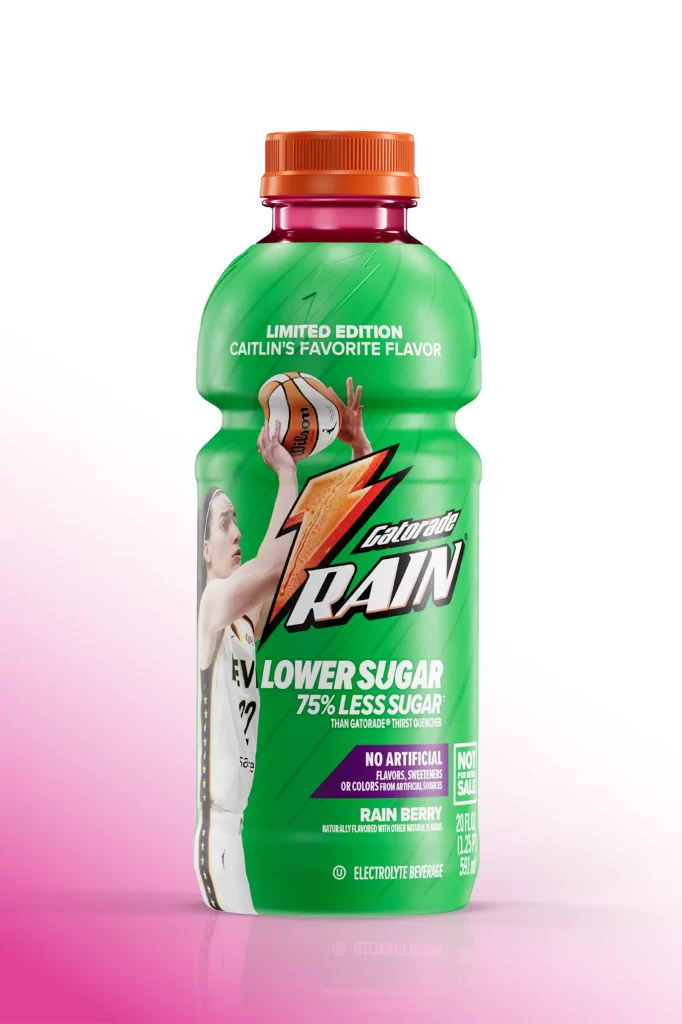
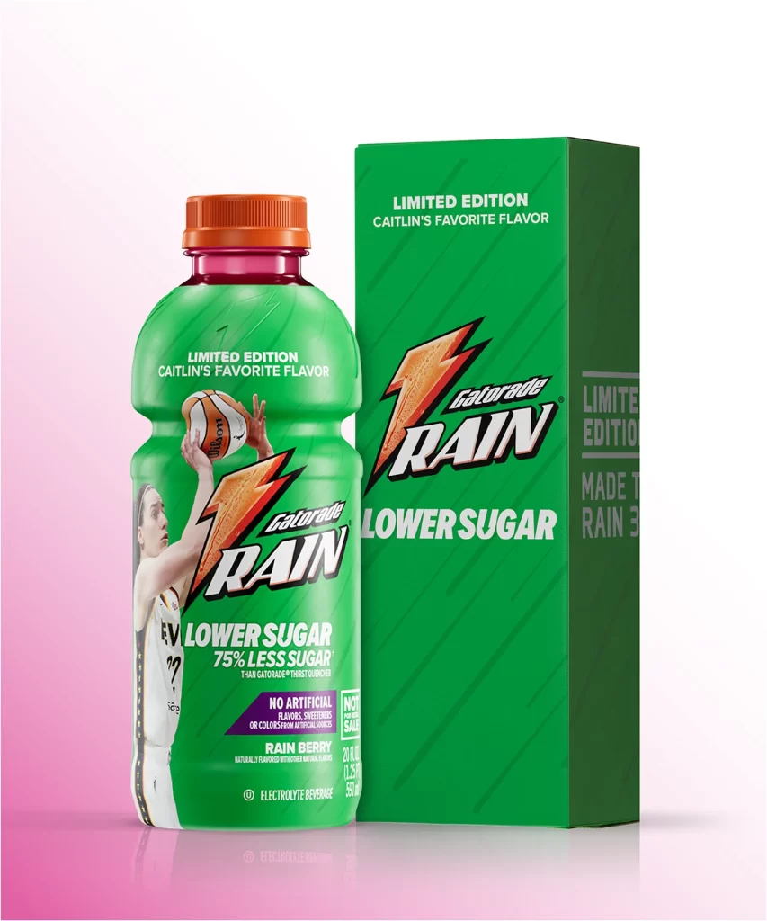
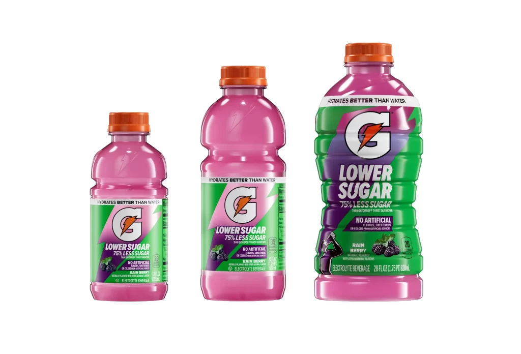
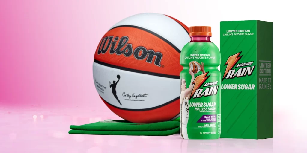
The image displays a close-up of a Gatorade Rain bottle label, characterized by a vibrant green background with subtle vertical pinstripes. Dominating the left side is the iconic orange lightning bolt logo, which appears textured with water droplets, positioned next to the bold white 'RAIN' typography. To the right, the packaging features grey text indicating it is a 'LIMITED EDITION' release, while 'LOWER SUGAR' is prominently displayed in large white letters at the bottom.
Positioned as a lighter hydration option, this product targets health-conscious athletes and active individuals seeking refreshment without excessive sweetness. The 'Made to Rain' slogan and sleek aesthetic suggest a crisp, clean taste profile that differentiates it from standard sports drinks. Its limited availability creates a sense of exclusivity, appealing to consumers who enjoy trying unique or seasonal beverage variations.
Packaging designers can draw inspiration from the effective use of high-contrast colors and dynamic logo placement to ensure immediate brand recognition. The layout successfully balances essential nutritional information with marketing buzzwords like 'Limited Edition' without cluttering the visual field. It serves as an excellent example of how subtle texture effects can add depth and tactile appeal to flat graphic designs.