Gatorade Zero Sugar Grape Thirst Quencher
DownloadTopics
Details
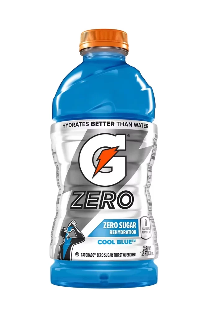
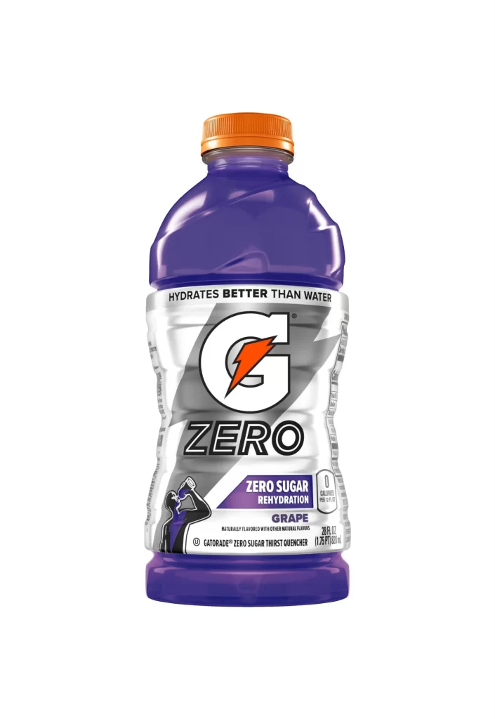
A 28-ounce contoured plastic bottle filled with translucent purple liquid stands as the central subject, sealed with a bright orange screw cap. The silver label wraps around the bottle's midsection, featuring the iconic white 'G' logo with an orange lightning bolt, followed by bold black 'ZERO' typography. Below this, a purple banner announces 'ZERO SUGAR REHYDRATION' and 'GRAPE' flavor, while a small athlete silhouette drinks from a bottle on the lower left. The composition presents the product frontally against a light backdrop with even studio lighting that eliminates harsh shadows.
Visual distinction emerges from the striking contrast between the deep violet beverage and the metallic silver label, creating immediate flavor recognition through color psychology. The orange cap provides a complementary accent that echoes the brand's lightning bolt icon, establishing a cohesive three-color palette. Designers studying beverage packaging will note how the contoured bottle shape creates natural highlights that emphasize the liquid's clarity. The full-resolution asset can be obtained at no cost for detailed examination of these material interactions.
Product photographers might reference this image to understand standard lighting setups for translucent liquids and reflective label materials. Brand strategists could analyze the typographic hierarchy that balances the parent brand mark with variant-specific zero-sugar messaging. Packaging engineers may study how the label graphics align with the bottle's ergonomic curves. 3D texture artists often require such clean product shots to accurately recreate plastic sheen and liquid refraction in digital environments.