Lemon Juice Drink Packaging
Topics
Details
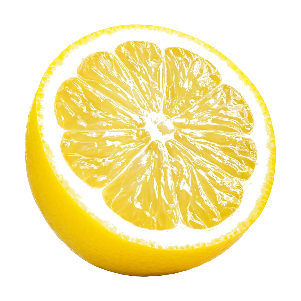
A rectangular gable-top carton of Yoyou brand lemon-flavored yogurt drink stands vertically, featuring a white upper field and a lime-green lower section. Bold green Chinese characters reading '嚼!柠檬' (Chew! Lemon) dominate the center above a large illustration of a sliced yellow lemon with a '带皮整榨' (whole fruit with peel pressed) badge. The net weight of 240g appears in the bottom left corner alongside the product category '轻乳果汁饮品', while the right side panel displays dense nutritional information in vertical text orientation.
Vibrant color blocking between the crisp white header and saturated citrus green base creates immediate visual energy and flavor association. Dynamic diagonal lines suggesting motion or juice splashes intersect with the central fruit graphic, adding kinetic tension to the otherwise static geometric form. The typographic hierarchy skillfully balances the playful exclamation mark in the main title against the clean oval logo at the top, establishing both brand recognition and product excitement.
Packaging designers studying beverage market trends in East Asia would examine this carton to understand current strategies for communicating fruit content authenticity through visual badges. Brand identity specialists could reference the specific shade combinations when developing fresh dairy or juice line extensions requiring perceived naturalness. Marketing teams launching functional drinks might analyze how the 'whole pressed' claim integrates with the primary imagery to reinforce texture expectations without verbal explanation.