Yogurt Drink Packaging Peach Flavor Beverage
Topics
Details
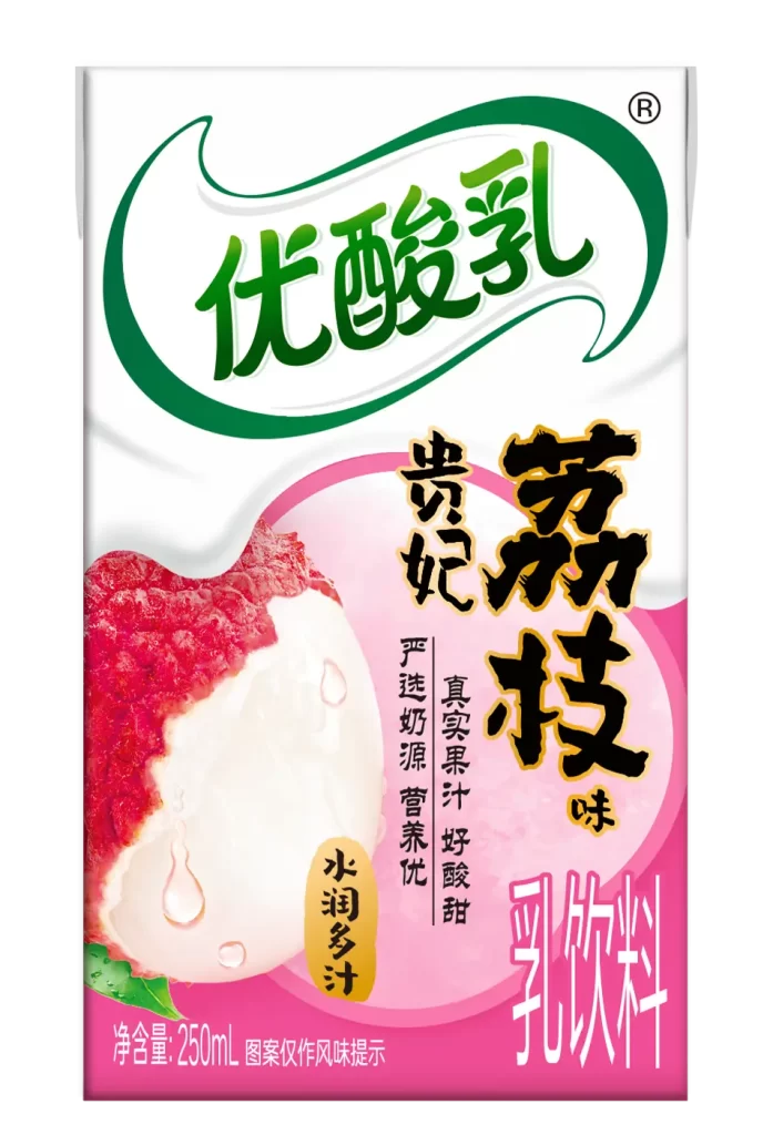
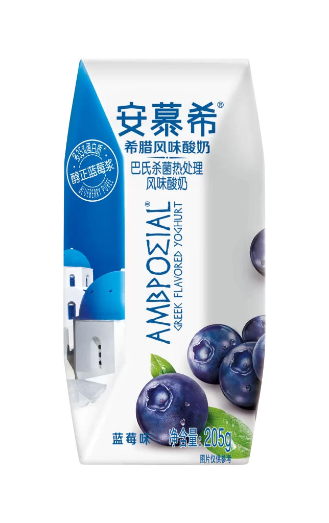
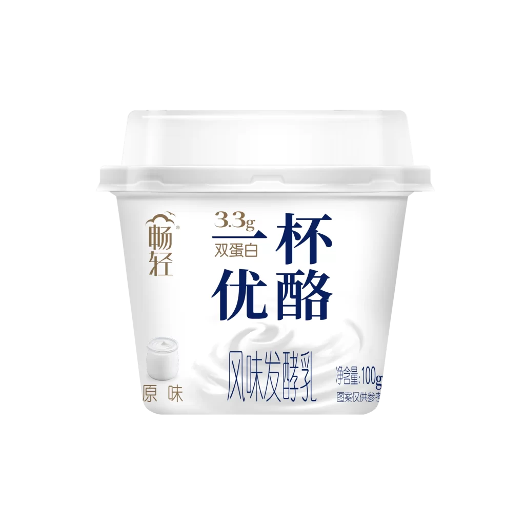
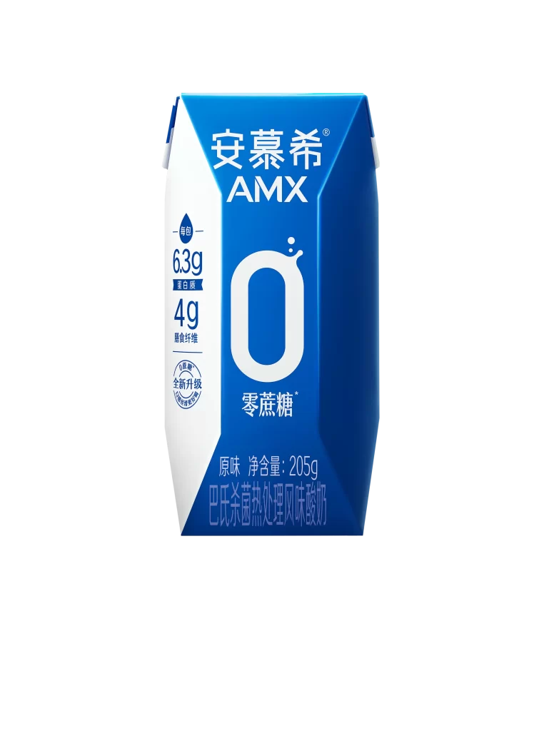
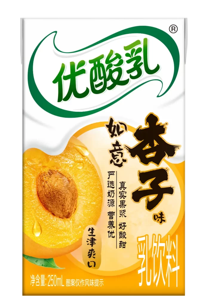
A rectangular carton of peach-flavored yogurt drink dominates the frame, featuring a clean white upper section that transitions into a vibrant yellow-orange gradient at the base. Bold, emerald-green Chinese characters for 'Yogurt' arc across the top within a sweeping white banner, while large, black calligraphic strokes announce the apricot flavor prominently on the right. A photorealistic, sliced peach with glistening water droplets and a visible stone anchors the left side, accompanied by smaller vertical text detailing product benefits like real fruit pulp and fresh milk sources.
Visual hierarchy plays a crucial role here, balancing modern sans-serif branding with traditional brush-stroke typography to evoke both freshness and artisanal quality. The saturated yellow palette immediately signals the specific fruit profile, while the glossy texture of the fruit illustration adds a tactile, appetizing quality that contrasts with the smooth, matte appearance of the packaging material. Such a layout effectively guides the eye from the brand identity at the top down to the flavor-specific imagery and nutritional claims.
Product photographers might study this composition to understand how to arrange text around central food imagery without cluttering the visual field. Branding specialists could analyze the color psychology behind using green for health-conscious dairy products paired with warm yellows for sweetness. Additionally, packaging engineers may reference this layout when designing labels that require multilingual text integration or when seeking to highlight specific ingredients through realistic graphic elements.