Red Ginseng Powder Packaging
Topics
Details
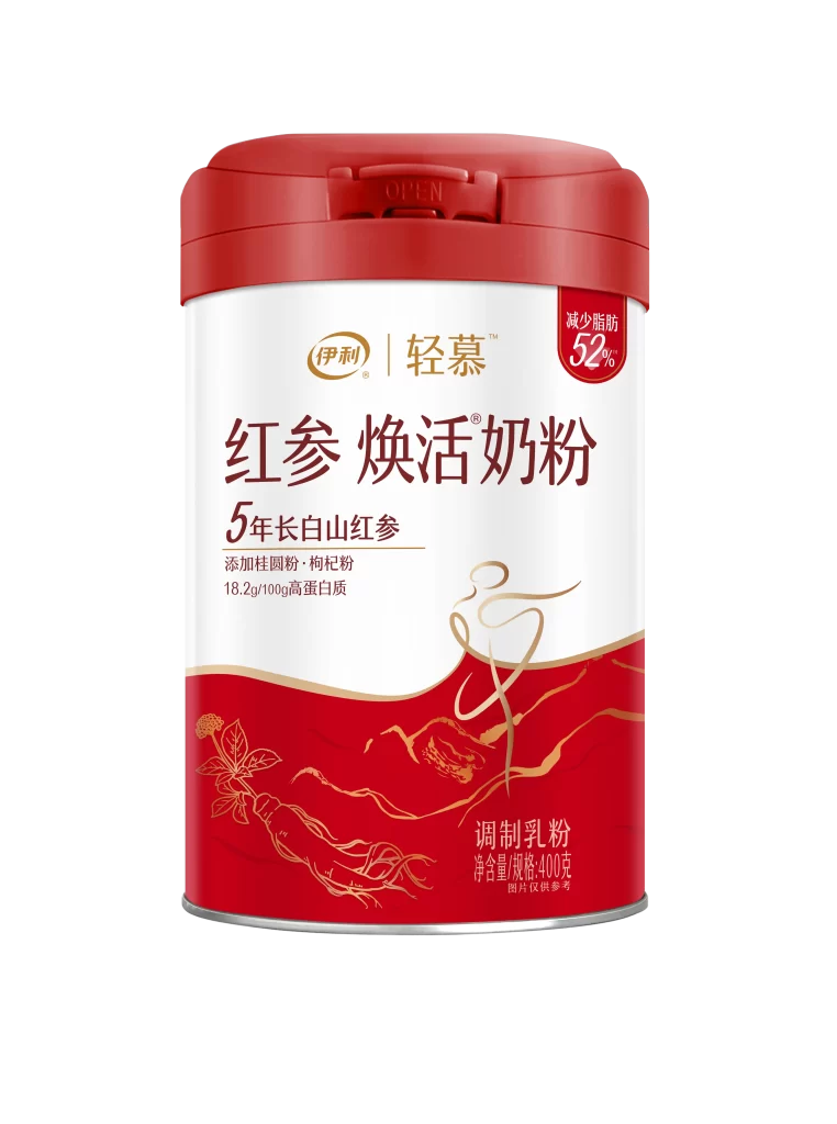
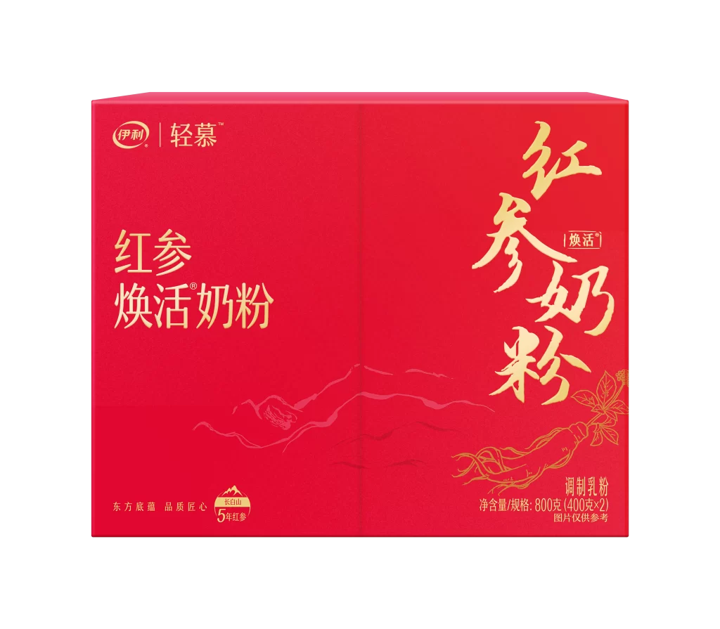
A vibrant crimson rectangular carton dominates the frame, its surface finished in a matte red that absorbs light softly. Gold foil typography spans the front and side panels, displaying the brand name 'Yili' and the product line 'Qingmu' alongside bold Chinese characters for Red Ginseng Revitalizing Milk Powder. Subtle line-art illustrations of mountain ranges and ginseng roots are embossed into the lower half, while a small badge at the bottom left corner indicates five-year-old ginseng from Changbai Mountain.
The visual strategy here relies on a striking contrast between the deep, saturated background and the metallic gold accents that catch the eye immediately. Vertical text orientation on the right panel breaks away from standard horizontal layouts, adding a dynamic sense of traditional elegance to the modern packaging structure. This particular version balances heritage cues like the calligraphic script with clean, contemporary branding elements, creating a premium aesthetic that feels both medicinal and luxurious.
Brand strategists analyzing Asian health-product markets would examine this case study to understand how color psychology drives perceived value in functional foods. Packaging engineers might reference the structural layout when developing boxes for powdered supplements requiring both shelf presence and practical storage. Marketing teams launching wellness-oriented dairy products could draw from this example to craft visual identities that communicate vitality without sacrificing sophistication.