Lemon Drink Packaging Beverage Fruit Juice
Topics
Details
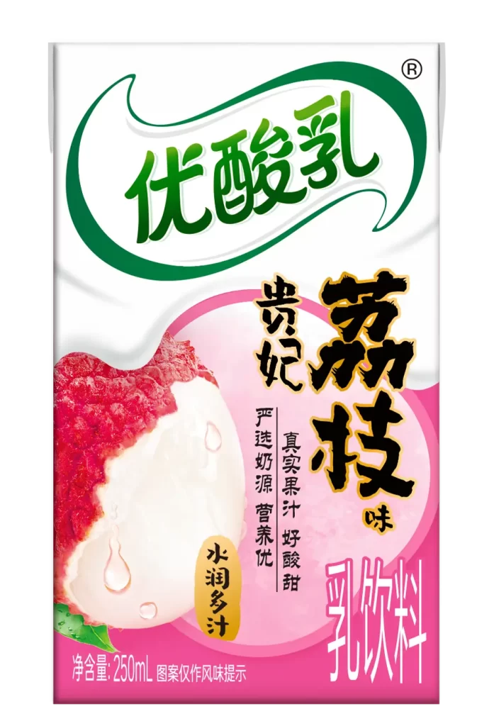
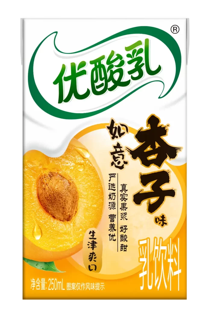
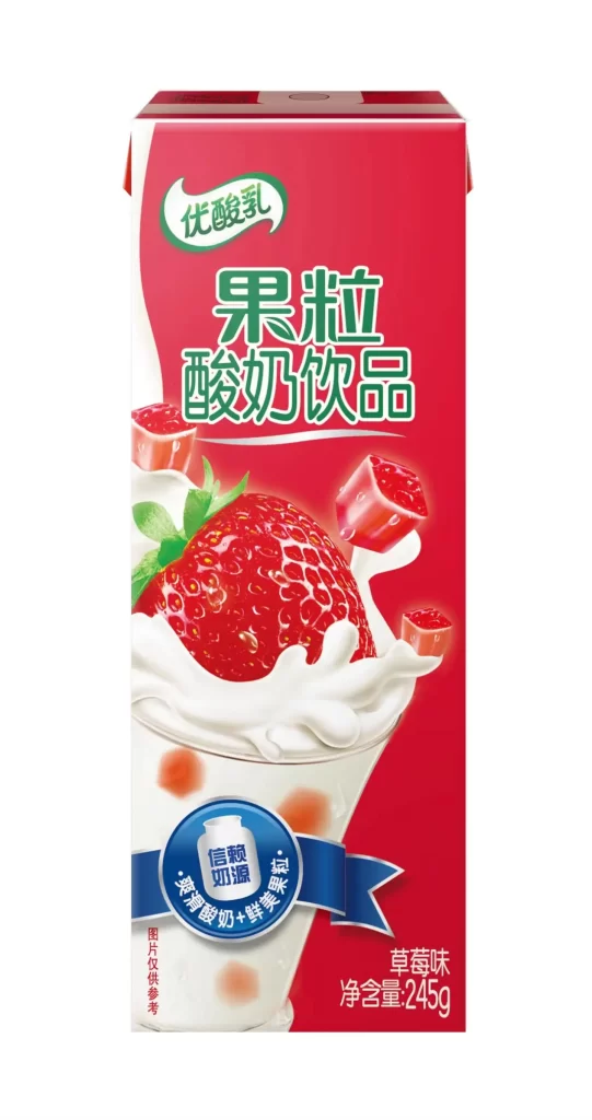
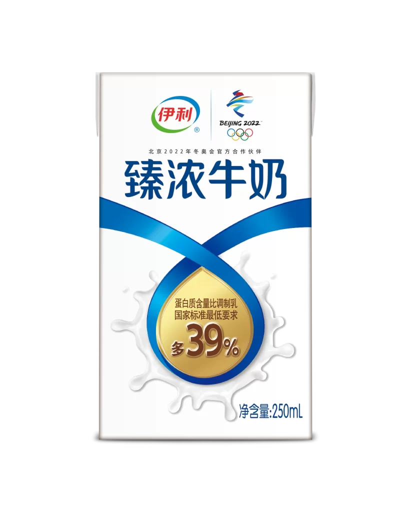
A rectangular carton of Yoplait yogurt drink stands upright, showcasing a vibrant blue upper section that transitions into a clean white base. The brand name appears in bold green characters within a white oval at the top, while the center features a large, juicy pomelo slice with visible pulp and a green leaf resting on top. Red text announcing 'Double Pomelo Pulp' overlays the fruit imagery, accompanied by smaller badges highlighting '100% Milk Source' and 'Real Fruit Juice with Pulp' near the bottom right corner.
The packaging leverages high-saturation citrus yellows against cool sky blues to create immediate visual appetite appeal, making the fruit content feel exceptionally fresh and abundant. Photorealistic rendering of the pomelo's textured interior and water droplets adds tactile depth that distinguishes it from flatter, more minimalist beverage designs. Layered typography combines traditional Chinese characters with modern graphic elements like speech bubbles and circular seals to balance heritage branding with contemporary energy.
Food photographers might study the lighting setup used to make the fruit slices appear translucent and dewy without losing color accuracy. Packaging designers could analyze how the diagonal red banner creates dynamic movement across the otherwise vertical carton structure. Marketing teams developing seasonal fruit beverages would benefit from examining how specific flavor claims are integrated into the overall illustration rather than tacked on as separate text blocks.