Glad Natural Bulgarian Style Yogurt Liter Packaging
Topics
Details
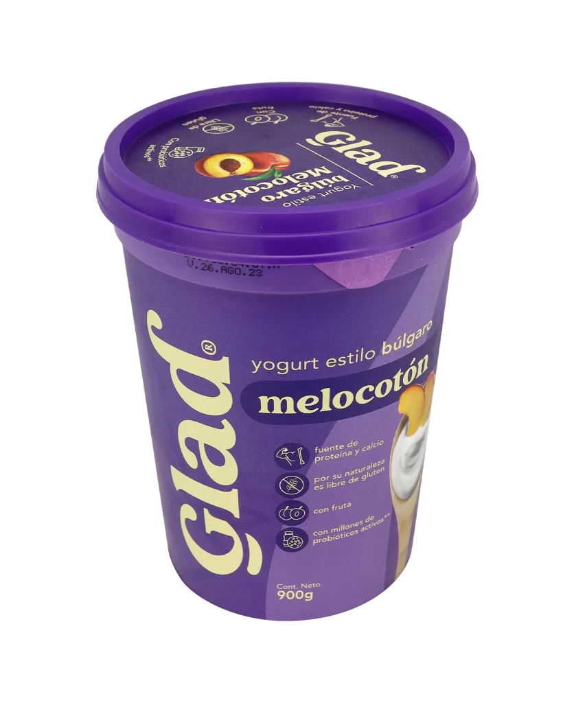
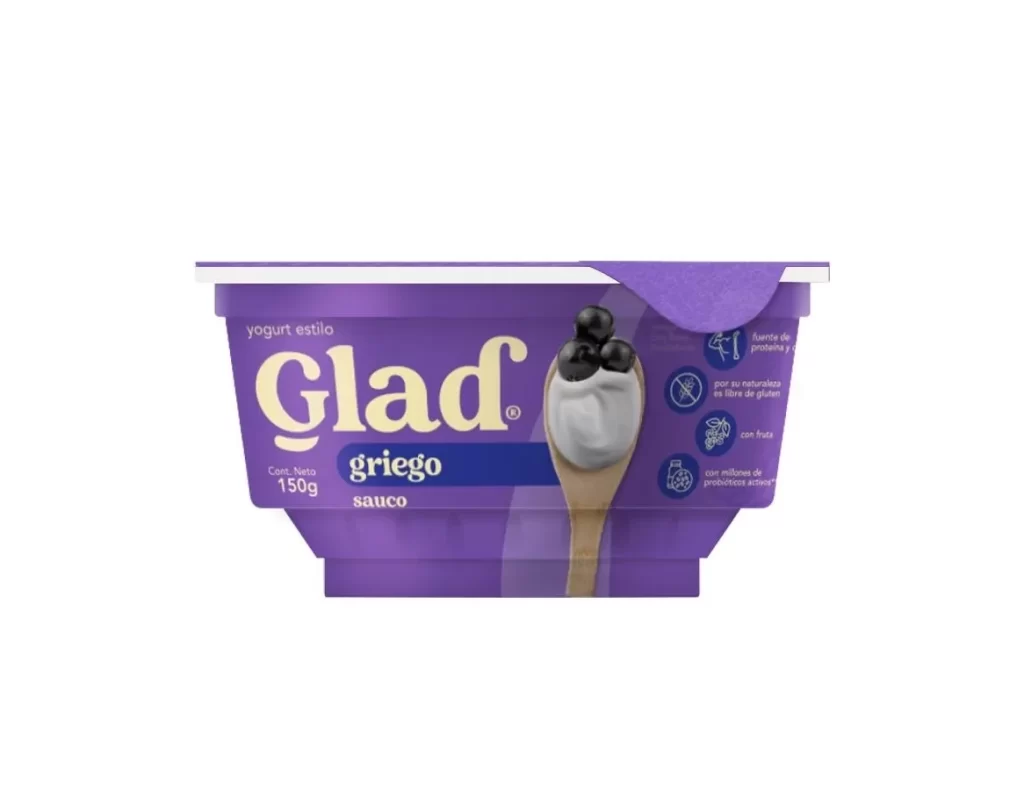
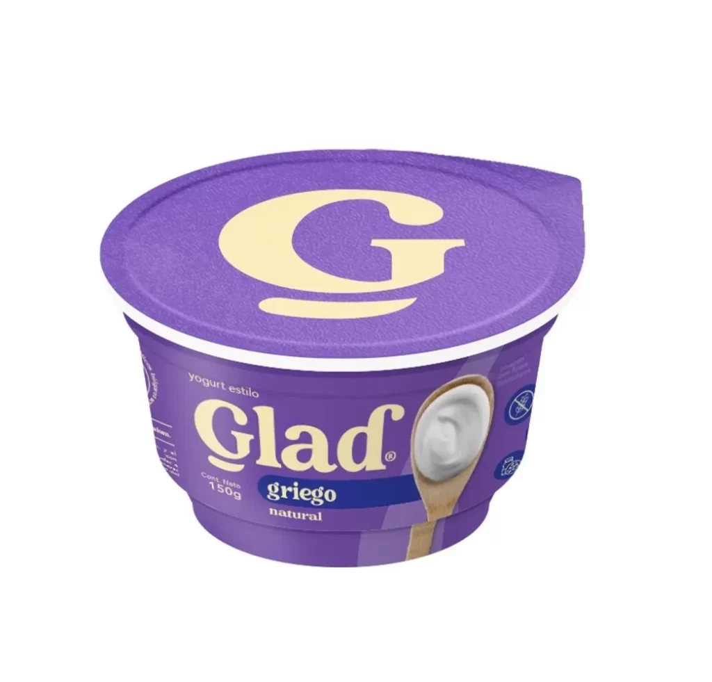
A vibrant purple plastic tub dominates the frame, featuring a matching lid and a clean white background that isolates the product. The brand name 'Glad' appears in large, cream-colored serif lettering vertically along the left side, while the product type 'yogurt estilo búlgaro' and the flavor 'natural' are printed in a smaller sans-serif font to the right. A wooden spoon filled with thick white yogurt is positioned on the right edge, providing a textural contrast to the smooth container surface.
The visual identity relies on a bold, monochromatic purple palette that differentiates this dairy item from traditional white or blue yogurt packaging. Four circular icons with thin line art communicate key nutritional benefits—such as being sugar-free, a source of protein, gluten-free, and rich in active probiotics—creating an informative yet uncluttered layout. The combination of elegant typography for the logo and functional iconography results in a modern aesthetic that feels both premium and health-conscious.
Brand strategists might examine this packaging to understand how color psychology is applied in the dairy aisle to signal specific dietary attributes like natural ingredients. Packaging engineers could reference the tub's structural shape and lid design when developing containers for similar viscous food products. Marketing teams analyzing competitor positioning would find the label hierarchy and nutritional callouts useful for planning their own product communication strategies.