Glad Peach Bulgarian Style Yogurt Liter Packaging
Topics
Details
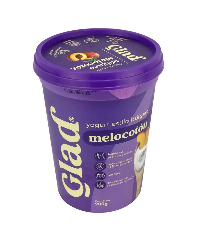
A deep violet plastic tub dominates the frame, its cylindrical form capped by a matching lid that features a peach graphic and the brand name 'Glad' in white script. The container's body displays 'yogurt estilo búlgaro melocotón' in bold cream and navy typography, accompanied by four circular icons detailing nutritional benefits like calcium and probiotics. Shot from a slightly elevated angle against a stark white background, the lighting is even and clinical, emphasizing the matte texture of the packaging and the 900g net weight printed near the base.
Visual interest stems from the sophisticated monochromatic purple palette, which creates a premium feel uncommon in standard dairy aisles. The typographic hierarchy effectively balances the oversized vertical 'Glad' logo with the horizontal product description, while the small illustrative elements of fruit and yogurt add organic softness to the industrial geometry. Such a cohesive color strategy ensures immediate shelf recognition while communicating a sense of artisanal quality through its minimalist yet informative layout.
Brand strategists might analyze this composition to understand how color psychology influences consumer perception of health-focused dairy products. Packaging engineers could study the structural proportions and lid integration for similar large-format food containers. Additionally, marketing teams could utilize this visual data to benchmark competitive positioning within the Bulgarian-style yogurt category, specifically examining how flavor indicators are integrated into the overall brand identity.