Glad Natural Greek Style Yogurt Tub Packaging
Topics
Details
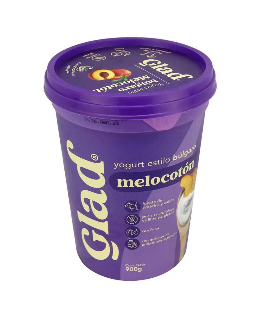
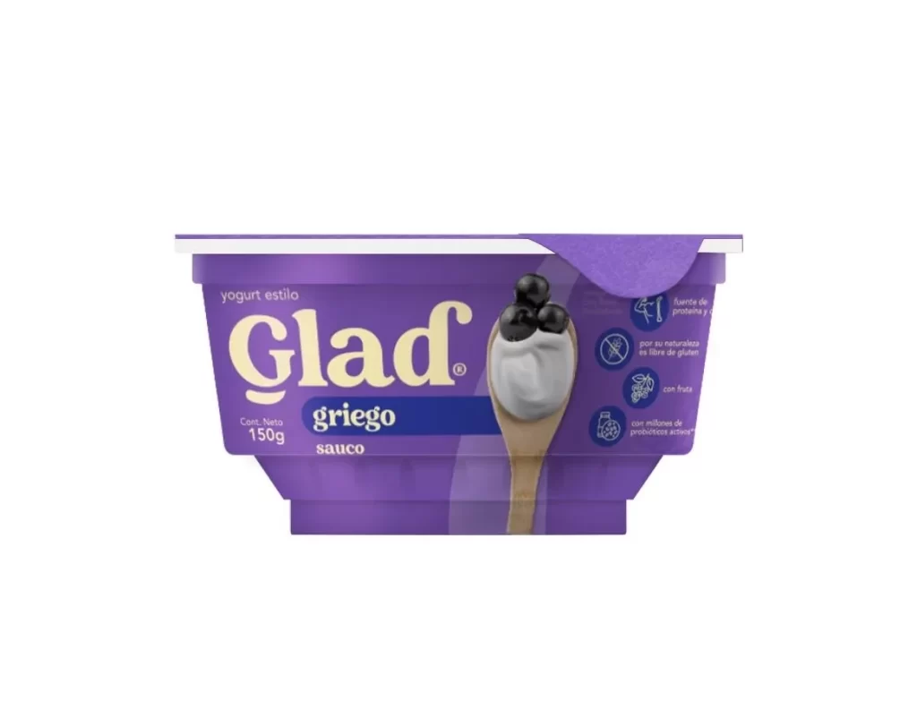
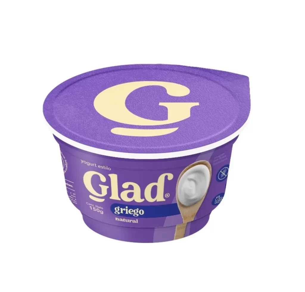
A cylindrical plastic tub of Glad yogurt dominates the frame from a direct frontal perspective, featuring a deep royal blue lid and a body wrapped in a vibrant purple label that transitions to a pale cream band at the top. Large, bold cream typography spells out '1kilo' across the upper rim, while the brand name 'Glad' runs vertically in oversized cream lettering down the left side of the container. The packaging displays 'yogurt estilo griego natural' alongside a wooden spoon image and four circular icons highlighting product attributes, all set against a white background.
Visual hierarchy is established through the strategic use of contrasting colors and varied font weights, drawing immediate attention to the product’s weight and style. A dark blue horizontal banner bisects the label to highlight ‘griego’ and ‘natural,’ effectively categorizing the dairy item for consumers seeking specific dietary attributes. Four circular icons line the right edge, succinctly communicating key selling points like the absence of added sugar and the presence of active probiotics without cluttering the main design.
Brand managers analyzing competitive packaging in the dairy aisle would utilize this visual to study color psychology and information density. Packaging engineers might examine the structural proportions of the tub and the placement of the nutritional claims to optimize their own label layouts. Marketing teams could reference the specific iconography used to denote health benefits when developing campaigns for similar probiotic food products.