Yogurt Drink Lychee Packaging Beverage Branding
Topics
Details
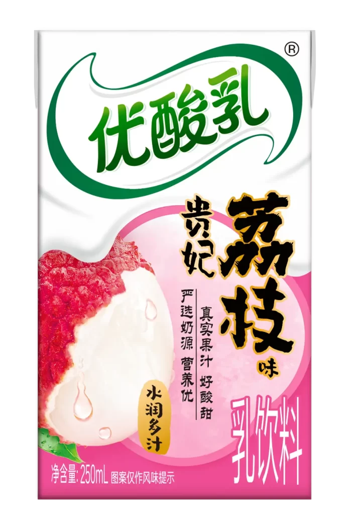
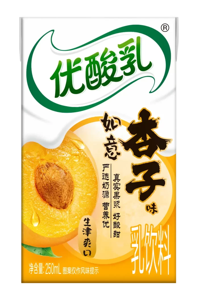
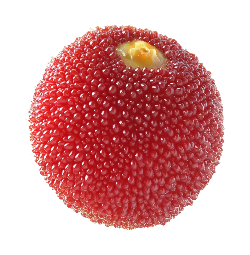
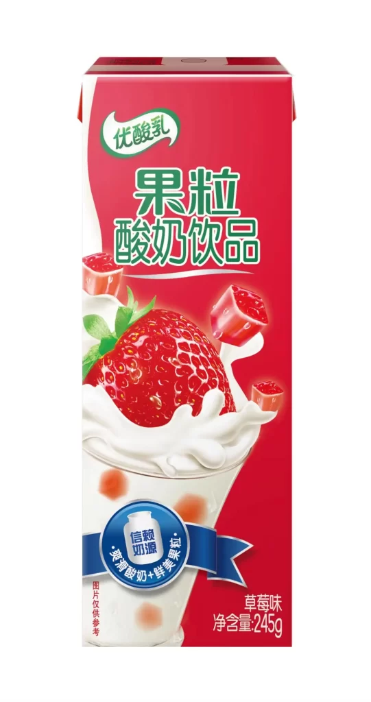
A rectangular carton of Yolplait yogurt drink stands at a slight three-quarter angle, showcasing a vibrant blue upper field that transitions into a creamy white base. The central visual focus is a massive, hyper-realistic cross-section of a red bayberry, its textured surface glistening with moisture and revealing a pale yellow core. Bold white characters for 'Yolplait' arc across the top within an emerald green swoosh, while large magenta typography announces 'Bayberry-Lychee Pulp' over the fruit imagery.
Visual impact relies on the dramatic scale of the fruit photography, which makes the berry appear almost sculptural against the liquid backdrop. The color palette creates a refreshing contrast between the cool sky-blue header and the saturated reds of the pulp, effectively signaling flavor before any text is read. Subtle details like the '100% Fresh Milk' badge and the small farmer icon add layers of brand trust without cluttering the primary message.
Brand managers developing fruit-based dairy lines can study this layout to understand how to balance appetite appeal with legible information hierarchy. Packaging engineers might reference the specific way the liquid splash integrates with the solid fruit graphic to suggest texture and mouthfeel. Marketing teams could analyze the typographic weight used here to ensure product variants remain distinct on crowded retail shelves.