Blue Packaging Beverage Carton Amx Brand
Topics
Details
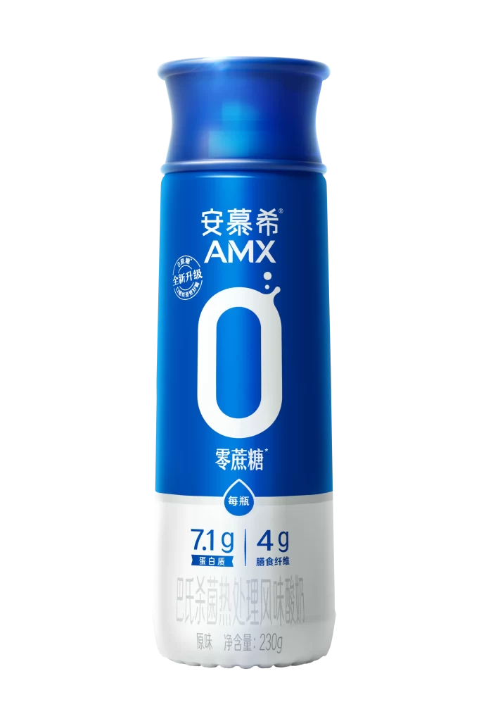
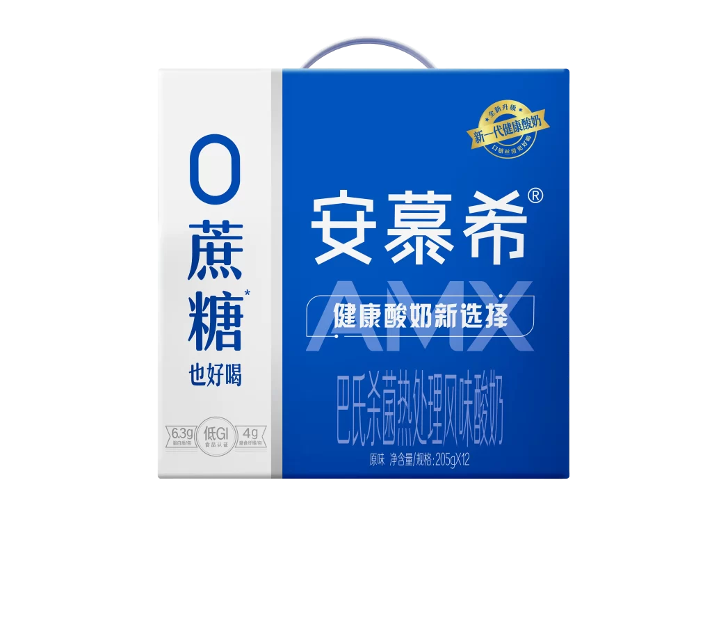
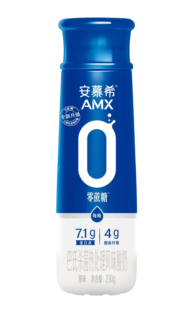
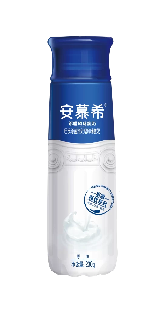
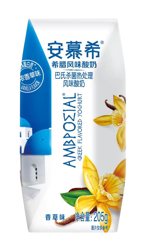
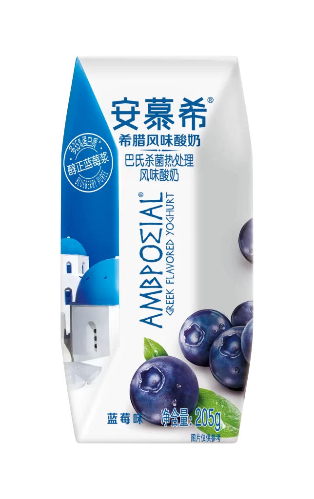
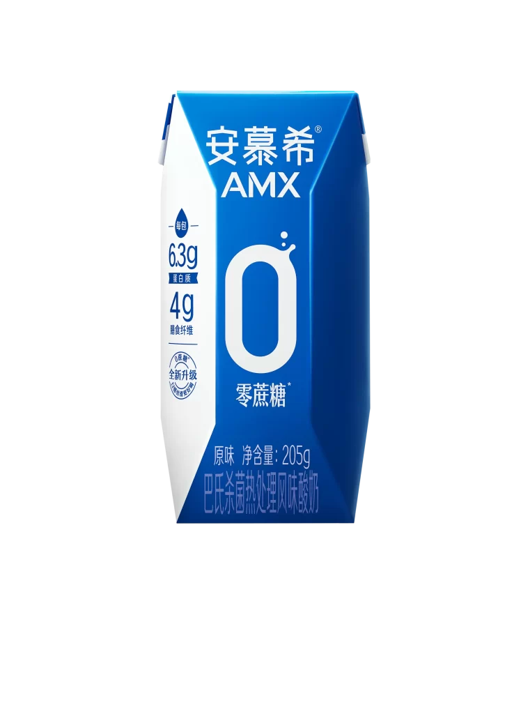
A vibrant blue and white beverage carton stands upright, featuring a sharp geometric silhouette with a diagonal split dividing the two primary colors. The front face displays the brand name '安慕希 AMX' in bold white characters at the top, while a large stylized '0' dominates the center to emphasize the '零蔗糖' (zero sucrose) claim. Nutritional highlights including 6.3g of protein and 4g of dietary fiber appear vertically along the left white panel, with product specifications like '原味 净含量: 205g' printed near the bottom edge against a clean, neutral backdrop.
Visual interest stems from the striking color blocking that creates immediate brand recognition through high-contrast blue tones. The oversized zero numeral acts as a focal point that communicates the sugar-free positioning at a glance, while the mix of Chinese typography and English branding adds a contemporary international feel. Subtle details like the droplet icon above the protein content and the circular badge indicating a formula upgrade provide layered information without cluttering the minimalist aesthetic.
Packaging designers studying dairy or health-focused beverage trends would find this carton useful for analyzing how nutritional claims integrate into modern label layouts. Marketing teams could reference the color psychology and typographic hierarchy when developing campaigns for similar wellness-oriented products. Students learning about structural packaging design might examine the angular geometry and panel division to understand how form influences consumer perception in the refrigerated section.