Blue Packaging Beverage Drink Brand Bottle
Topics
Details
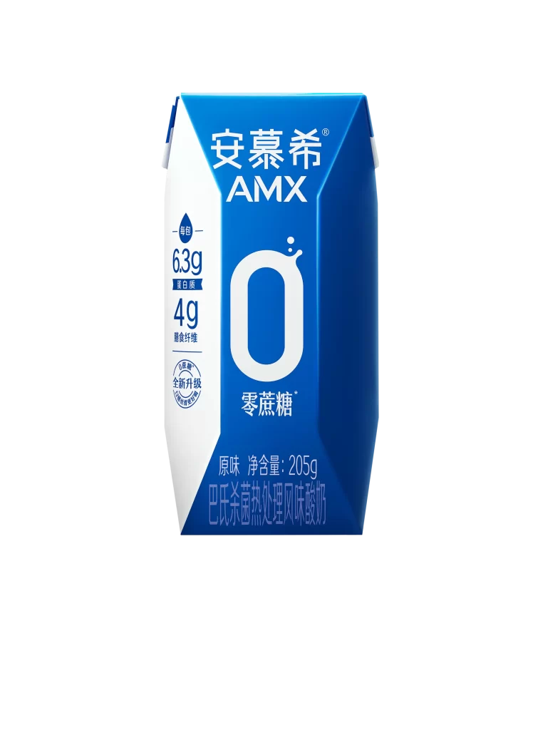
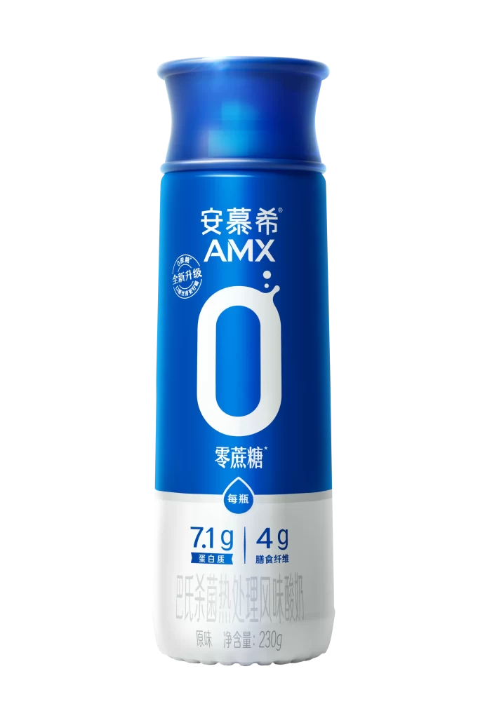
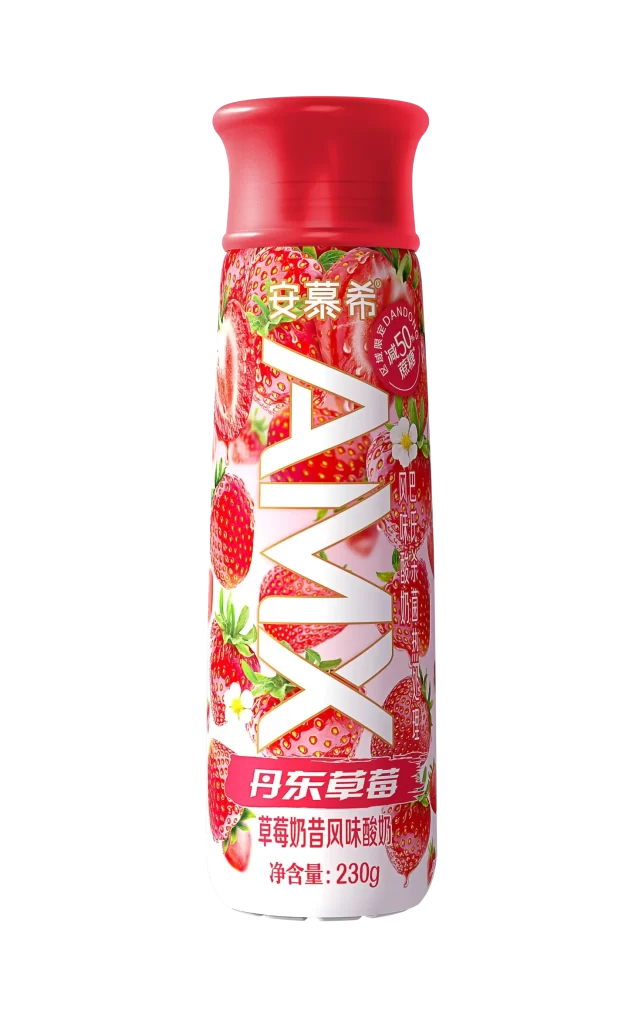
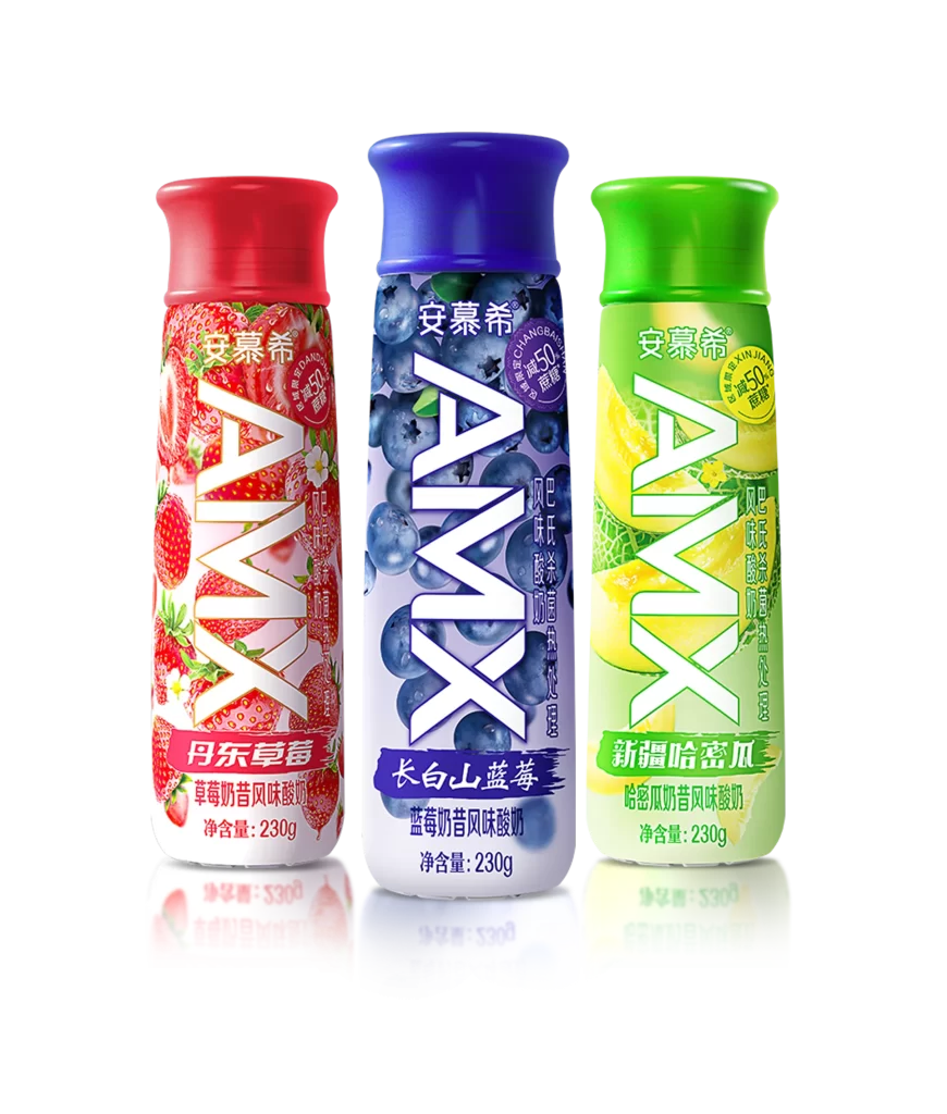
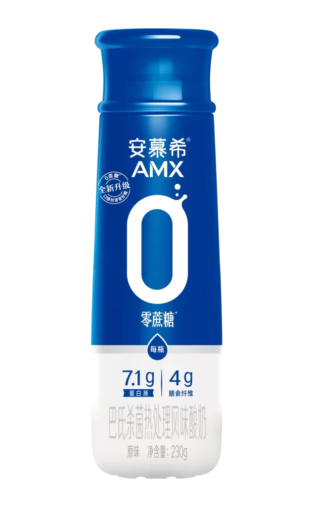
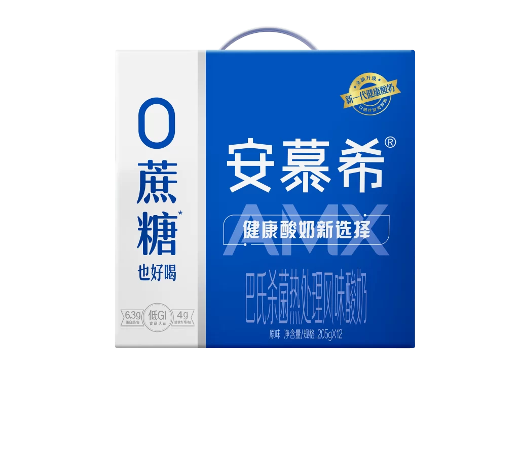
A rectangular beverage carton features a split-panel design with a white left side and deep blue right field, topped by a curved gray carrying handle. Large vertical Chinese characters reading '0蔗糖' (0 Sucrose) dominate the white section, while the brand name '安慕希' appears in bold white type on the blue background. Below the main branding, smaller text identifies this as '巴氏杀菌热处理风味酸奶' (Pasteurized Heat-Treated Flavored Yogurt) in original flavor, with net content listed as 205g×12.
The two-tone color blocking creates immediate visual hierarchy, separating nutritional claims from brand identity through stark contrast between the light and dark fields. A golden seal badge in the upper right corner adds premium positioning, while the translucent watermark-style 'AMX' lettering behind the central slogan introduces layered depth to the flat surface. Nutritional callouts including '6.3g protein', '4g sugar', and 'Low GI' appear in subtle gray boxes, anchoring health-conscious messaging without disrupting the primary visual flow.
Brand strategists analyzing dairy packaging trends would examine how zero-sugar claims integrate with established yogurt identities across different markets. Packaging engineers could reference the handle placement and structural proportions when developing similar multi-pack containers for refrigerated goods. Color theorists might study the specific cobalt-blue value against white to understand how beverage categories signal freshness and trust through palette selection alone.