Milk Packaging Olympic Branding Beverage Product
Topics
Details
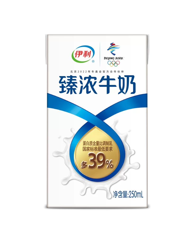
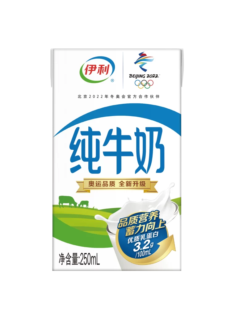
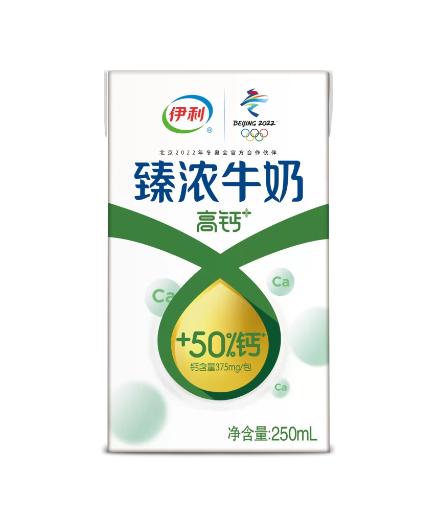
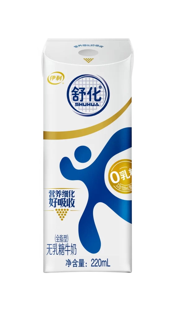
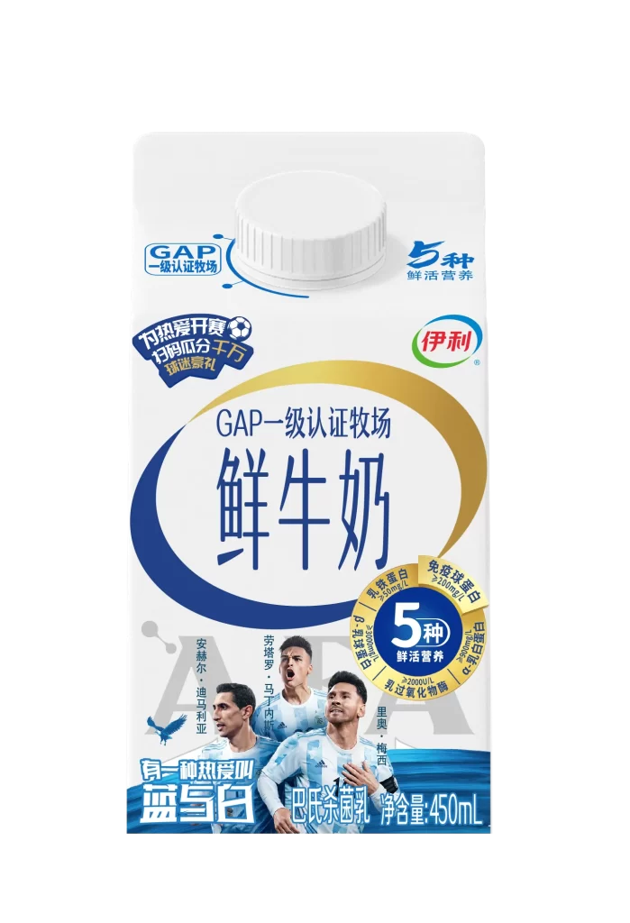
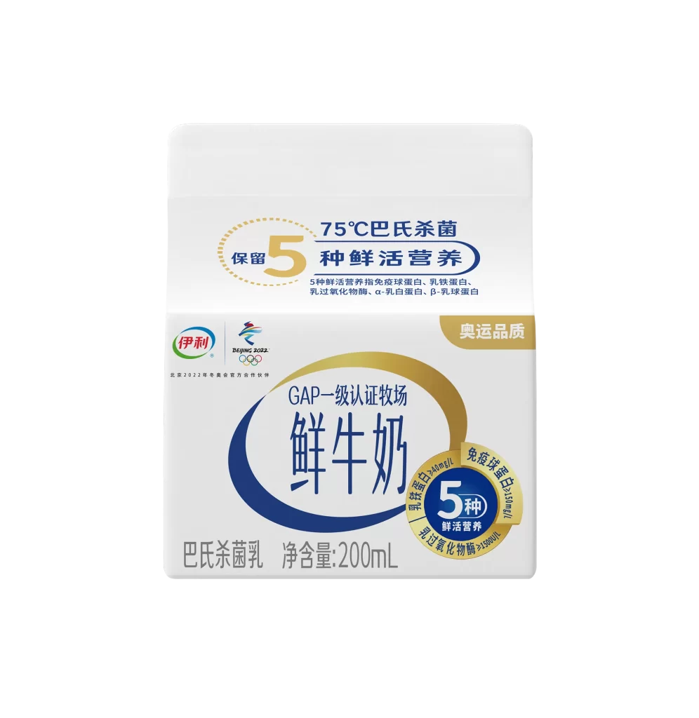
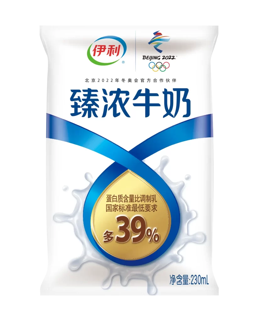
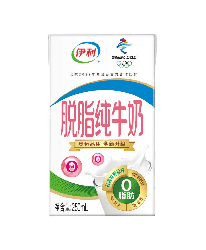
A rectangular 250mL carton of Yili skimmed pure milk stands as the central subject, featuring a predominantly white base accented by a sweeping cerulean arc across the upper third. The brand's signature red and green oval logo occupies the top left corner, balanced on the right by the official Beijing 2022 Winter Olympics emblem and Olympic rings. Large, bold magenta characters announce the product name in the center, positioned above a golden ribbon banner proclaiming an upgraded Olympic quality standard, while a green circular badge at the bottom right emphasizes zero fat content alongside a dynamic splash of white milk.
Visual hierarchy drives the packaging's impact through strategic color blocking and typographic scale, where the vibrant pink lettering immediately signals the health-conscious nature of the product. The integration of official Olympic branding elements creates a sense of institutional trust and premium positioning, while the circular iconography—ranging from pink fat indicators to the multi-segmented zero-fat seal—establishes a cohesive visual language of nutritional transparency. Subtle textural details like the perforated green wave pattern at the base add depth without cluttering the clean, modern aesthetic.
Brand strategists analyzing sports sponsorship visual systems would find this carton particularly useful for studying how global event logos integrate with consumer product identities. Packaging designers developing dairy or wellness product lines could reference the specific layout techniques used to balance bilingual text with regulatory nutrition claims. Marketing teams preparing campaigns for major sporting events might examine the color psychology employed here to convey both energy and purity within a confined retail footprint.