Milk Packaging
Topics
Details
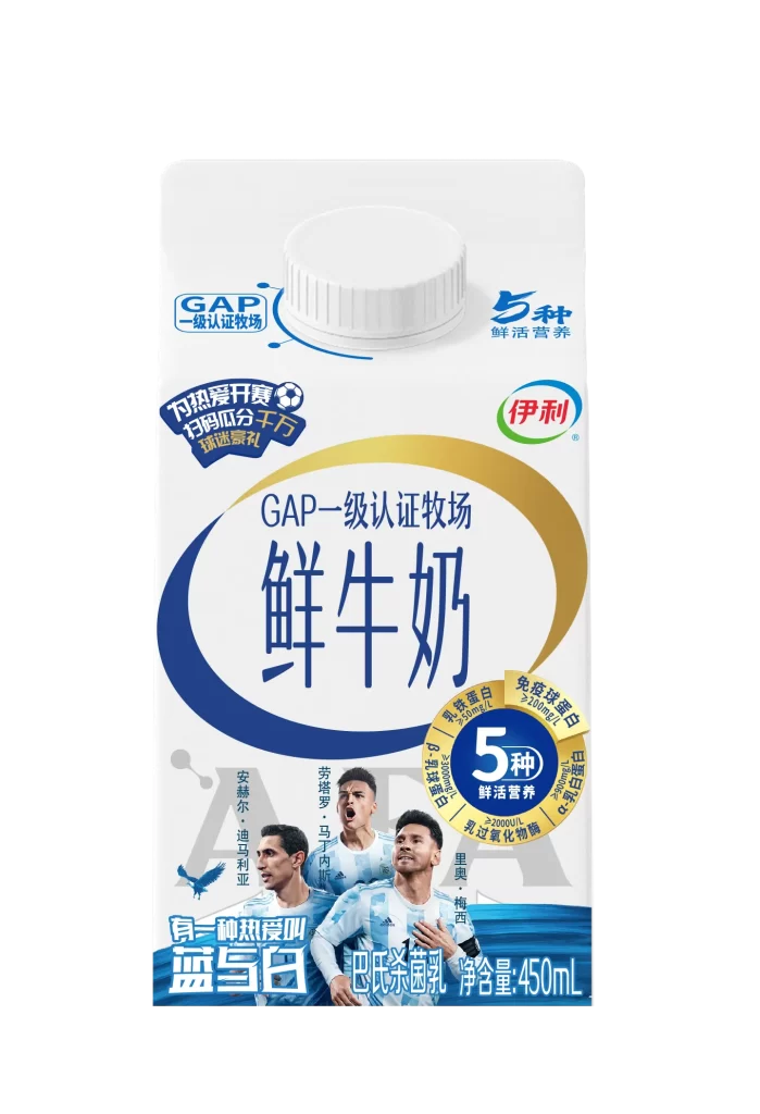
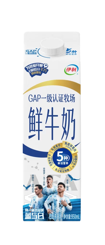
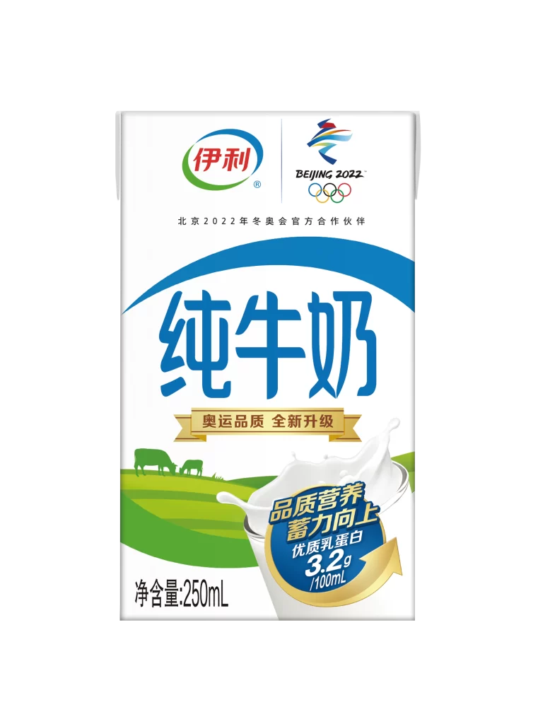
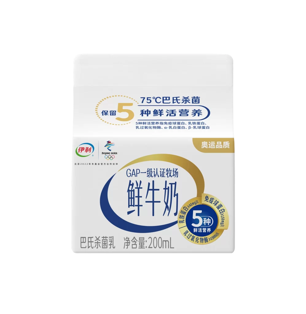
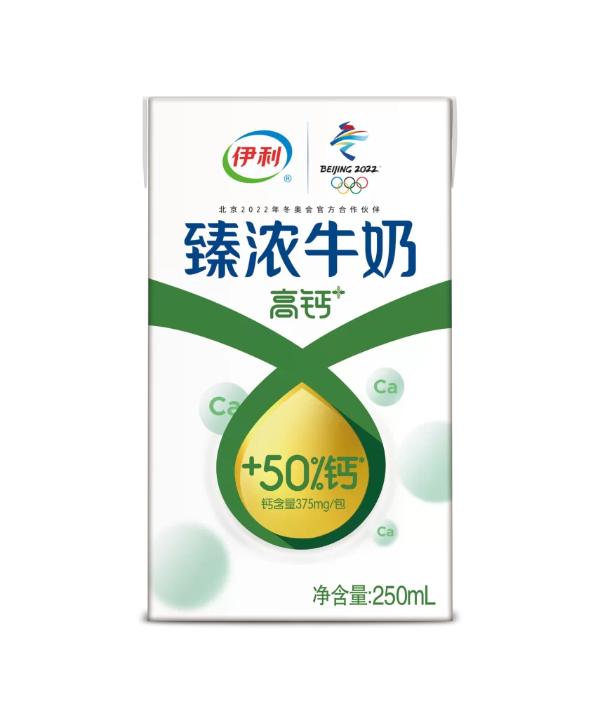
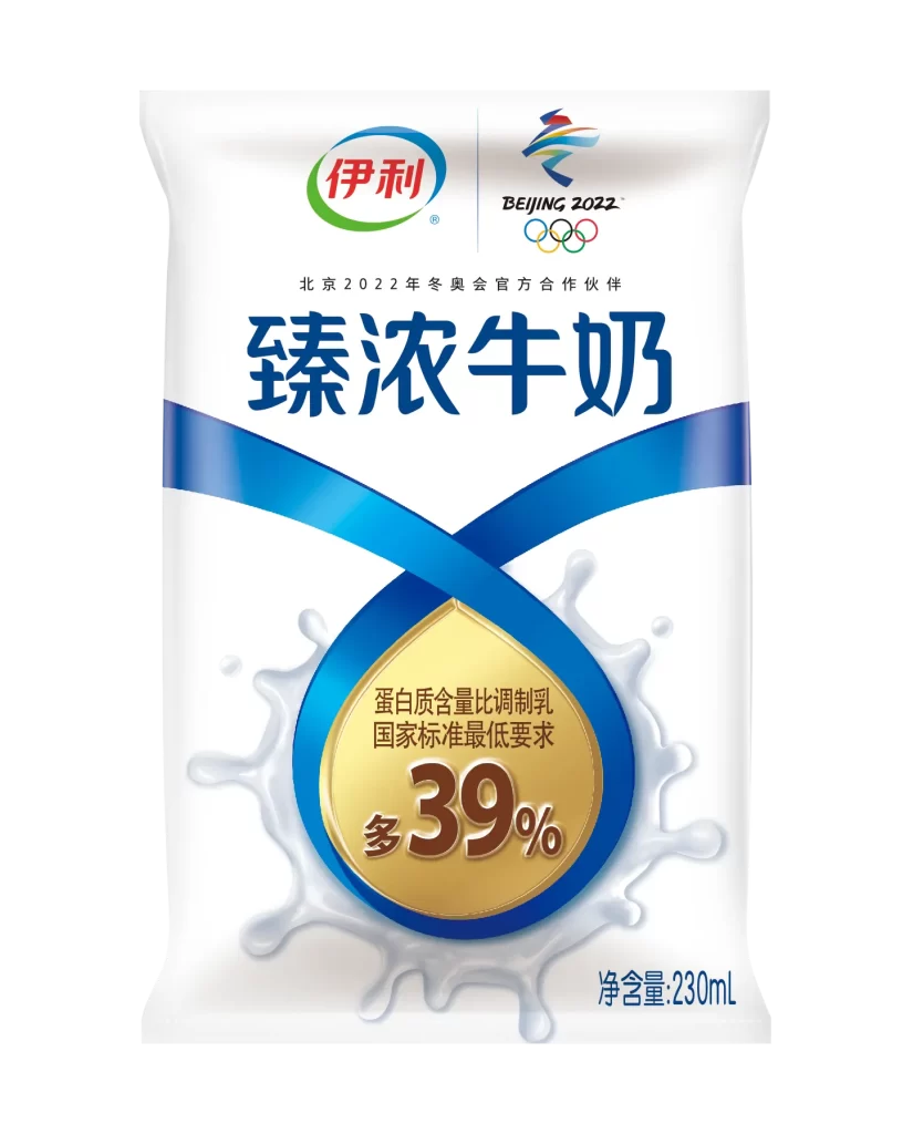
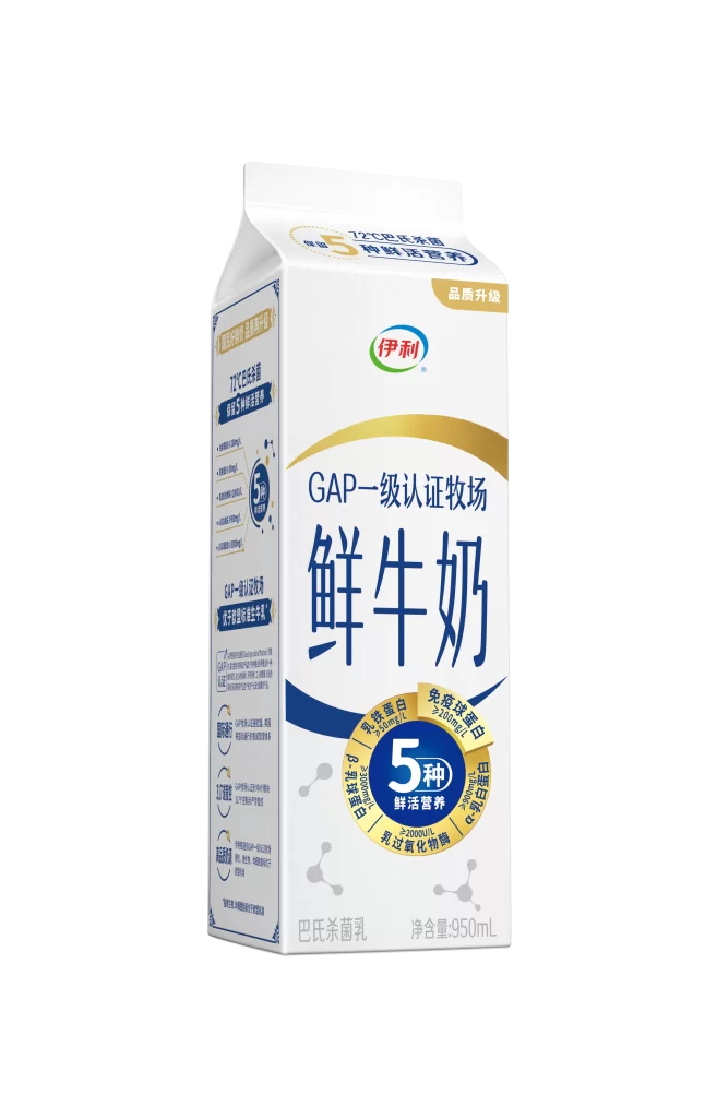
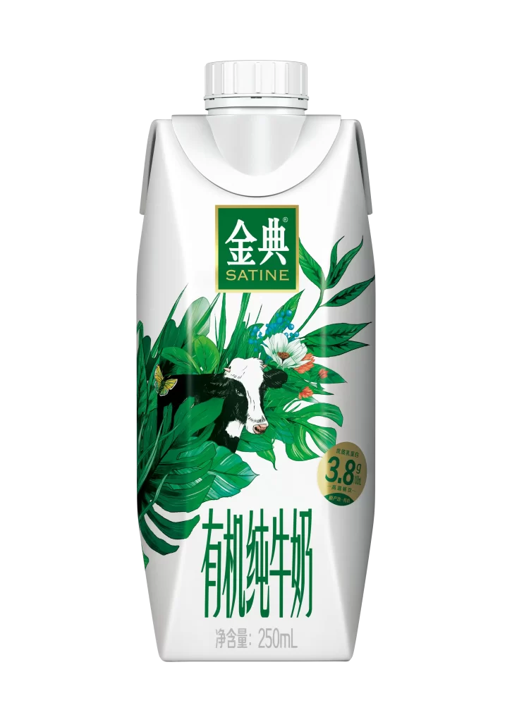
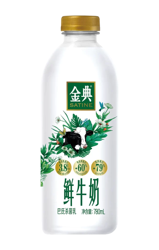
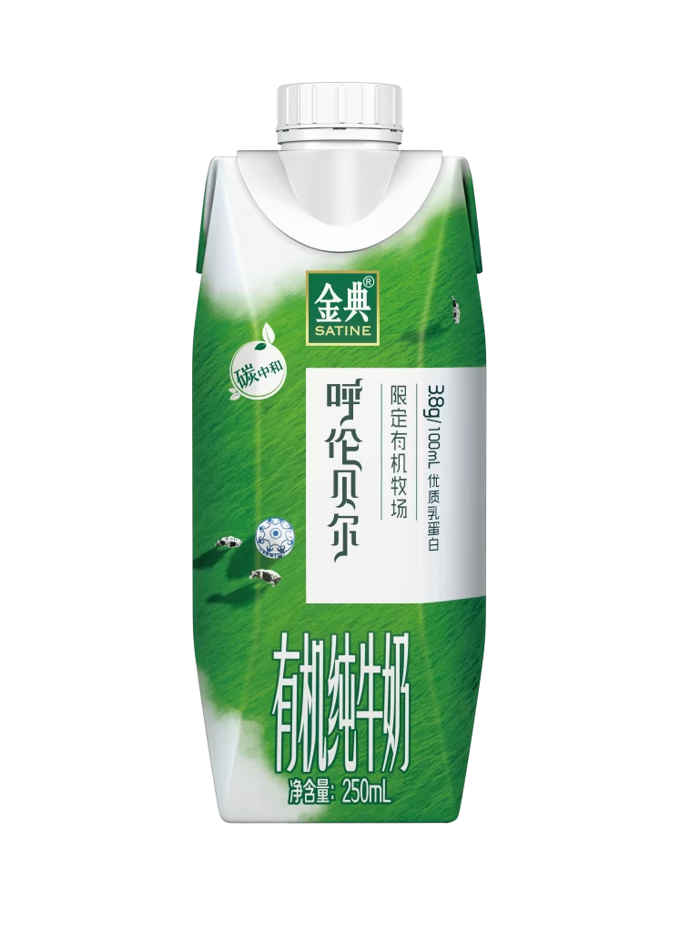
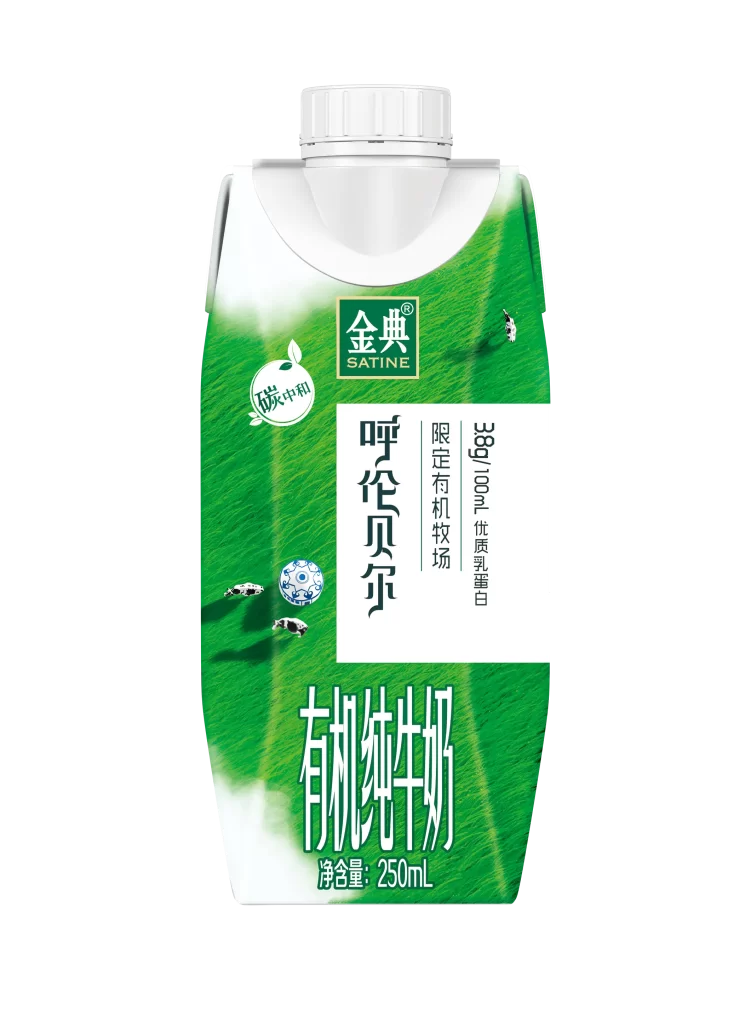
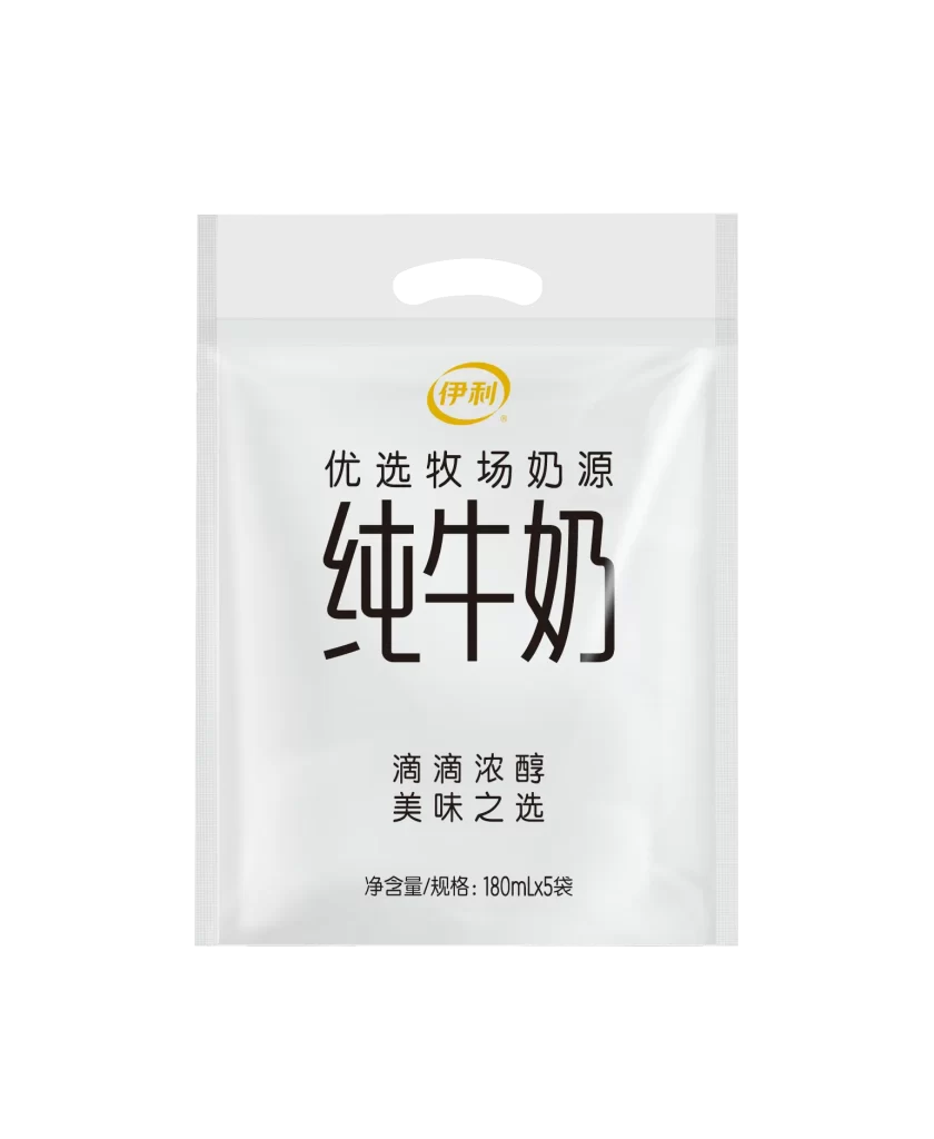
A semi-translucent white plastic pouch with a die-cut handle at the top presents a minimalist dairy product design. The surface features a golden-yellow oval logo containing Chinese characters, positioned above bold black typography that reads 'Pure Milk' in large characters. Smaller text above specifies 'Selected Pasture Milk Source,' while phrases below promise 'Drip by Drip Rich and Mellow' alongside net content specifications of 180ml multiplied by five bags. Soft studio lighting creates subtle highlights across the glossy material, emphasizing the clean vertical composition against a neutral backdrop.
Visual hierarchy dominates this packaging through dramatic scale variation between the oversized product name and supporting copy. The restrained palette of white, black, and gold conveys premium positioning without decorative clutter, allowing the material's slight sheen to provide textural interest. Typography choices balance traditional Chinese character forms with modern sans-serif weights, creating a contemporary yet trustworthy aesthetic for everyday consumables.
Brand strategists developing Asian market dairy lines could analyze this layout for effective information architecture on flexible packaging formats. Packaging engineers might reference the handle placement and seal visibility when constructing similar multi-pouch retail configurations. Visual merchandisers studying shelf presence would benefit from examining how negative space amplifies readability across varying store lighting conditions.