Milk Packaging Olympic Branding Beverage Dairy
Topics
Details
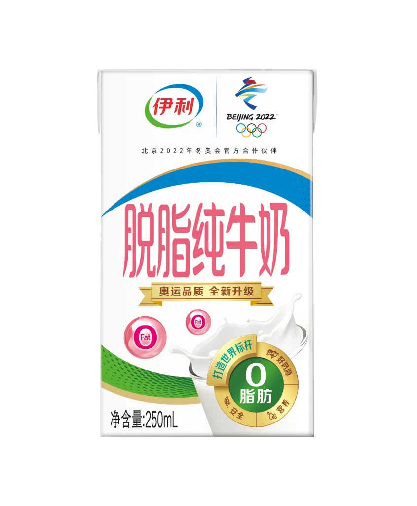
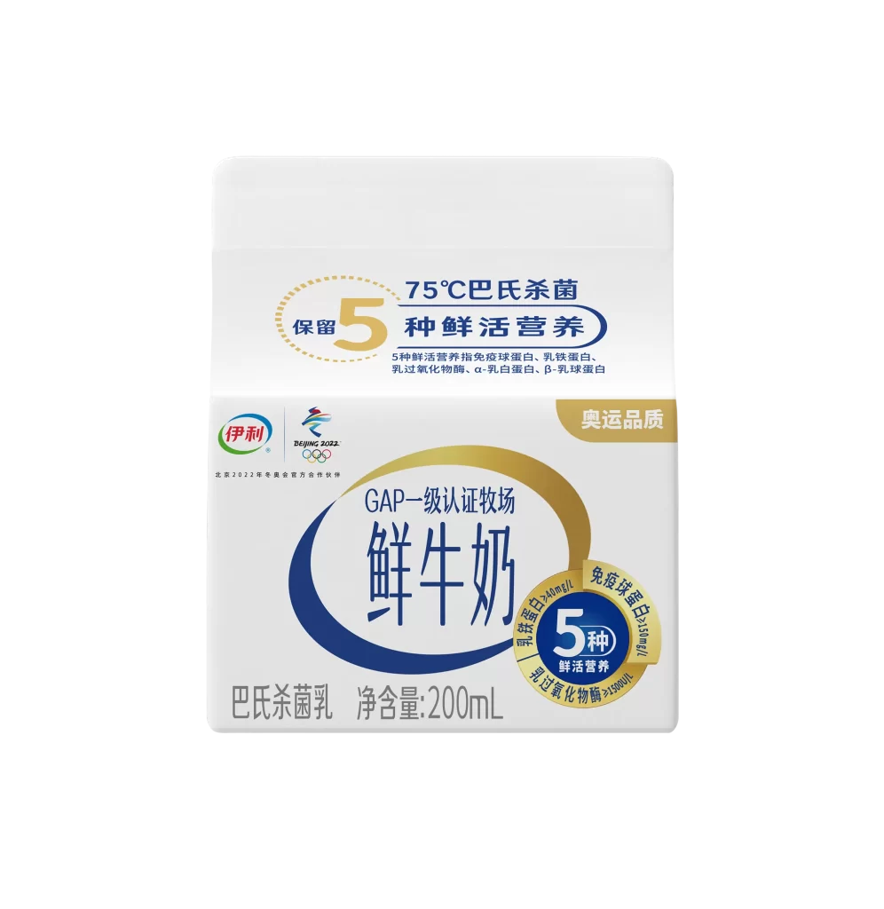
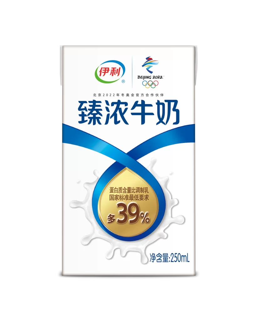
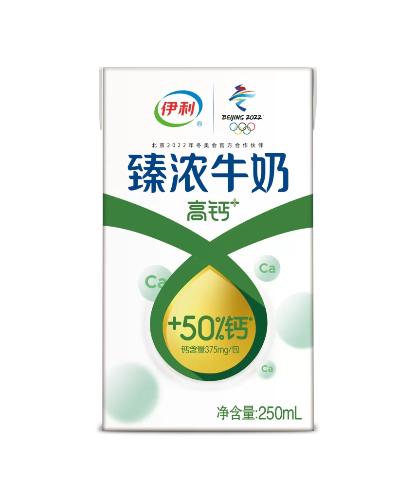
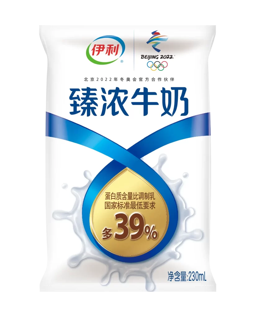
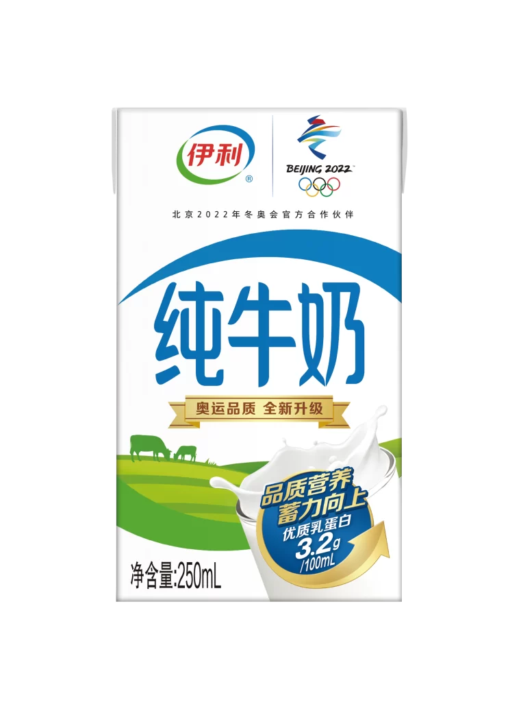
A rectangular white carton of Yili Pure Milk dominates the frame, featuring a prominent blue arc that sweeps across the upper half. The brand name appears in red and green within an oval logo at the top left, while the Beijing 2022 Olympic logo sits to the right with its colorful geometric figure and five rings. Large blue Chinese characters for 'Pure Milk' anchor the center, positioned above a golden ribbon banner and a pastoral illustration of green rolling hills with grazing cows. A dynamic splash of milk erupts from a glass in the lower right corner, partially obscuring a circular blue badge that highlights 3.2g of protein per 100ml.
Visual hierarchy plays a crucial role here, with the massive typography drawing immediate attention before the eye travels to the official Olympic partnership credentials. The combination of the organic green landscape and the energetic milk splash creates a balanced narrative between natural sourcing and nutritional vitality. Gold accents on the upgrade banner and protein badge add a premium feel that elevates the standard dairy packaging aesthetic without overwhelming the clean white canvas.
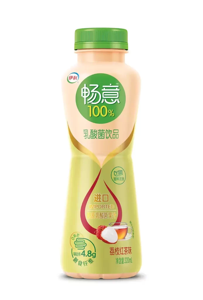
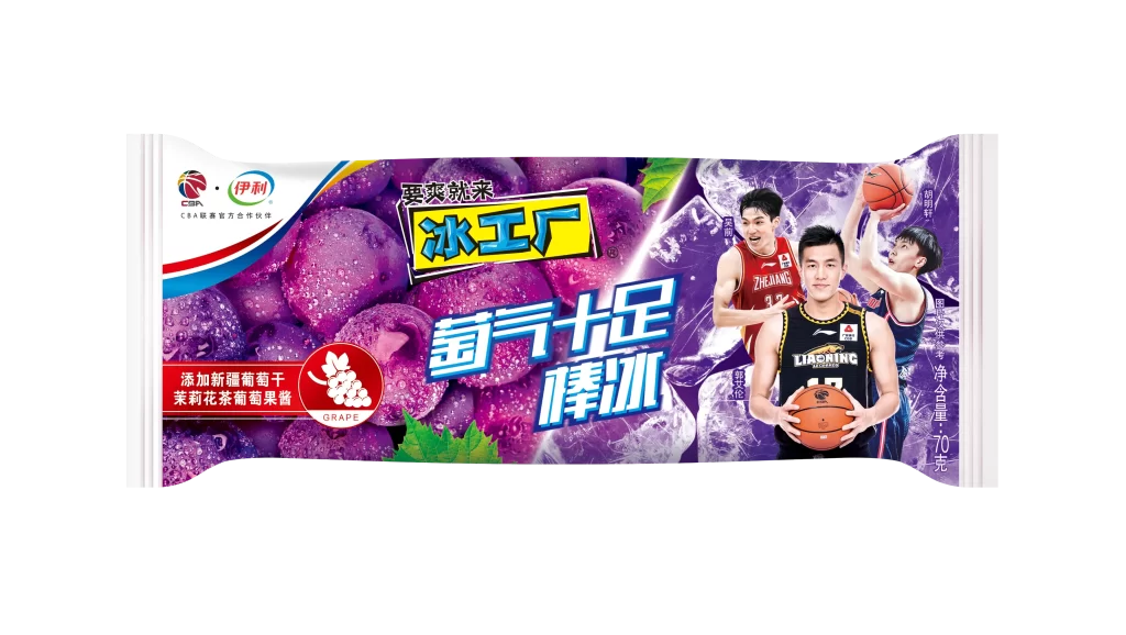
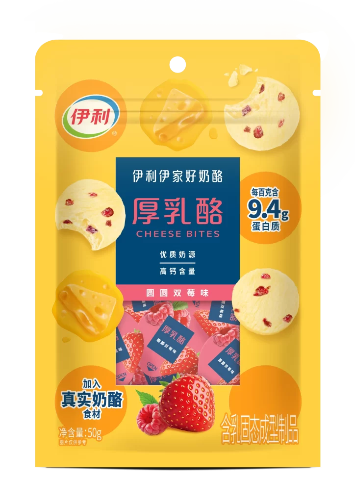
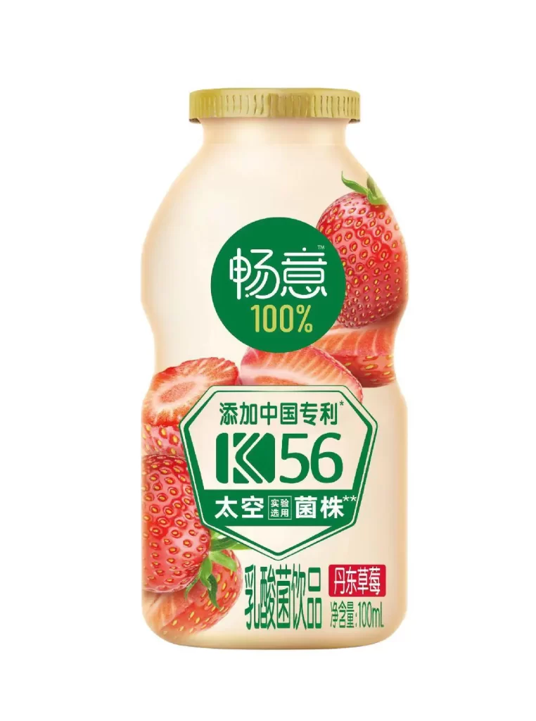
Brand strategists analyzing sports sponsorship integration would find this particularly useful for studying how global event logos coexist with local product identities. Packaging designers working on dairy or beverage projects could examine the effective use of color blocking between the blue header and green footer sections. Marketing teams planning promotional campaigns might reference the specific layout techniques used to emphasize nutritional claims alongside heritage branding elements.