Glad Greek Style Yogurt Single Cup Packaging
Topics
Details
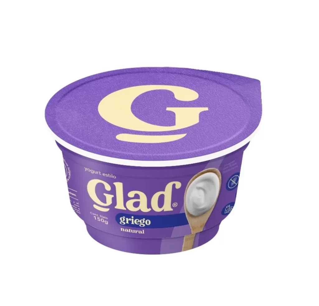
A rich purple hue dominates the rounded cup body and fitted lid of this single-serve Glad Greek yogurt container, which features a large, cream-colored serif 'G' emblazoned on top. The front label displays the brand name in bold cream lettering above a dark blue banner reading 'griego natural,' alongside a printed image of a wooden spoon filled with thick white yogurt. Visible text indicates a 150g net content and identifies the product as 'yogurt estilo' (style yogurt), all presented on a clean white surface.
Bold typography serves as the primary visual anchor here, creating an immediate brand presence through the oversized lettering on the top surface. The choice of a deep violet background provides a striking contrast to the pale yellow text and the realistic food photography, making the natural texture of the yogurt appear fresh and appealing. Subtle details like the small circular icons on the right side add a layer of technical information without cluttering the overall minimalist aesthetic.
Food stylists and packaging engineers can study the way the lid’s shape integrates with the cup’s rim for seamless branding continuity. Illustrators looking to practice rendering different materials will find a useful challenge in the mix of matte plastic, glossy print, and the organic look of the dairy product. Marketing teams might also analyze how the specific color palette is used to differentiate this Greek variety from other flavors in the same product line.