Home Logo Typography
Topics
Details
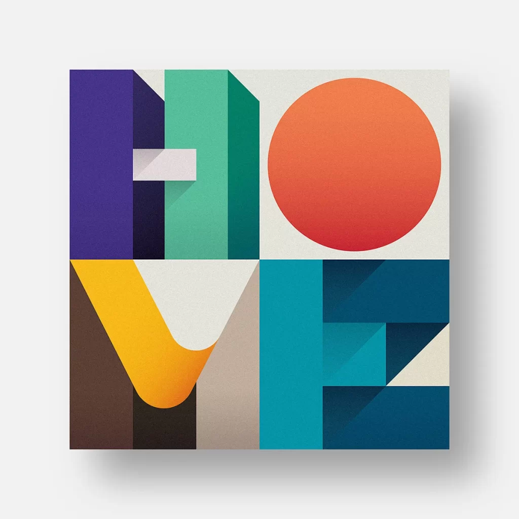
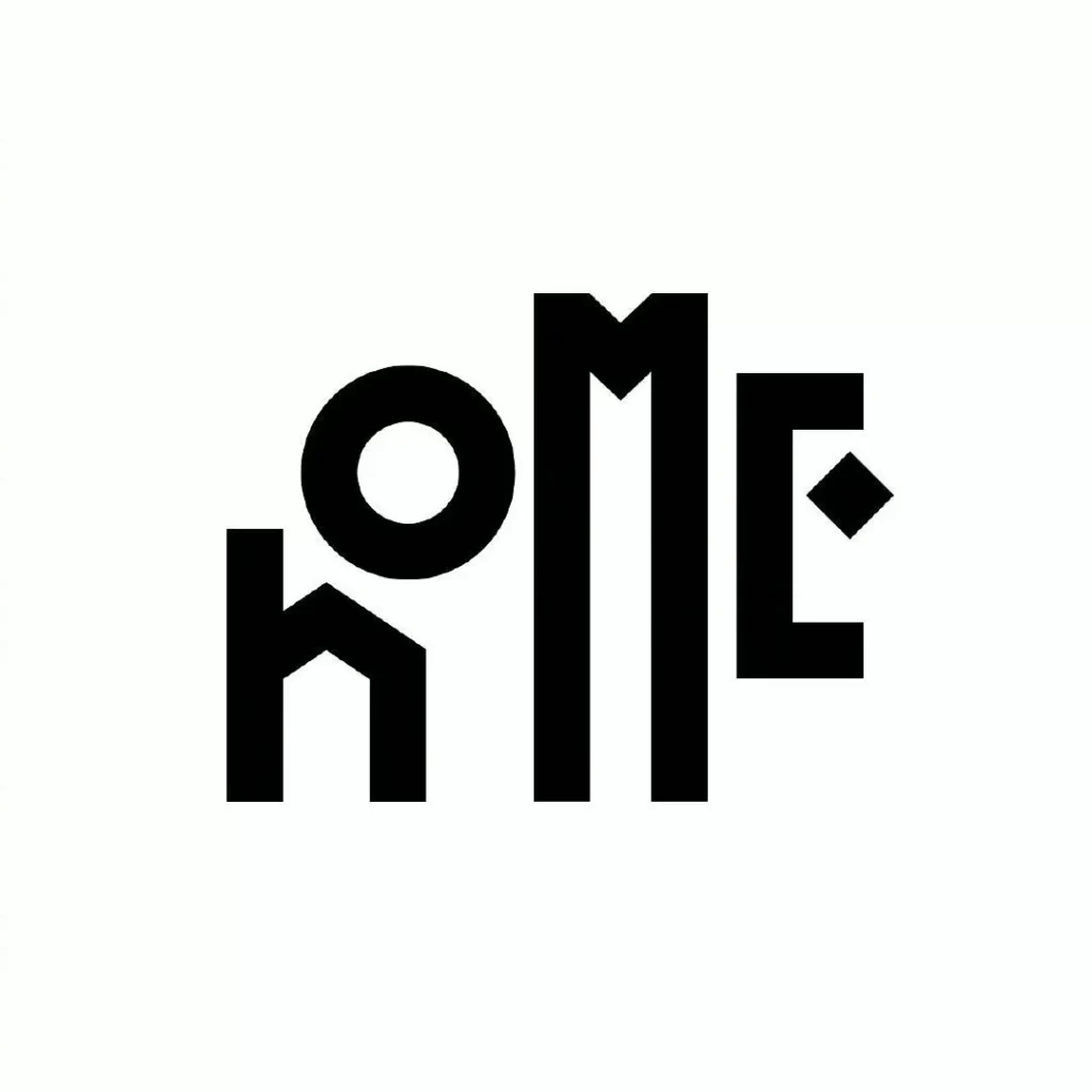
Solid black geometric letterforms spell the word 'home' across a white surface. A lowercase 'h' with sharp, angular peaks anchors the left side, while a perfectly circular 'o' sits slightly elevated beside it. A towering uppercase 'M' dominates the center with vertical strokes that stretch high to create a strong architectural presence.
Visual tension emerges from the deliberate interplay between scale and case, as the massive capital ‘M’ dwarfs its neighboring characters while the ‘h’ remains grounded in lowercase form. That small diamond element attached to the final letter introduces an unexpected decorative flourish that breaks the otherwise rigid grid structure. Such typographic manipulation transforms a common word into a memorable visual identity through strategic weight distribution and clever negative space utilization.
Brand identity specialists might study this composition when developing signage systems for residential architecture firms or interior design studios seeking modern aesthetics. Typography instructors could employ this example to demonstrate how mixing cases and scales can create dynamic wordmarks without sacrificing legibility. Environmental graphic designers may reference these letterform relationships when planning wayfinding systems for housing developments or co-living spaces.