Logo Branding Typography Graphic Minimalist Black
Topics
Details
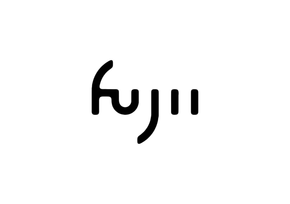
Deep black lettering spells out the wordmark 'fujii' in a custom rounded sans-serif typeface against a white background. The lowercase 'f' features a distinctive curved hook at its top left, while the 'j' descends with a smooth, sweeping curve below the baseline. Two vertical rectangular strokes complete the minimalist composition.
What makes this particular logotype compelling is its masterful use of negative space combined with soft, organic curves that soften the otherwise geometric structure. The uniform stroke weight throughout all characters creates a cohesive rhythm, while the playful integration of those two trailing dots transforms a simple name into a memorable brand mark. This approach demonstrates how minimalism can still carry personality through subtle typographic quirks rather than elaborate ornamentation.
Brand identity designers studying contemporary wordmark trends would find this example particularly useful for understanding how to balance legibility with distinctiveness. Art directors working on tech startups or lifestyle brands might reference this when developing clean, modern visual systems that require versatility across digital and print applications. Typography enthusiasts could also analyze the custom letterform construction to learn how small modifications—like that curved ‘f’ terminal—can elevate standard type into proprietary branding.