Kim Typography
Topics
Details
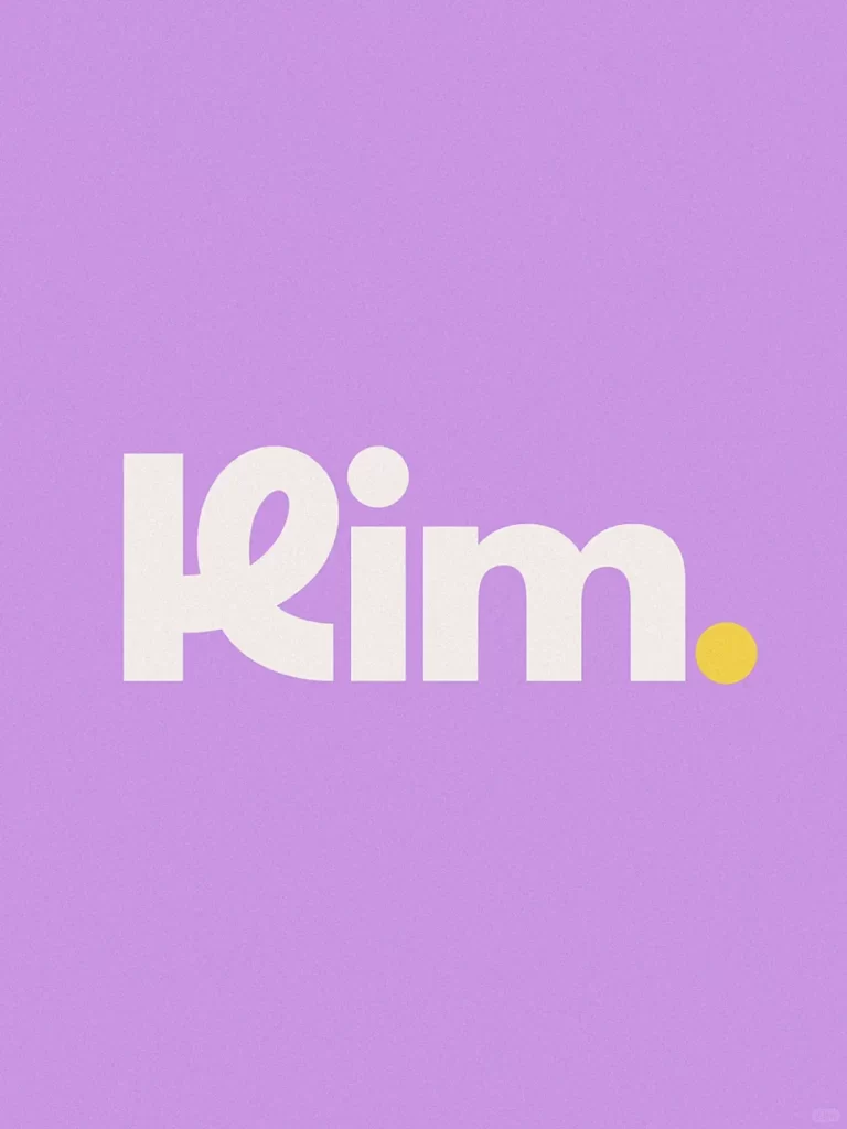
Thick, rounded strokes of off-white lettering spell out the word 'Kim' in a bold sans-serif typeface, with the 'i' crowned by a circular dot and a small yellow circle punctuating the right side of the final 'm'. The composition anchors the text on a solid lavender background that fills the entire frame.
Visual distinction emerges from the playful yet substantial weight of the letterforms, which balance geometric precision with approachable curves. The unexpected yellow dot introduces a subtle color accent that breaks the two-tone palette, drawing attention to the terminal point of the name. Such typographic choices suggest a brand identity that feels both modern and friendly, avoiding sharp edges in favor of organic shapes that convey accessibility.
Brand strategists might reference this when developing visual identities for lifestyle startups or children’s products requiring warm, approachable typography. Art directors could study the color interaction between lavender, cream, and yellow to inform palette selections for packaging or digital interfaces. Educators teaching basic logo design principles would find this useful for demonstrating how minimal elements—type, background, and a single accent shape—can create memorable visual communication.