Dinshaw’s Ice Cream
Topics
Details
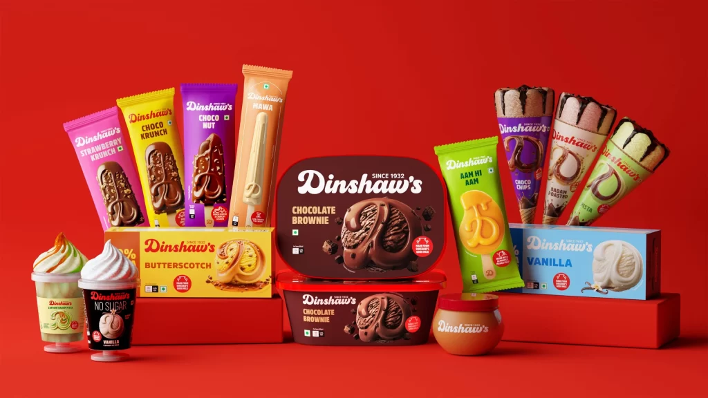
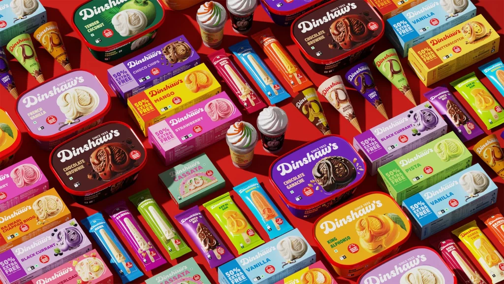
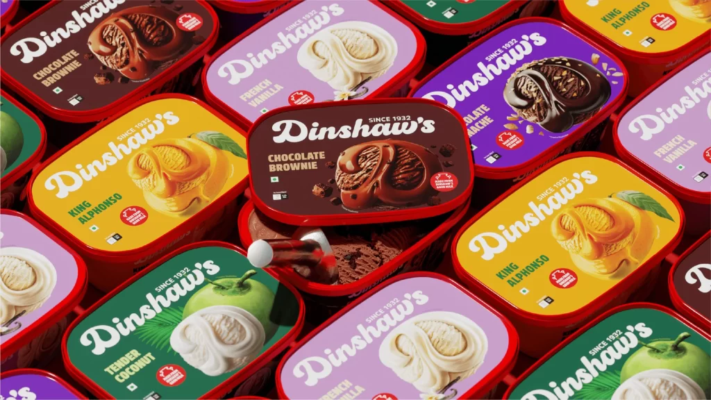
Overlapping rectangular tubs with rounded corners and vibrant red rims create a dense, grid-like pattern across the frame. Each container features a distinct background hue—deep chocolate brown, sunny mango yellow, fresh coconut green, and soft lavender—while the brand name 'Dinshaw's' appears in a bold, white cursive script. A slightly elevated camera angle reveals the open lid of the central Chocolate Brownie tub, exposing the actual frozen dessert and a white plastic spoon nestled inside.
Visual interest stems from the high-contrast color coding that allows each flavor to stand out immediately within the crowded composition. The photorealistic illustrations of scoops on the lids use dramatic lighting to emphasize texture, from the glossy sheen of chocolate swirls to the matte finish of vanilla. This specific arrangement balances product information with aesthetic appeal by turning standard packaging into a cohesive, almost tessellated visual field.
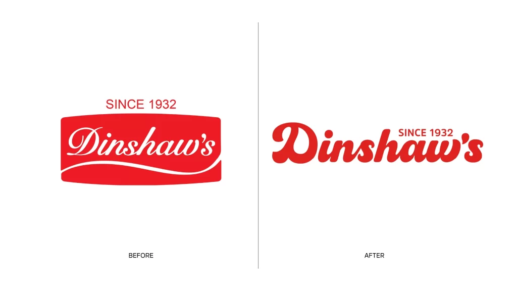
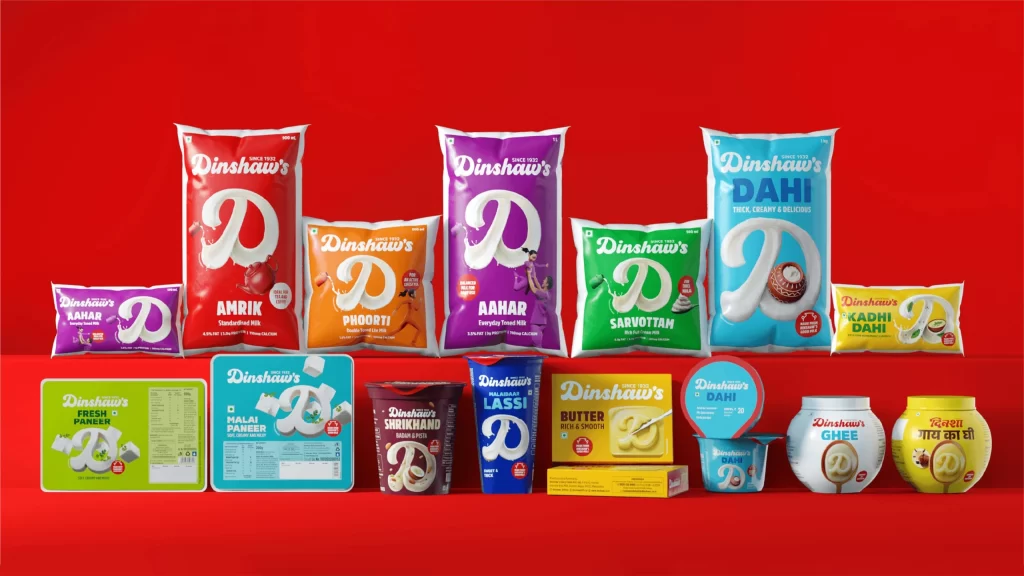
Packaging designers might study this layout to understand how to organize multiple SKUs in promotional photography without losing individual product identity. Food stylists could reference the way light interacts with different ice cream textures to plan their own dairy product shoots. Marketing teams looking to refresh legacy brands would find value in analyzing how traditional typography pairs with modern, saturated color palettes to attract contemporary consumers.