Dinshaw’s Ice Cream Box View
Topics
Details
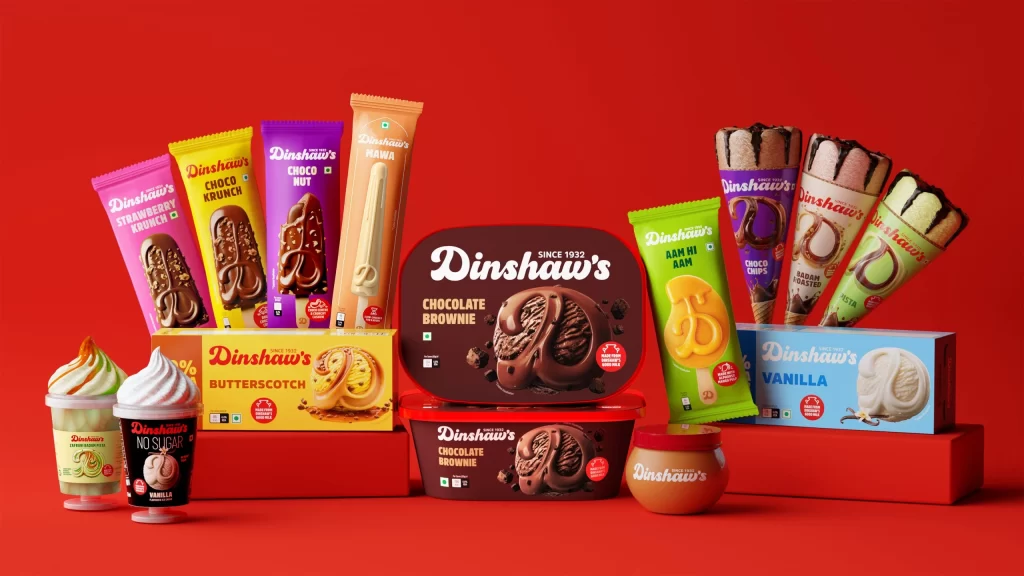
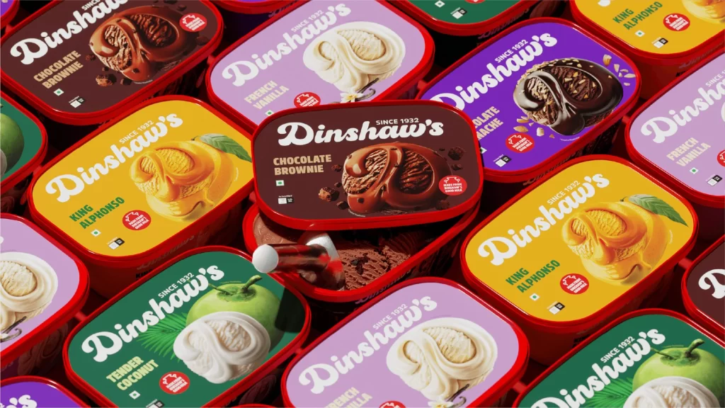
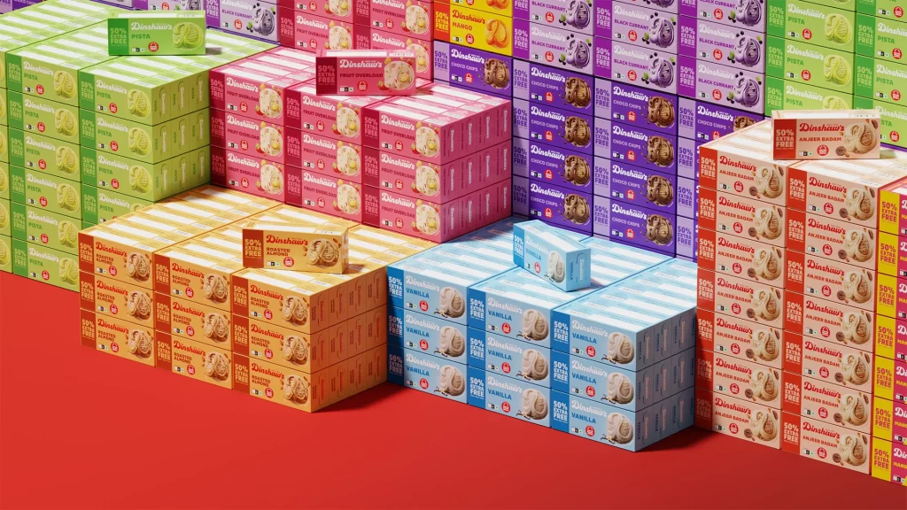
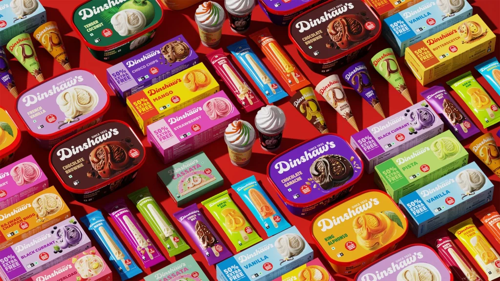
Vibrant red serves as the unifying backdrop for an extensive spread of frozen desserts, where rectangular tubs, slim stick bars, and conical wrappers interlock in a dense, grid-like arrangement. The packaging palette spans deep chocolate browns, sunny yellows, pastel pinks, and rich purples, each container bearing the 'Dinshaw's' brand name in a distinctive white script alongside flavor identifiers like 'Tender Coconut,' 'Mango,' and 'Black Currant.' Soft, even lighting eliminates harsh shadows, allowing the glossy finishes of the plastic tubs and the matte textures of the cardboard boxes to pop with clarity from a slightly elevated, straight-on camera perspective.
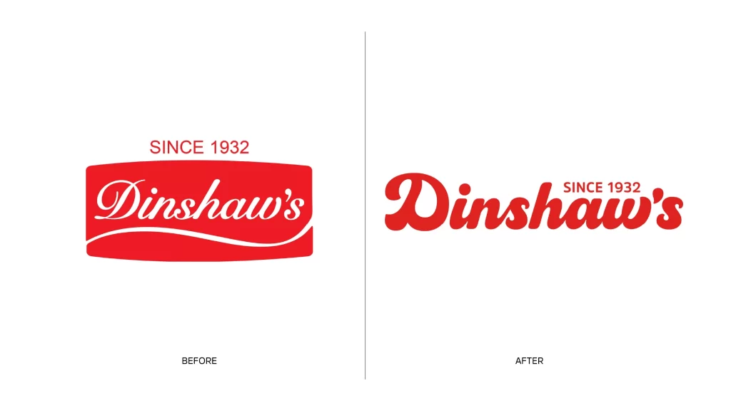
Visual distinction emerges from the systematic color-coding strategy that assigns a unique hue to every flavor variant, creating an intuitive navigation system across the product line. The typographic hierarchy balances the elegant cursive logo with bold sans-serif nutritional claims such as '50% Extra Free' and 'Sugar Free,' ensuring legibility while maintaining aesthetic appeal. Furthermore, the deliberate mix of rounded tub edges and sharp bar packaging corners introduces subtle geometric variety that keeps the eye moving across the composition without fatigue.
Brand strategists might analyze this layout to understand how cohesive color families can organize extensive product portfolios into digestible visual categories. Packaging designers could study the interplay between photography and graphic elements to learn how appetizing food imagery integrates with mandatory regulatory text. Meanwhile, retail merchandising teams would find value in examining how density and repetition create a sense of abundance that drives consumer interest in physical store displays.