VS Mani Co Ribbon Murukku Pouch
Topics
Details
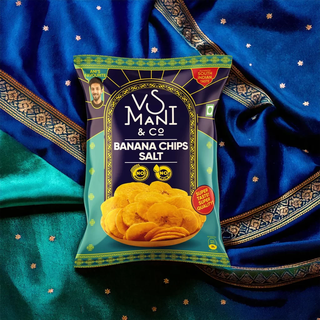
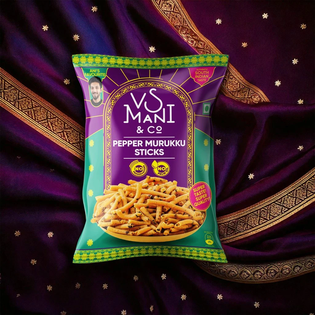
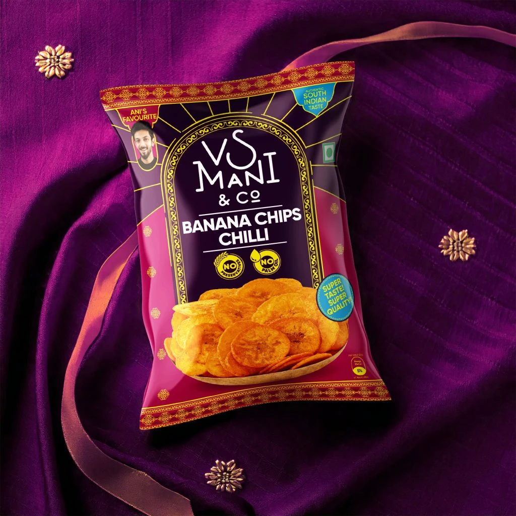
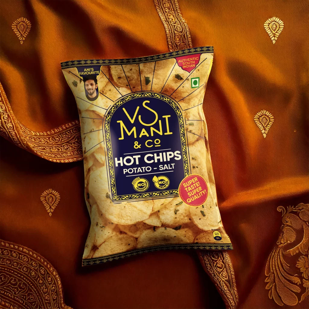
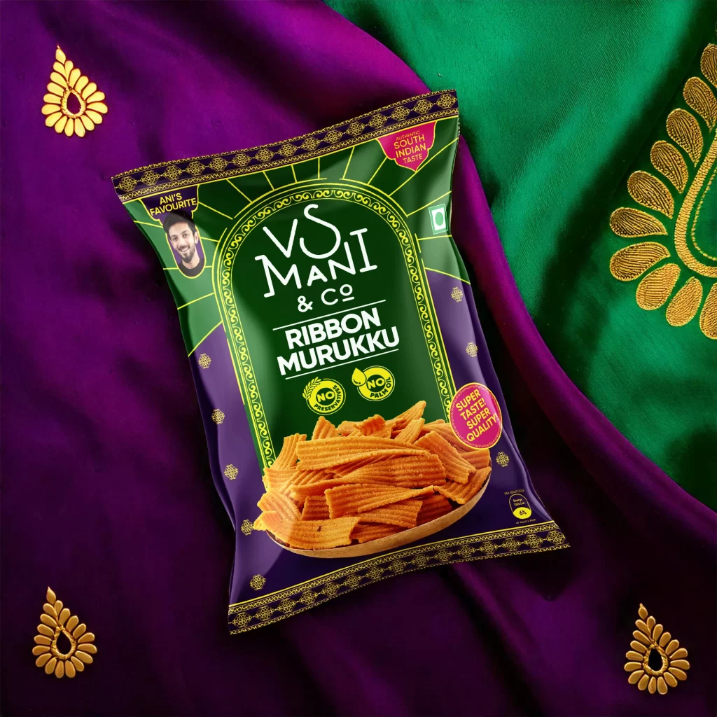
Set against a rich backdrop of deep violet and emerald textiles, the VS Mani & Co Ribbon Murukku pouch commands the center of the frame with a striking dark green and purple color palette. The packaging features an ornate, arched golden border framing the brand name in a stylized white serif font, while the product name 'RIBBON MURUKKU' sits prominently below in bold capital letters. A realistic photograph of the ridged, golden-brown snack fills the lower third of the bag, which is angled slightly to reveal additional text like 'ANIR'S FAVOURITE' and 'AUTHENTIC SOUTH INDIAN TASTE' within circular badges.
Visually, this specific iteration stands out due to its heavy reliance on traditional Indian textile motifs and jewelry-inspired patterns that frame the modern snack packaging. The juxtaposition of the crisp, geometric lines of the ribbon murukku against the soft, flowing drapes of the embroidered fabric creates a compelling textural contrast. Furthermore, the use of high-contrast neon yellow for decorative elements against the dark base colors ensures legibility while maintaining a festive, premium aesthetic typical of regional specialty foods.
Brand strategists and packaging designers might utilize this composition to study how cultural heritage elements can be integrated into contemporary FMCG product photography without appearing cluttered. Food stylists could analyze the lighting setup used to highlight the crispy texture of the fried snacks, ensuring they look appetizing rather than greasy. Additionally, art directors working on ethnic food campaigns would find value in the way the background fabrics are used to reinforce the product's geographic origin through color psychology and pattern association.