VS Mani Co Potato Chip Bag
Topics
Details
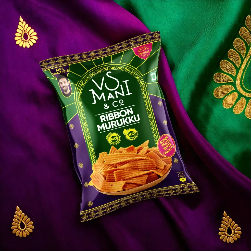
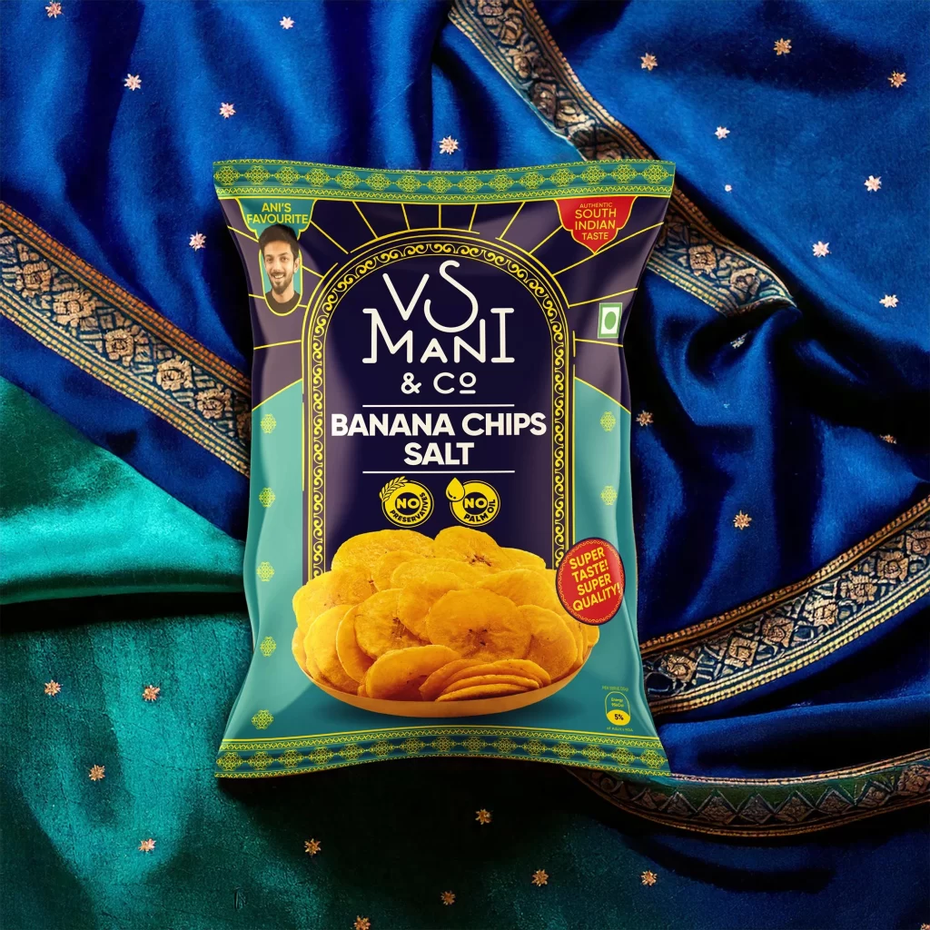
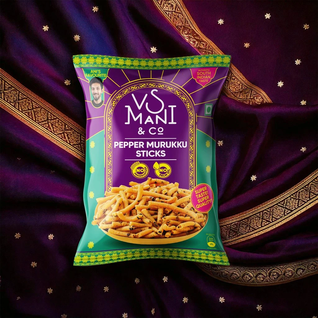
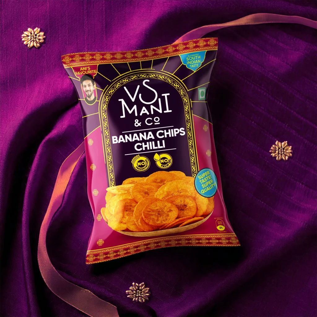
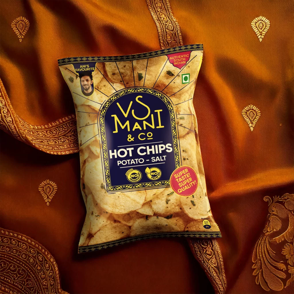
Resting on a luxurious, golden-orange fabric with intricate paisley embroidery, the VS Mani & Co Hot Chips bag commands attention through its rich color palette and traditional motifs. The packaging features a deep navy blue central archway containing bold yellow typography for the brand name, contrasted against a photographic background of golden potato chips. A small circular portrait labeled 'Ani's Favourite' sits in the upper left corner, while badges proclaiming 'Authentic South Indian' and 'Super Taste! Super Quality!' add vibrant pink accents to the composition.
What sets this design apart is its clever fusion of contemporary snack packaging aesthetics with distinctly South Indian cultural elements, particularly visible in the ornate border patterns and the warm, textile-like background choice. The typographic hierarchy creates immediate visual impact, with the stylized 'VS Mani' logo serving as an anchor that balances the playful product photography. Additionally, the strategic placement of quality indicators—such as the green Indian flag symbol and 'No Preservatives' seals—demonstrates how regional authenticity can be communicated through modern graphic design language.
Brand strategists developing FMCG products for ethnic or regional markets would find this reference invaluable when exploring how to blend heritage visual cues with contemporary packaging standards. Packaging designers working on savory snack lines could study the color psychology at play here, noting how the orange-gold spectrum evokes both appetite appeal and cultural warmth. Marketing teams planning product photography shoots might also examine the styling choices, particularly how fabric textures can elevate a simple chip bag into a premium lifestyle proposition.