Packaging
Topics
Details
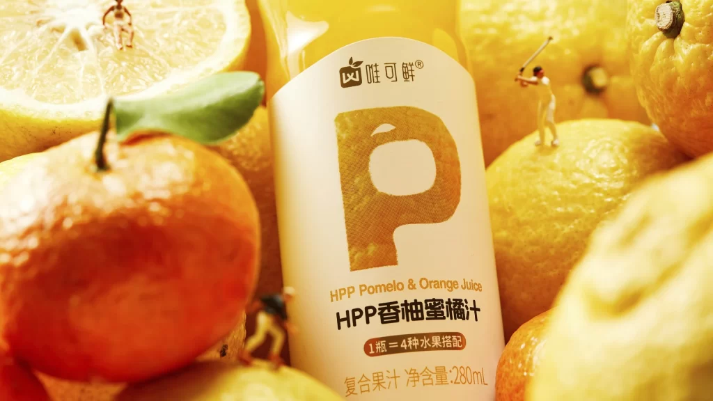
A cylindrical white carton stands at the center of a warm, golden-lit composition, surrounded by the glossy, textured surfaces of fresh citrus fruits. The packaging features a prominent, oversized orange letter 'P' with a halftone texture, positioned above bilingual text identifying the product as 'HPP Pomelo & Orange Juice' and 'HPP香柚蜜橘汁'. A small brown badge below indicates that one bottle contains a blend of four fruits, while the net volume of 280mL is noted at the bottom in orange type.
Visual interest arises from the playful juxtaposition of miniature human figurines engaged in sports activities atop the fruit surfaces, creating an unexpected sense of scale and narrative whimsy. The design balances clean, modern typography with organic, vibrant backgrounds, utilizing the natural translucency of citrus peels to enhance the product's fresh appeal. Warm directional lighting emphasizes the tactile contrast between the smooth matte carton and the dimpled, moisture-beaded skins of the surrounding oranges and pomelos.
Art directors developing beverage campaigns might study this arrangement to understand how macro photography can elevate standard consumer goods into lifestyle imagery. Packaging engineers could analyze the hierarchy of information on the label to optimize their own layouts for multilingual markets. Food stylists may reference the specific placement of props to learn how to build dynamic, story-driven scenes around simple grocery items.