VS Mani Co Pepper Murukku Stick Pouch
Topics
Details
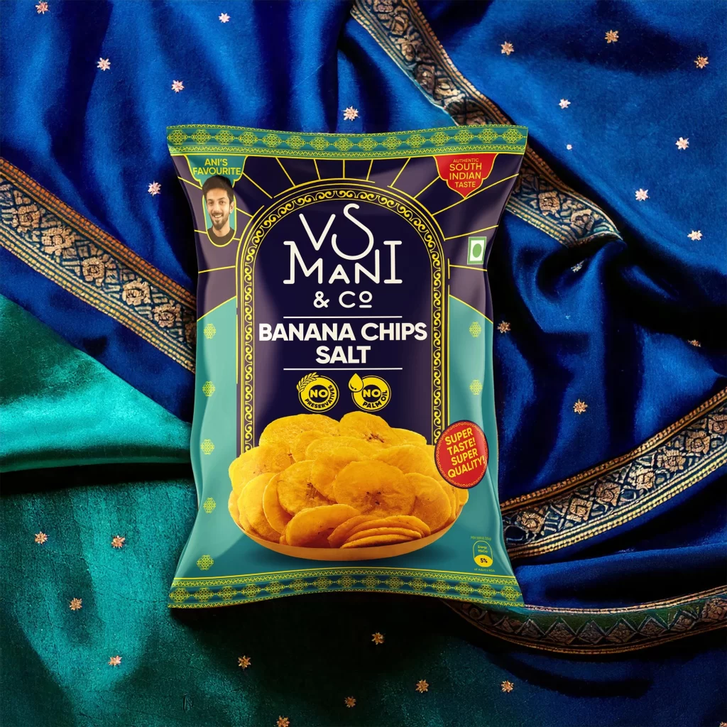
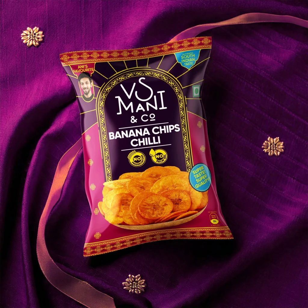
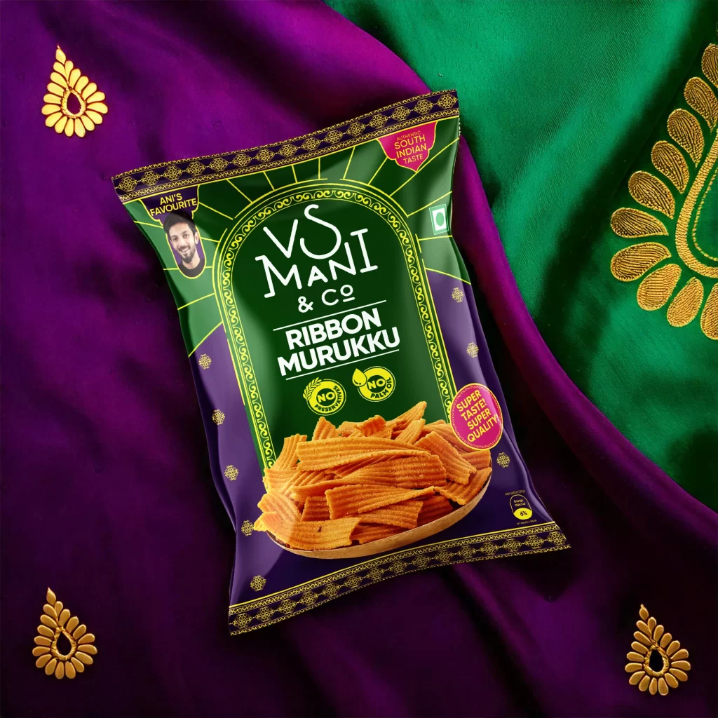
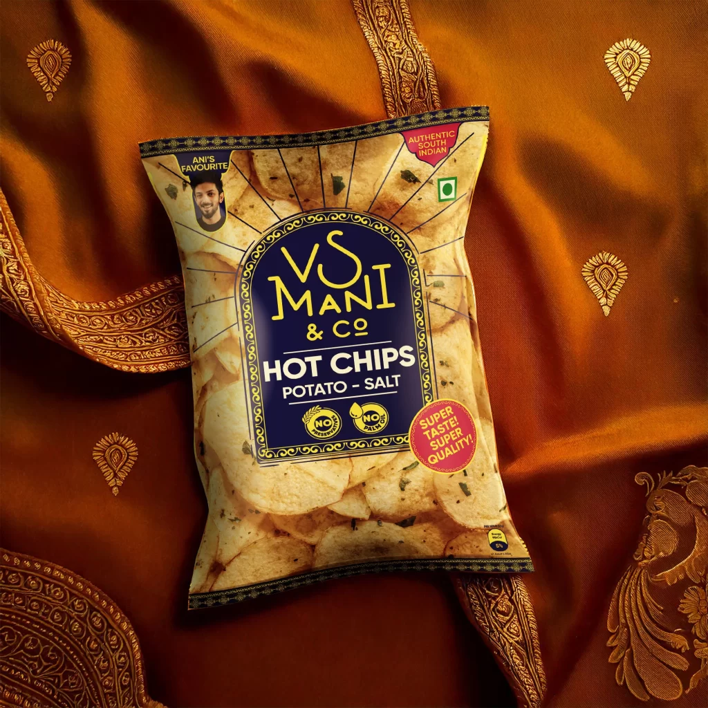
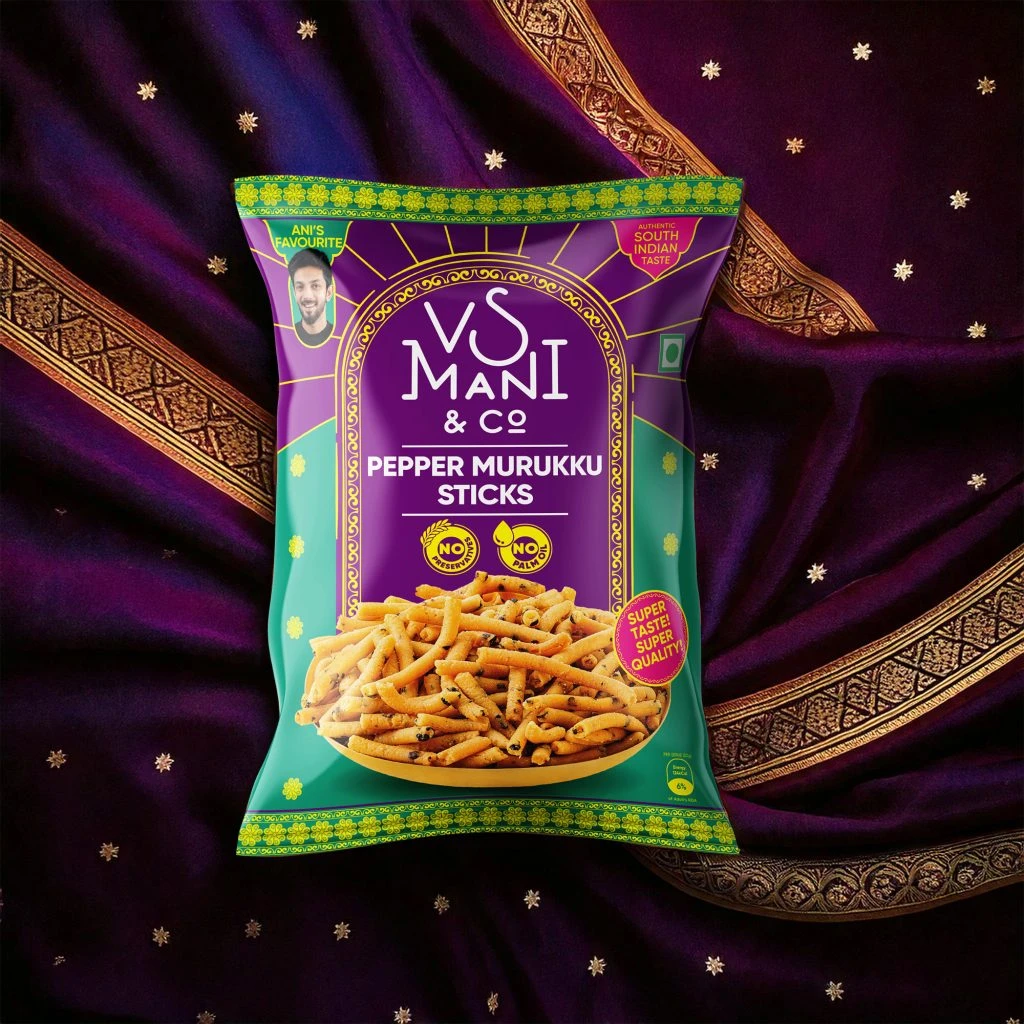
Deep purple fabric with golden embroidered borders and scattered star-shaped embellishments serves as the backdrop for a vibrant snack pouch. The packaging features a bold color scheme of royal purple and emerald green, accented by bright yellow floral patterns along the top and bottom edges. Centered within an ornate arched frame, the brand name 'VS Mani & Co' appears in white serif lettering above the product title 'Pepper Murukku Sticks' in clean sans-serif type. A photographic image of golden-brown, twisted snack sticks occupies the lower portion, while circular badges indicate 'No Preservatives' and 'No Palm Oil' alongside a pink seal proclaiming 'Super Taste! Super Quality!'.
Visual distinction emerges from the fusion of traditional South Indian textile aesthetics with modern commercial packaging conventions. The archway motif surrounding the brand name echoes temple architecture, while the contrasting purple and green fields create immediate shelf presence through complementary color theory. Small details like the 'Ani's Favourite' endorsement badge and the 'Authentic South Indian Taste' claim reinforce regional identity without cluttering the primary visual hierarchy. Golden decorative borders on the background fabric mirror the ornamental trim on the pouch itself, creating a cohesive cultural narrative that bridges the product and its presentation context.
Brand strategists developing ethnic food product lines might examine this composition to understand how traditional motifs translate to contemporary retail packaging. Color theorists could analyze the specific hex values of the purple-green-yellow triad to study high-contrast palette effectiveness in snack category marketing. Photographers specializing in product styling might reference the interplay between the textured fabric background and the glossy pouch surface to plan similar cultural heritage shoots. Marketing teams launching regional specialty items could utilize this as a case study in balancing authenticity cues with modern health-conscious labeling requirements.