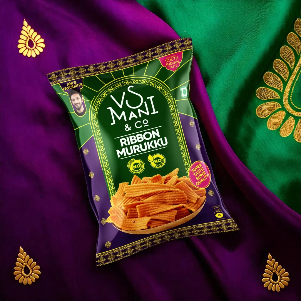
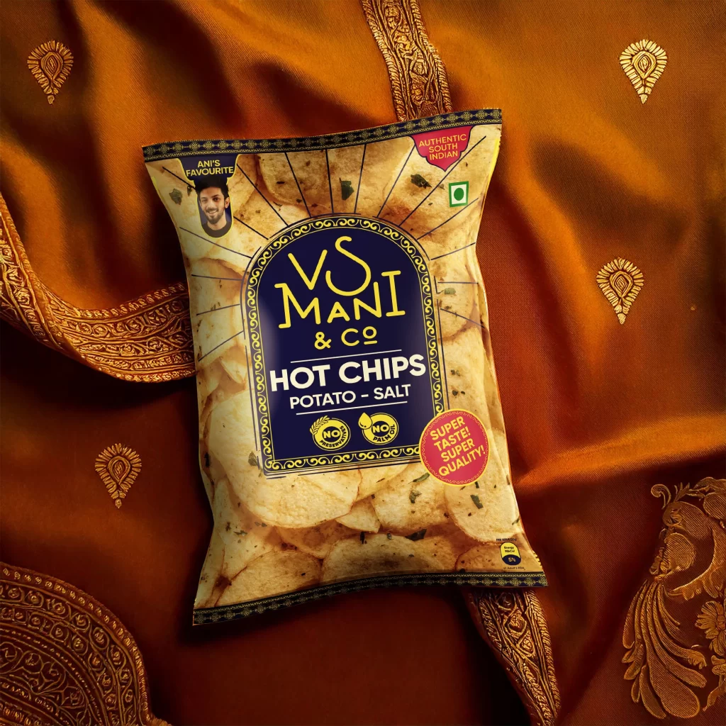
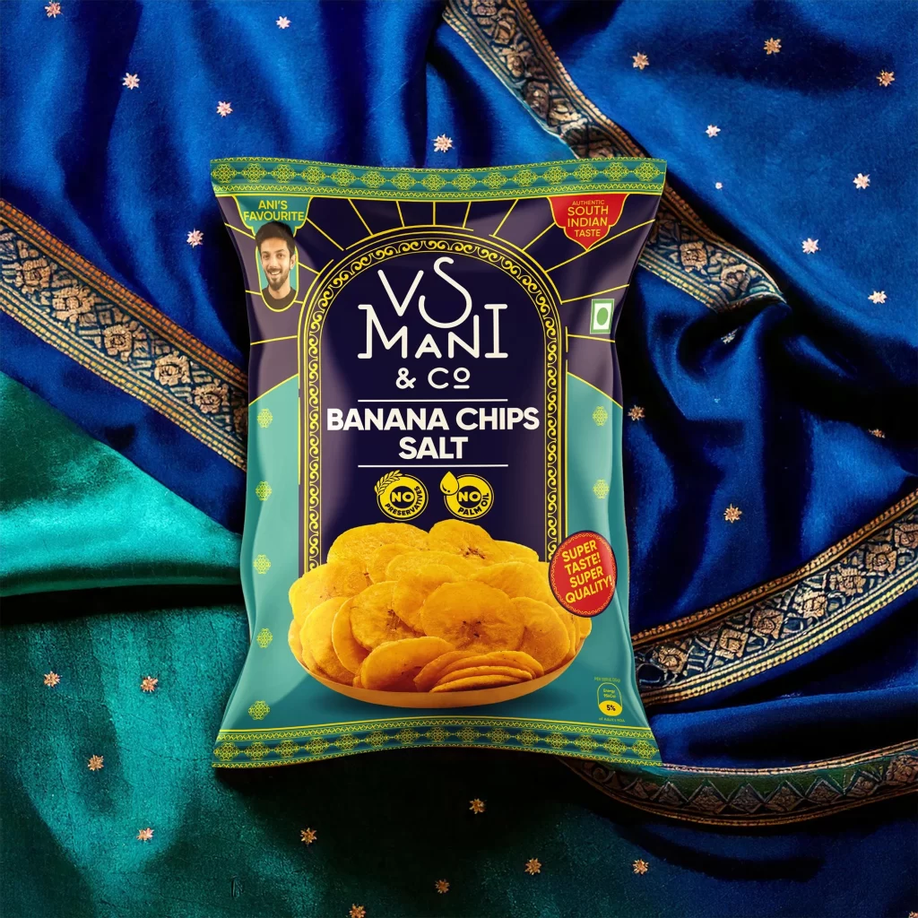
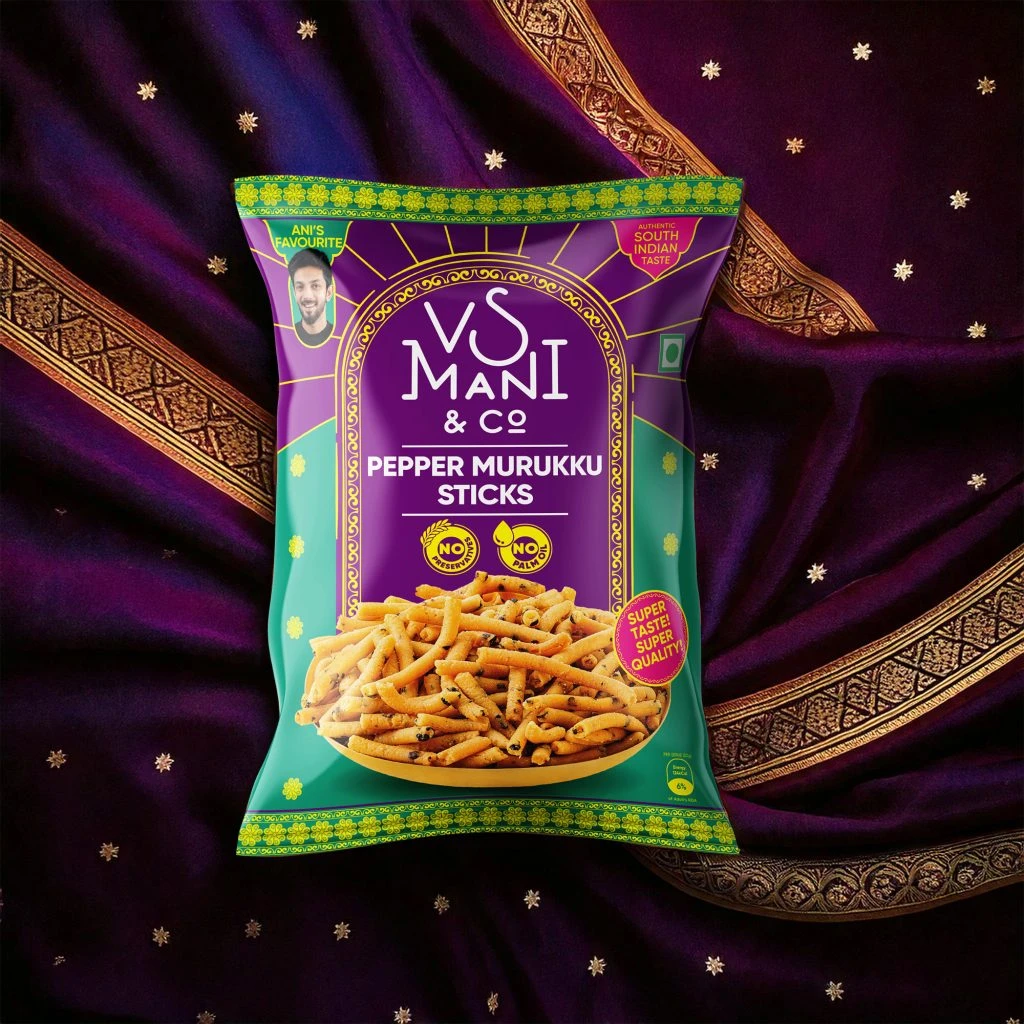
VS Mani Co Easy Filter Coffee Pouch View
Topics
Details
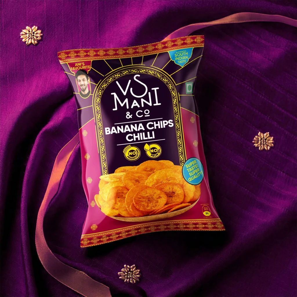
Cradled against a backdrop of deep crimson and royal blue silk, the VS Mani & Co Easy Filter Coffee pouch commands attention with its rich indigo packaging and ornate gold filigree borders. A white spout cap sits atop the flexible container, while the central label features a light blue archway framing the brand name in a stylized serif font above the product title. Below the text, a golden South Indian filter dripper holds a frothy, dark brew, surrounded by decorative motifs and badges proclaiming 'Ani's Favourite' and 'Authentic Filter Coffee Taste.'
Visual distinction emerges from the deliberate fusion of traditional textile aesthetics with modern convenience packaging, creating a luxurious yet accessible market presence. The color palette draws heavily from cultural heritage—deep purples, burnished golds, and vibrant reds—while the photographic rendering of the coffee froth adds tactile realism to the flat design elements. Such careful layering of patterns, typography, and product photography demonstrates how heritage branding can maintain authenticity within contemporary retail formats.
Product photographers studying food and beverage styling would examine this composition for its masterful use of fabric textures to elevate a mass-market item into something aspirational. Packaging designers analyzing regional Indian markets could reference the specific typographic hierarchy and color coding that signals traditional preparation methods to consumers. Marketing teams developing heritage-brand narratives might study how the 'Ani's Favourite' endorsement badge integrates personal testimony alongside institutional quality markers like the 'Pure Filter Coffee' seal.