VS Mani Co Banana Chips Salt Pouch
Topics
Details
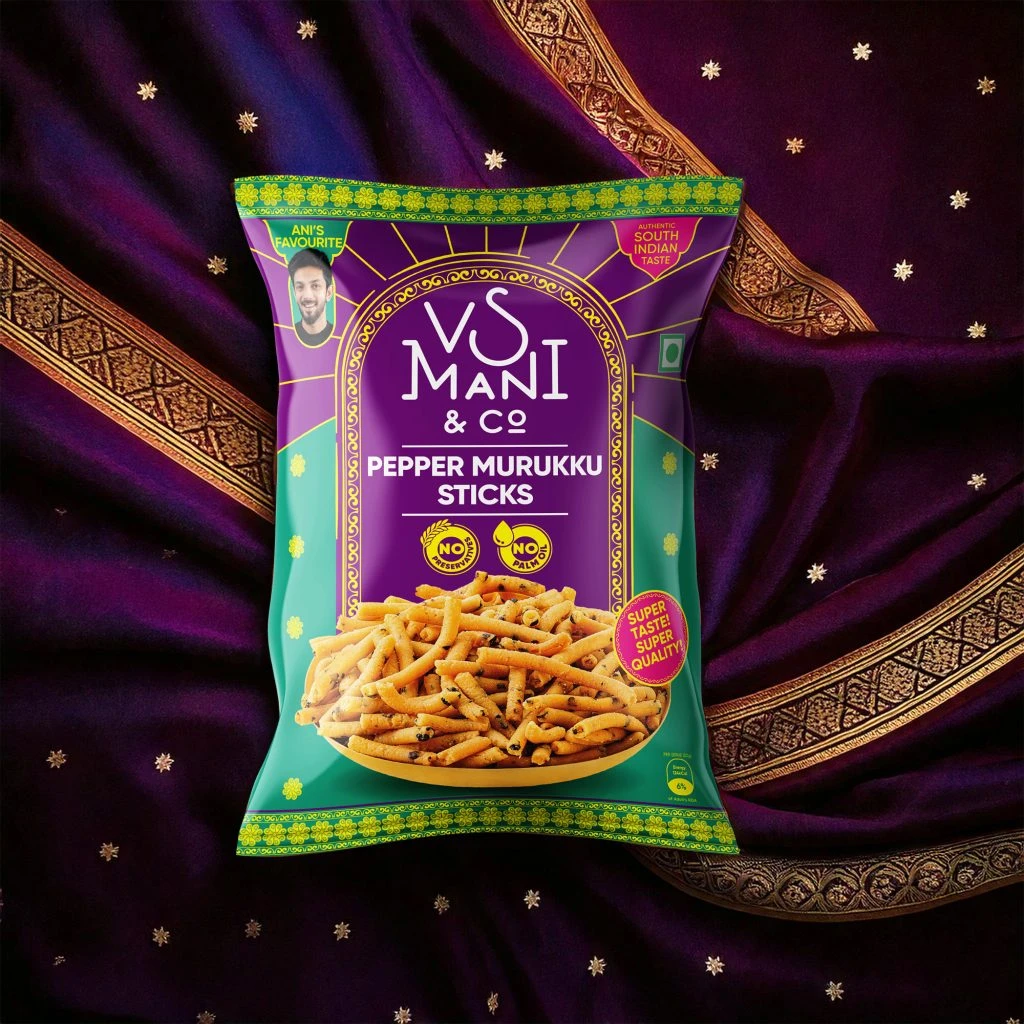
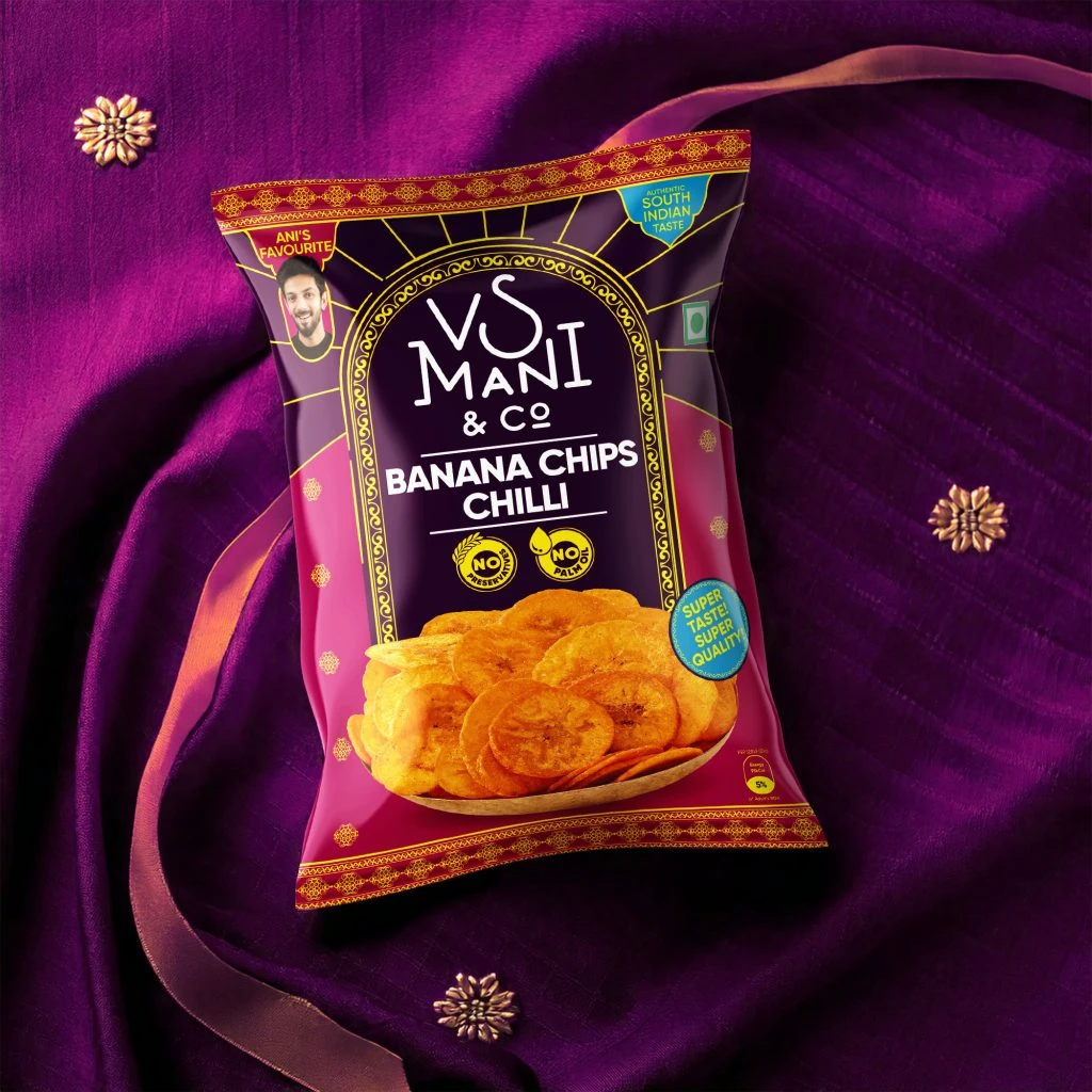
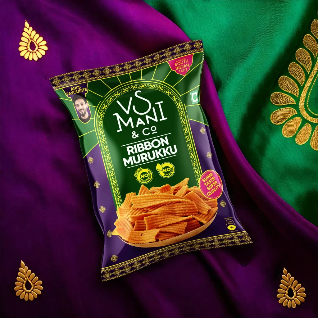
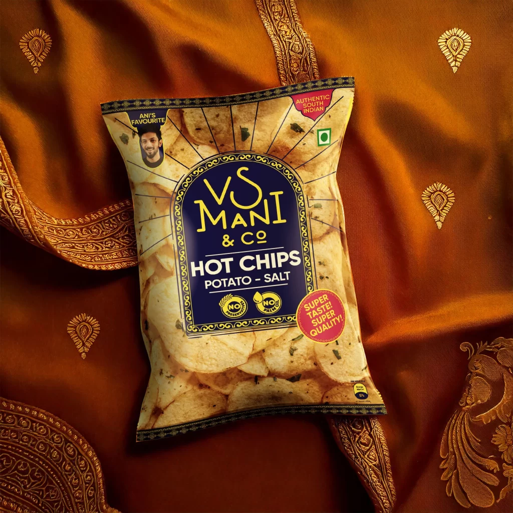
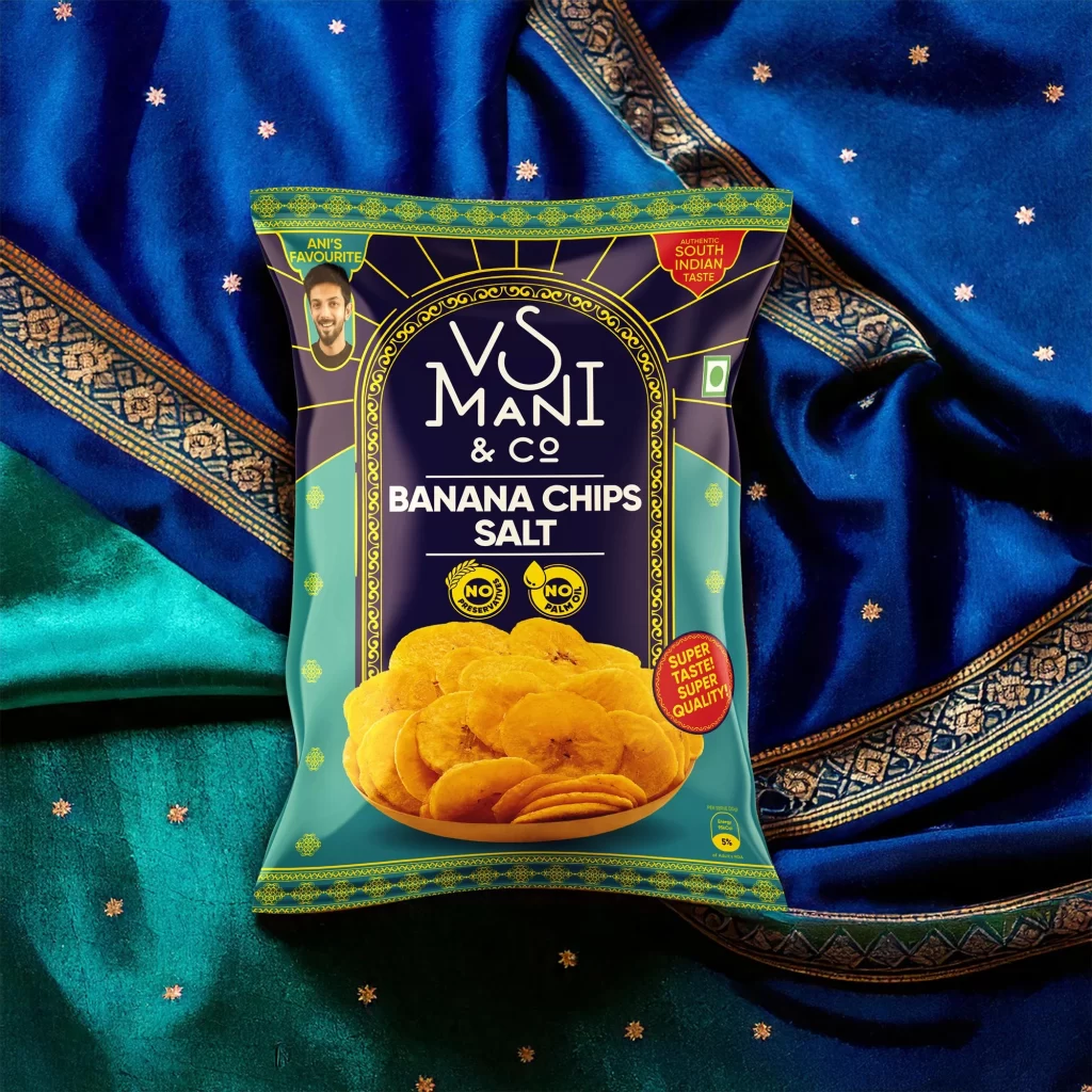
Resting atop a luxurious blue textile with golden embroidery and scattered star-shaped embellishments, the VS Mani & Co banana chips pouch commands attention through its bold color blocking of deep navy and teal. The packaging features an ornate arched frame in yellow-green that encloses the brand name and product title, while a realistic photograph of golden salted chips anchors the lower half. A small circular portrait labeled 'ANIC FAVOURITE' sits in the upper left corner, balanced by red badges proclaiming 'AUDACIOUS SOUTH INDIAN TASTE' and 'SUPER TASTE! SUPER QUALITY!' against the dark background.
Visual hierarchy emerges from the contrast between the traditional Indian architectural motif of the central arch and the modern, clean typography used for the product identification. The integration of cultural textile patterns in the backdrop creates a cohesive narrative that bridges contemporary snack packaging with regional heritage aesthetics. Notable design elements include the dual certification seals indicating 'NO PRESERVATIVES' and 'NO PALM OIL', which add functional credibility to the ornamental presentation.
Brand strategists analyzing FMCG packaging for South Asian markets would examine this composition to understand how traditional motifs can be adapted for mass-market snack products. Photographers specializing in product styling might reference the interplay between fabric textures and glossy packaging surfaces to achieve similar depth in their own commercial shoots. Marketing teams developing regional flavor campaigns could study the placement of endorsement portraits and quality badges to optimize consumer trust signals on limited print real estate.