VS Mani Co Filter Coffee Powder Pouch
Topics
Details
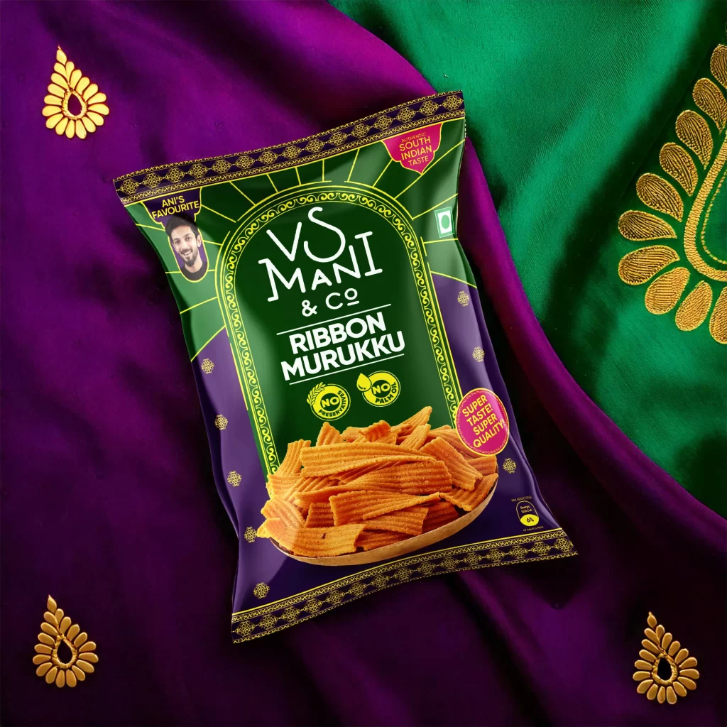
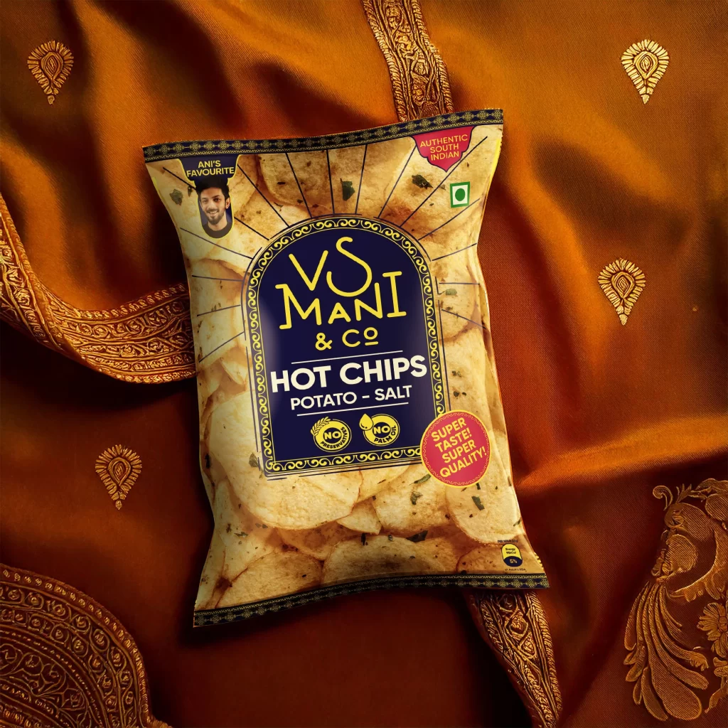
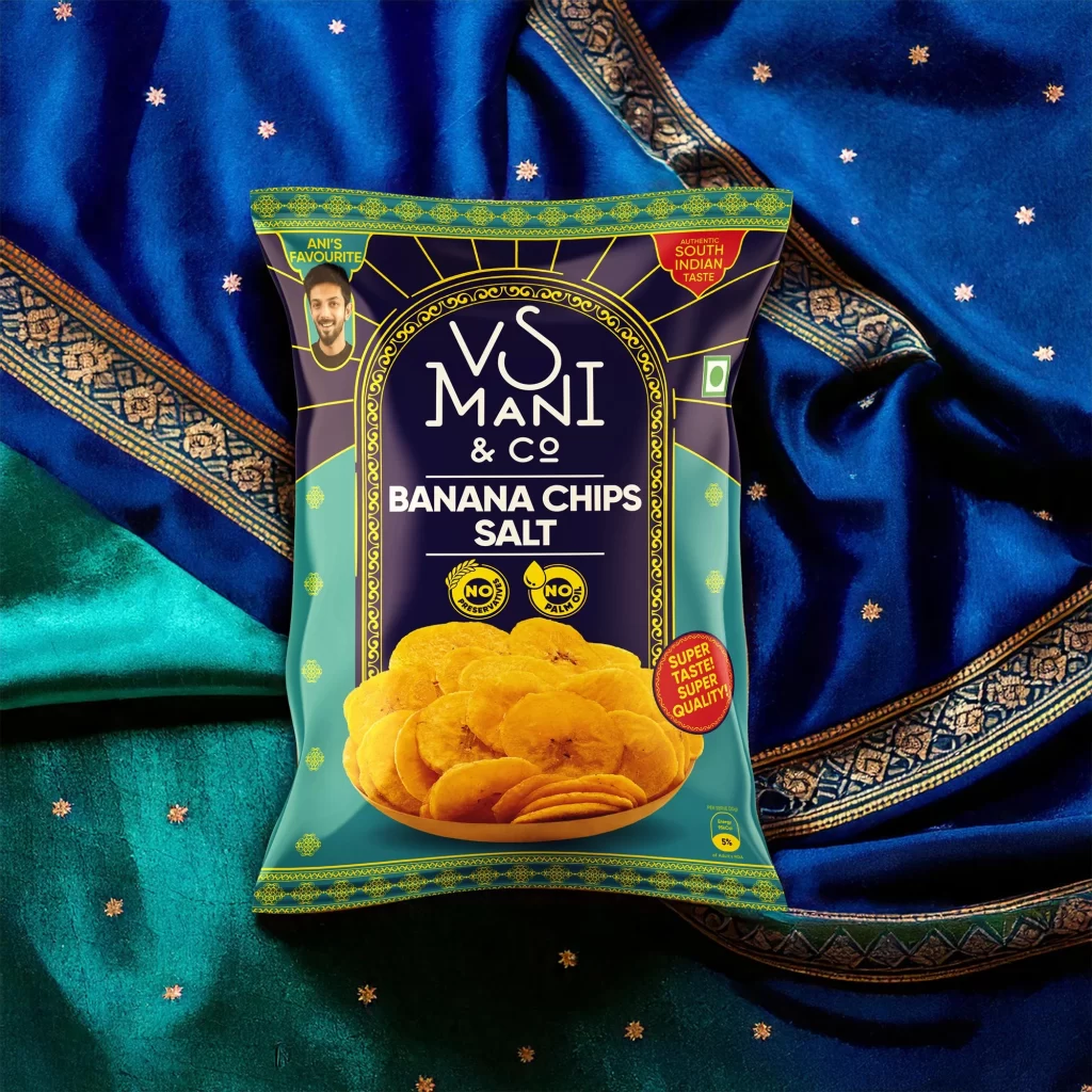
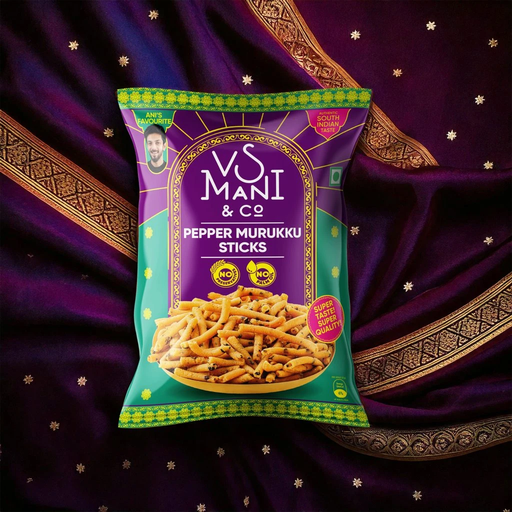
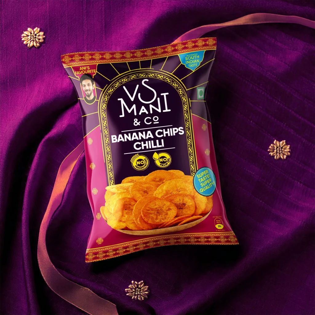
Resting upon a luxurious backdrop of deep crimson and navy blue fabric embroidered with golden peacocks, the VS Mani & Co pouch commands attention with its regal purple and midnight blue color scheme. The packaging features an ornate, arched gold frame encasing the brand name in elegant serif typography, while a realistic depiction of frothy filter coffee in a traditional metal tumbler anchors the lower half. Soft studio lighting highlights the metallic gold accents and the glossy finish of the pouch, which is photographed at a slight three-quarter angle to reveal its dimensional form against the rich textile textures.
Visual distinction emerges from the sophisticated fusion of traditional South Indian aesthetic elements with modern commercial packaging standards. The intricate border patterns resembling temple architecture, combined with the specific 'Ani's Favourite' endorsement badge and the green 'Rich South Indian Coffee' label, create a layered narrative of authenticity and personal recommendation. Such deliberate use of gold foil effects against deep jewel tones establishes a premium market positioning that differentiates it from standard commodity coffee packaging through its ceremonial and heritage-driven visual language.
Brand strategists developing heritage food products might analyze this composition to understand how cultural motifs translate into contemporary retail contexts. Packaging engineers could study the balance between decorative elements and mandatory nutritional information placement, while photographers specializing in product lifestyle shoots might reference the interplay between fabric textures and reflective surfaces. Marketing teams launching regional specialty items would find value in examining how celebrity endorsements are integrated without overwhelming the traditional design vocabulary.