VS Mani Co Easy Filter Coffee Pouch
Topics
Details
Against a rich, deep blue fabric backdrop with intricate golden embroidery patterns, a bright yellow VS Mani & Co Easy Filter Coffee pouch sits as the central focal point. The pouch features a white spout cap at the top and displays bold typography including 'EASY FILTER COFFEE' within an arched light-blue frame, alongside an image of frothy coffee in a traditional metal cup. A small circular badge labeled 'ANI'S FAVOURITE' appears in the upper left corner, while the bottom highlights an 80% coffee to 20% chicory ratio in a dark blue shield emblem.
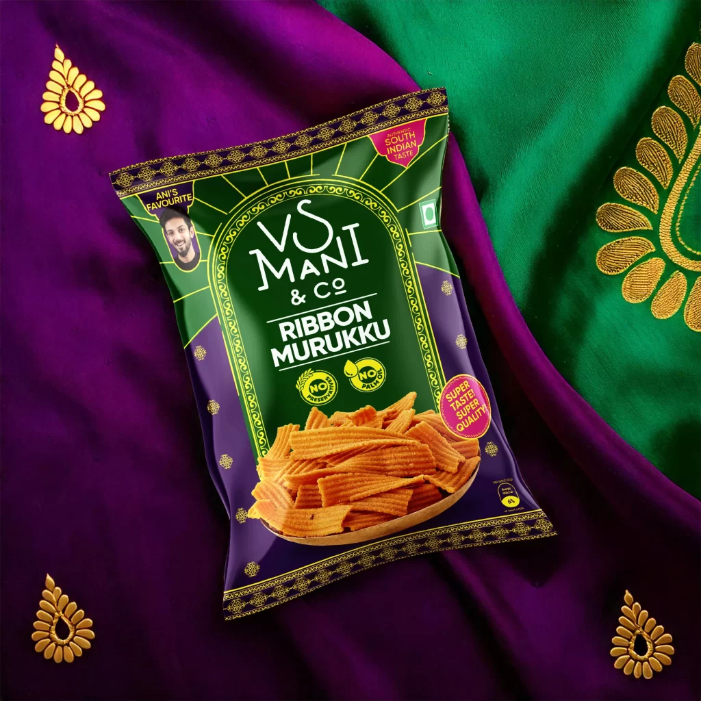
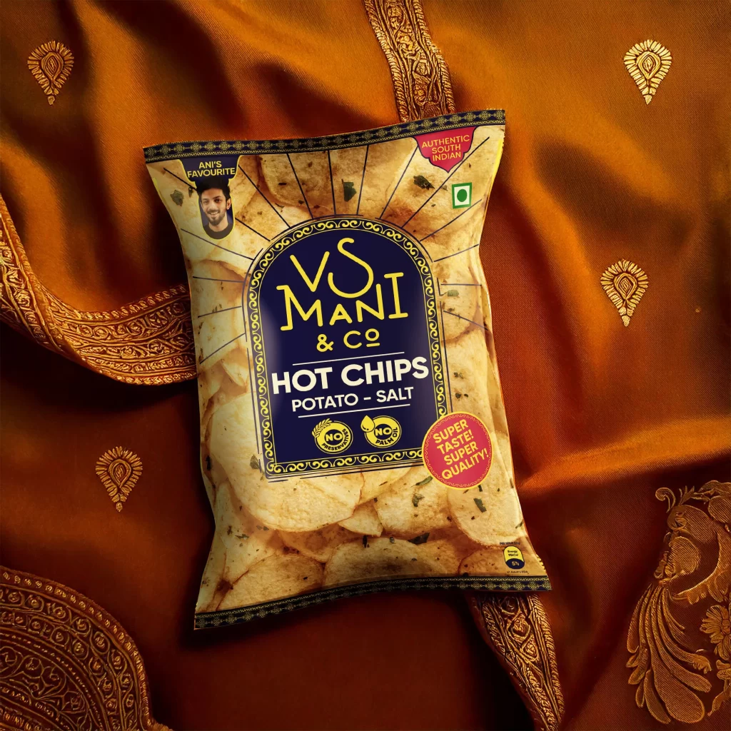
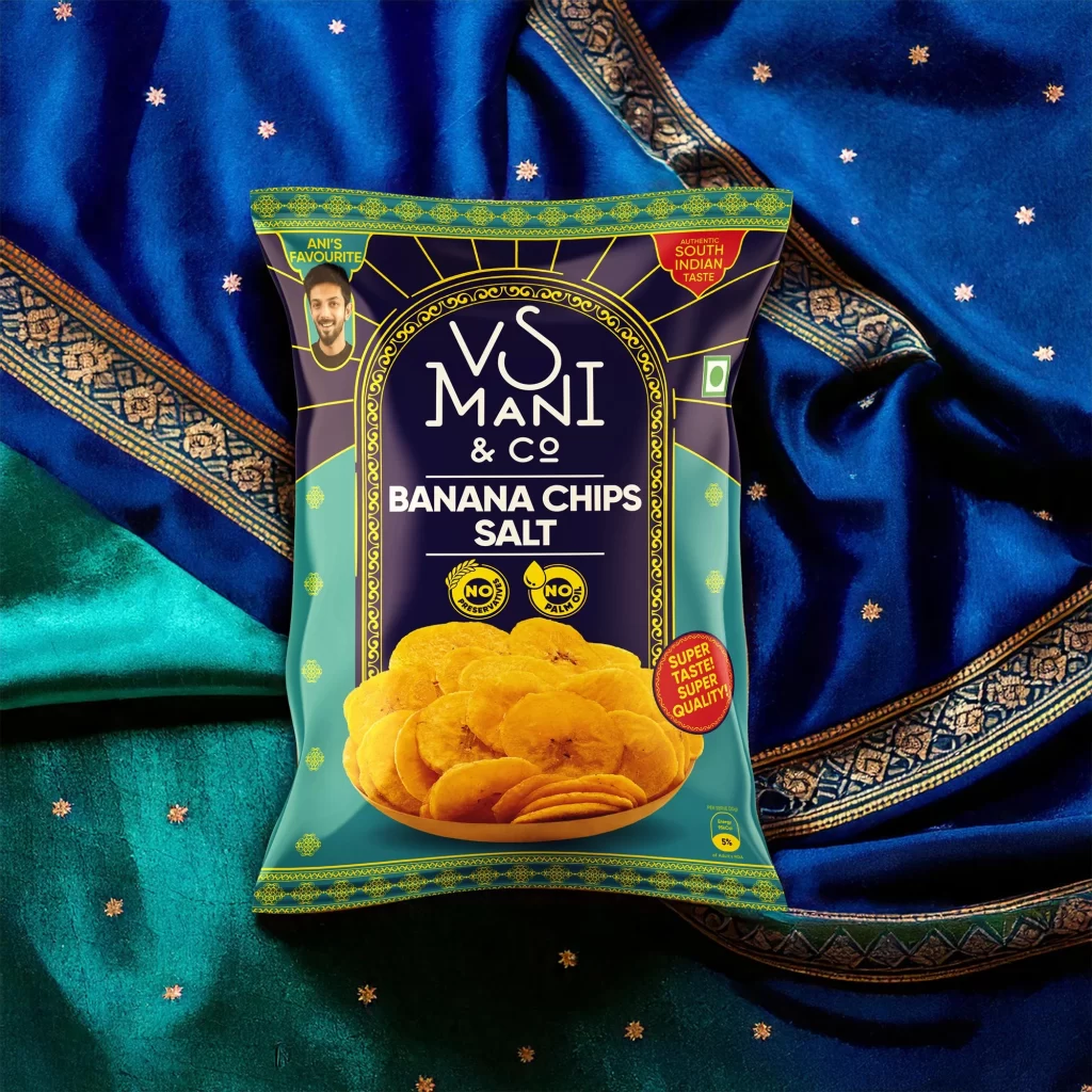
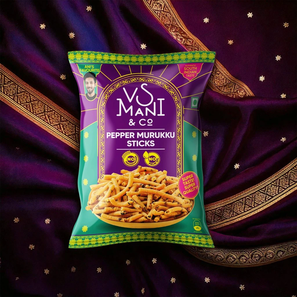
What makes this packaging visually compelling is its deliberate fusion of modern convenience with traditional South Indian aesthetic cues. The vibrant yellow creates immediate shelf-pop against the luxurious textile background, while the ornate border patterns and arch-shaped logo frame evoke heritage craftsmanship. The inclusion of both a celebrity endorsement badge and specific brewing instructions ('Add Milk, Sugar, Mix.') balances aspirational marketing with practical usability in a single cohesive design system.
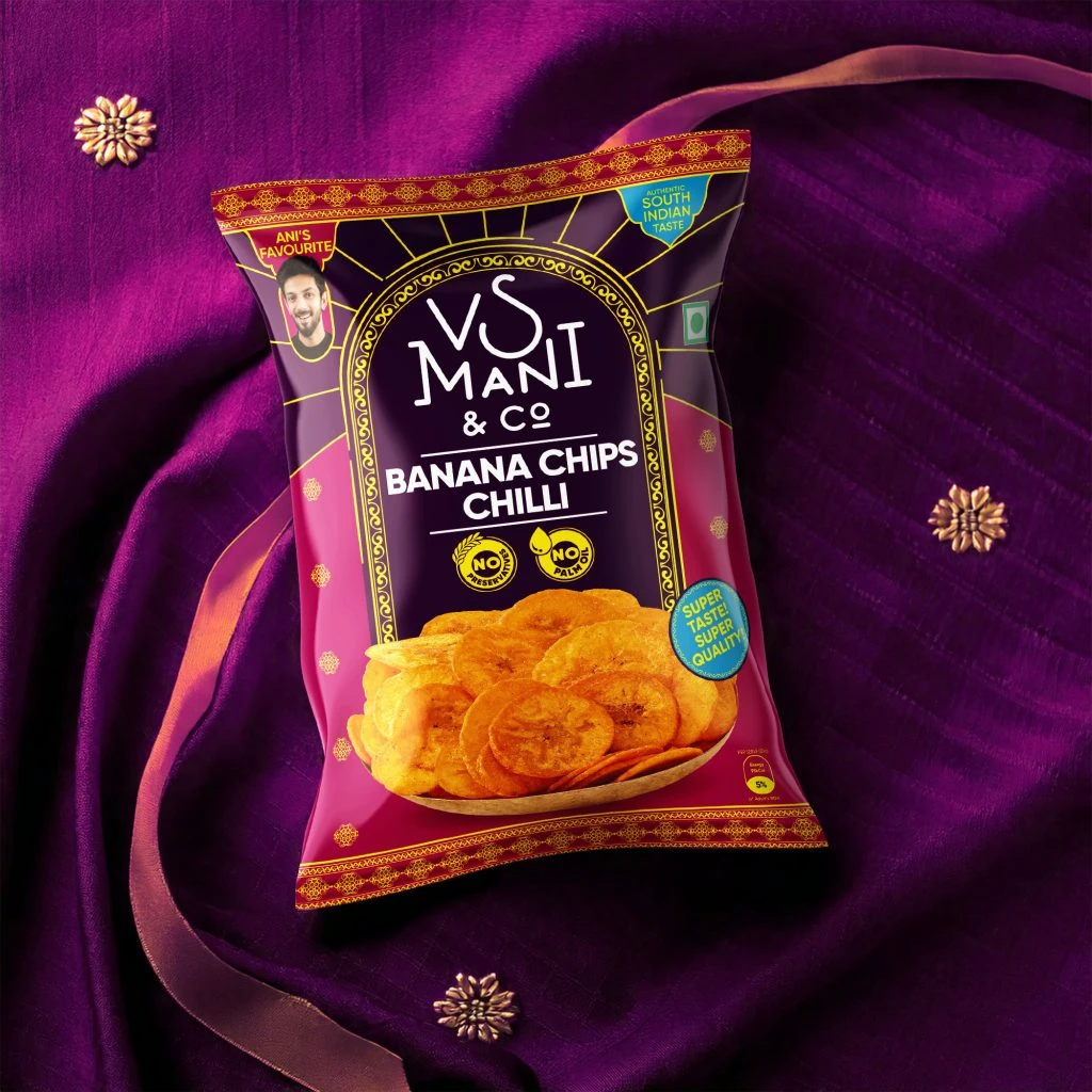
Product photographers studying food-and-beverage styling would find this composition particularly useful for understanding how cultural textiles can elevate everyday grocery items into lifestyle photography. Brand designers working on Indian FMCG packaging could analyze the color hierarchy and typographic layering that communicates multiple value propositions simultaneously. Art directors planning e-commerce shoots might reference the way the spout-pouch format is positioned to show functionality while maintaining visual appeal through strategic prop placement.