Kita No Tegami Cracker Box Studio Shot
Topics
Details
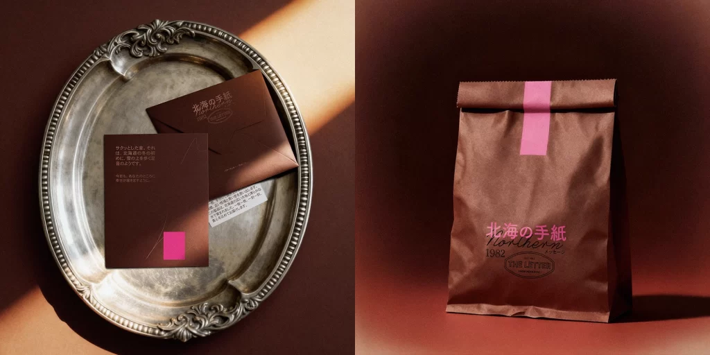
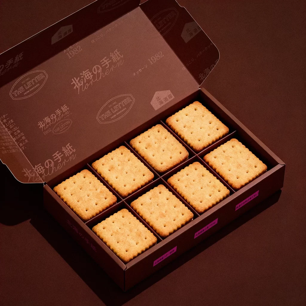
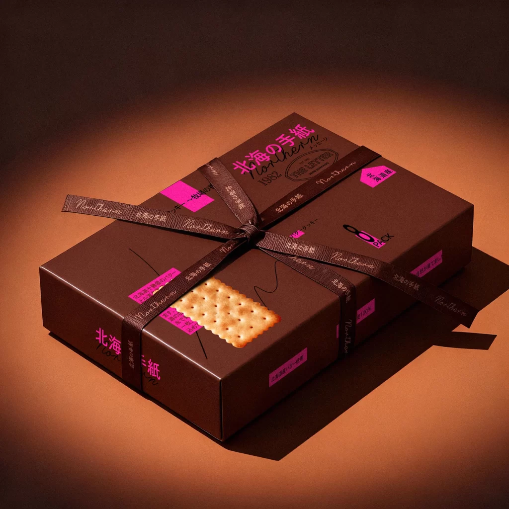
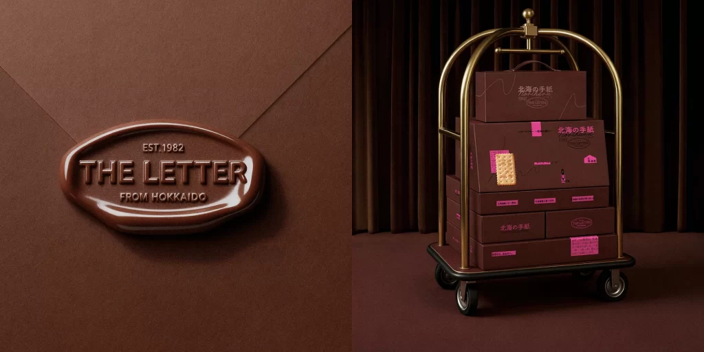
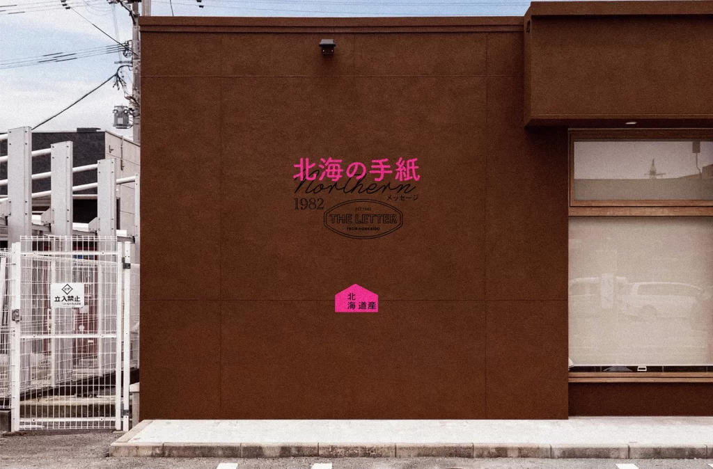
Two rectangular cardboard boxes in a rich chocolate-brown hue display the '北海の手紙' (Northern Letter) cracker packaging, with the larger 8-pack positioned slightly behind and to the left of the smaller 6-pack. Vibrant magenta accents punctuate the design through bold Japanese typography, informational labels, and graphic elements, while realistic biscuit images with distinctive perforated patterns anchor the front of each box. Soft directional lighting from the left casts gentle shadows across the matte surface, highlighting the subtle texture of the cardboard and creating a sophisticated studio presentation that emphasizes the product's premium aesthetic.
Visual interest stems from the striking juxtaposition of the muted, organic brown substrate against the electric pink typography, which creates an immediate focal point without overwhelming the minimalist layout. The design cleverly balances Japanese calligraphy with English script elements like ‘1982’ and ‘THE LETTER,’ while the inclusion of realistic food photography alongside abstract wavy line graphics adds textural depth. This specific iteration demonstrates how limited color palettes can achieve high contrast through strategic accent placement rather than complex patterns.
Packaging designers studying premium snack branding would find this composition useful for analyzing hierarchy between product imagery and typographic information. Art directors working on Japanese-market confectionery projects could reference the specific way traditional motifs are modernized through neon color choices. Additionally, 3D artists requiring accurate material studies for cardboard textures and foil-stamping effects on matte surfaces would benefit from observing the subtle surface reflections and edge definitions present in this studio setup.