Kita No Tegami Stationery Label
Topics
Details
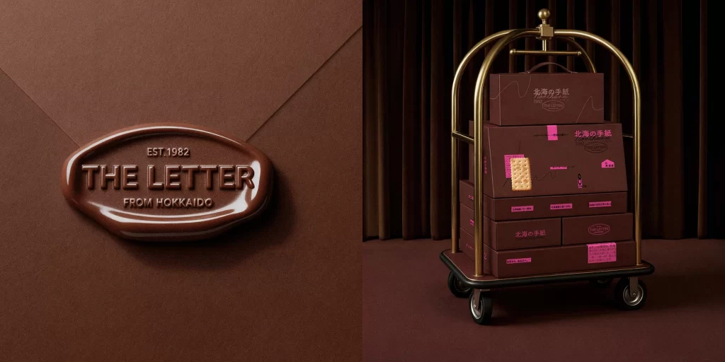
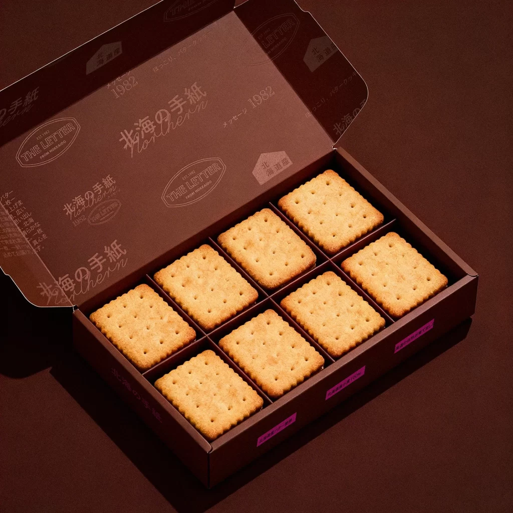
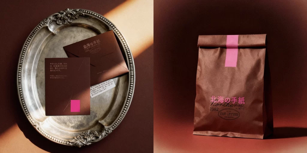
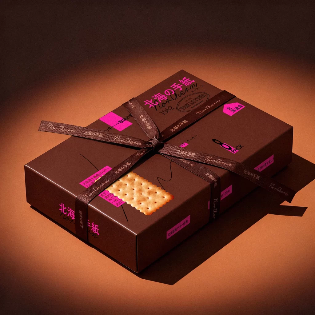
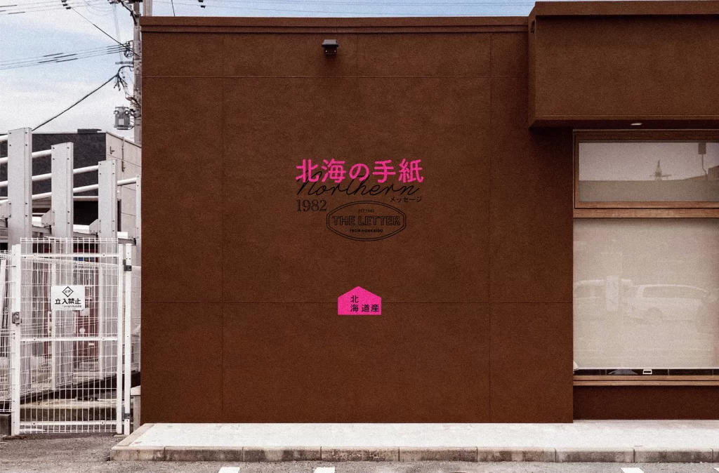
Against a matte chocolate-brown facade, a stationery brand identity unfolds with striking typographic contrast. Vibrant magenta Japanese characters for 'Hokkai no Tegami' (Letter from the North Sea) dominate the upper center, while elegant black cursive script spells 'Northern' beneath it. The composition includes a small octagonal seal reading 'THE LETTER FROM HOKKAIDO,' a house-shaped pink badge indicating 'Northern Hokkaido Store,' and a large window with a translucent roller shade on the right edge.
Visual tension arises from the deliberate clash between the warm, earthy architectural surface and the electric pink signage. This color strategy ensures immediate legibility while maintaining an artisanal, boutique atmosphere through mixed typefaces—combining bold sans-serif kanji with flowing Latin script and geometric iconography. The restrained placement of elements creates breathing room around each textual component, allowing the branding to feel both contemporary and rooted in traditional correspondence culture.
Retail designers studying exterior signage systems will find value in this example of bilingual identity application. Environmental graphic professionals can examine how scale and hue hierarchy function across different writing systems on a single plane. Additionally, brand strategists developing heritage-inspired visual languages might reference this balance of established date markers ('1982') alongside modern fluorescent accents for contemporary retail contexts.