Kita No Tegami Cracker Box Flat Lay
Topics
Details
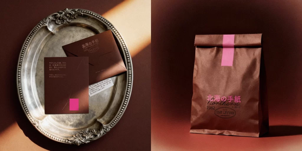
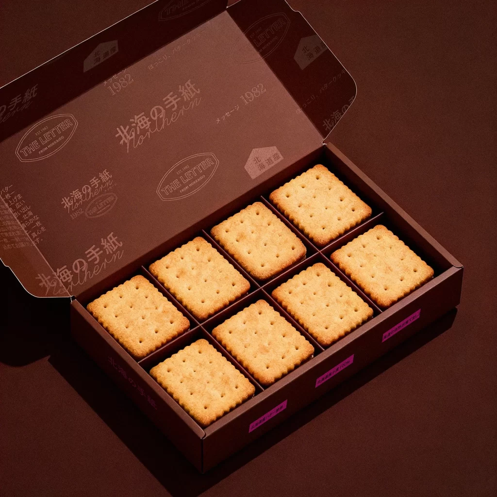
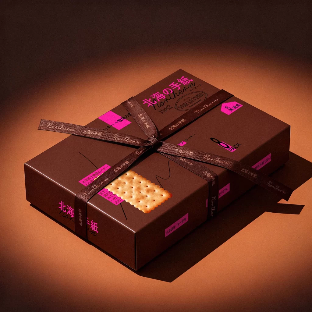
Resting on a reflective metallic tray, the rectangular cracker box displays a deep chocolate-brown matte finish that absorbs the ambient light. A vibrant magenta stripe wraps around the center, contrasting sharply with the dark base and the black Japanese typography that reads '北海の手紙' (Northern Letter) alongside the English word 'northern' and the year 1982. Two golden, perforated crackers lie flat in the foreground, while a third is printed vertically on the packaging itself, all illuminated by warm directional lighting that creates soft shadows against the seamless brown backdrop.
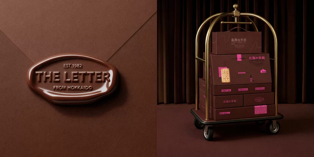
What sets this packaging apart is its sophisticated interplay between rustic textures and bold, modern graphic elements. The combination of handwritten-style script, clean sans-serif fonts, and neon pink accents creates a visual tension that feels both nostalgic and contemporary. Subtle details like the wavy line illustration and the specific '8 PACK' notation add layers of information without cluttering the composition, making it an excellent study in balanced hierarchy.
Photographers studying food styling might analyze how the metallic surface reflects the product to add depth without distraction. Brand designers working on artisanal snack lines could examine how the color palette evokes richness while the pink accents inject energy. Even illustrators looking to practice rendering different materials—paper, metal, and baked goods—would find the varied textures and lighting conditions a practical challenge for observational studies.