Kraft Mac & Cheese Box Design
Topics
Details
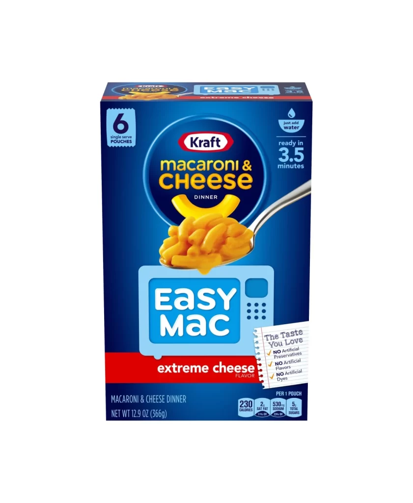
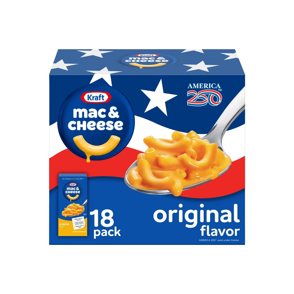
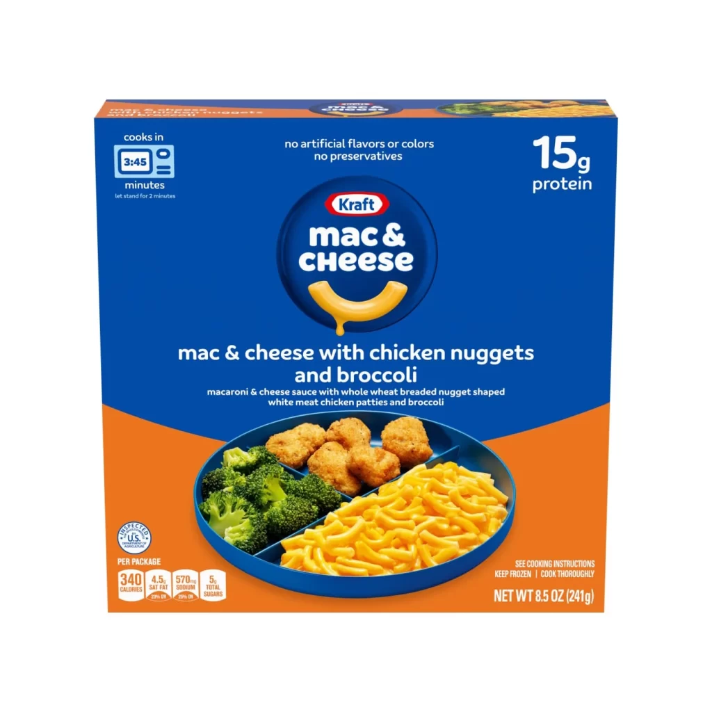
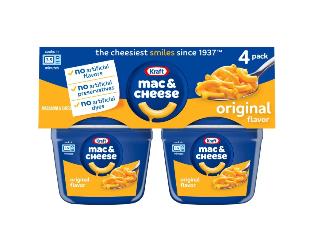
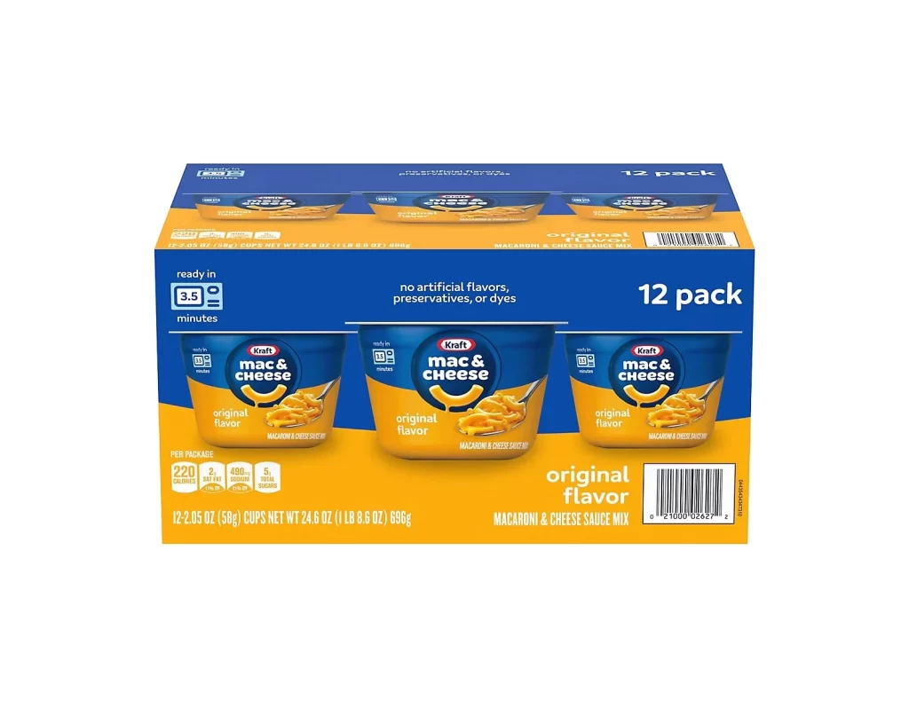
Against a deep navy blue background, the packaging features a prominent circular logo in a slightly lighter shade of blue, housing the white 'Kraft' brand name within its signature red oval. Below this, bold white sans-serif letters spell out 'mac & cheese' above a stylized, dripping yellow macaroni noodle that acts as a smile. The word 'DELUXE' dominates the center in large, clean typography, while an orange horizontal band anchors the bottom with 'ORIGINAL CHEDDAR' in white capitals.
Visual hierarchy plays a crucial role here, guiding the eye from the trusted brand mark down to the specific product variant through strategic color blocking and scale. The inclusion of a small circular badge proclaiming 'MADE WITH REAL CHEDDAR CHEESE' adds a layer of authenticity that complements the rich, photographic food styling on the right side. Such deliberate placement of text and imagery creates an immediate association between the premium labeling and the appetizing, gooey texture of the final dish.
Brand historians might analyze this layout to understand how Kraft maintains visual consistency across different product lines while signaling quality upgrades. Marketing teams could study the specific contrast between the dark backdrop and the vibrant orange accent to inform their own packaging strategies for comfort foods. Additionally, food photographers often examine the lighting on the macaroni to replicate that specific glossy, melt-in-your-mouth appeal in their own culinary shoots.