Kraft Macaroni & Cheese Dinner Box
Topics
Details
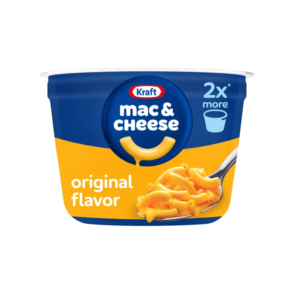
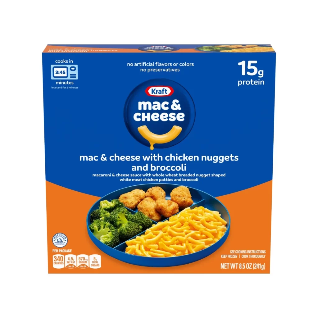
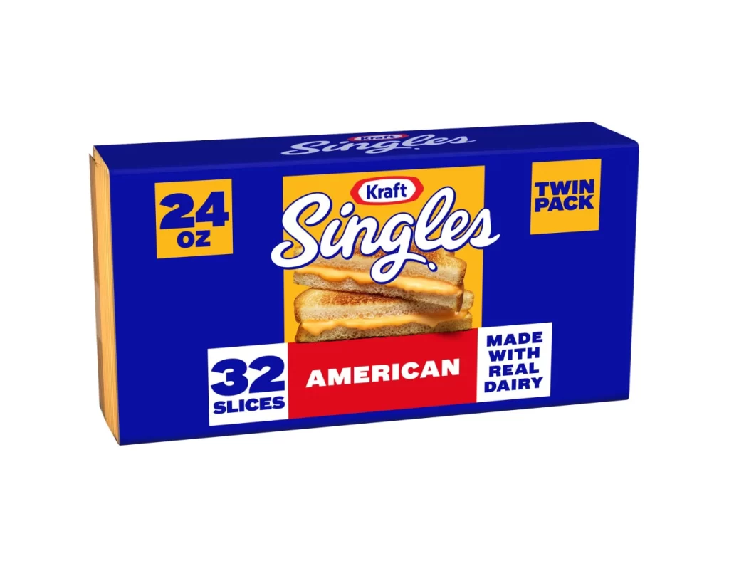
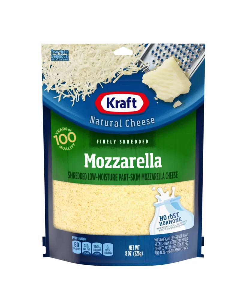
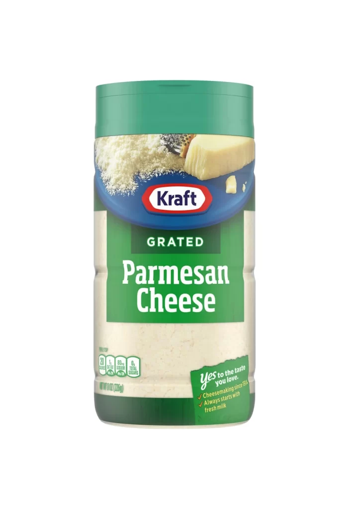
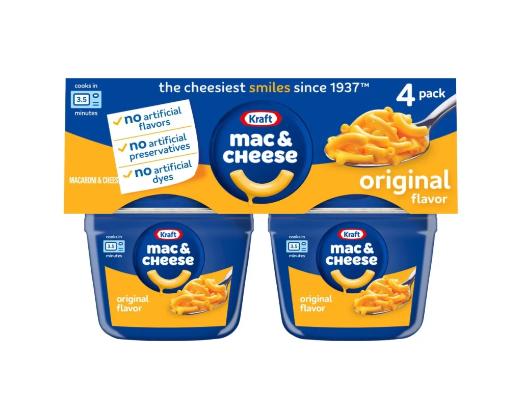
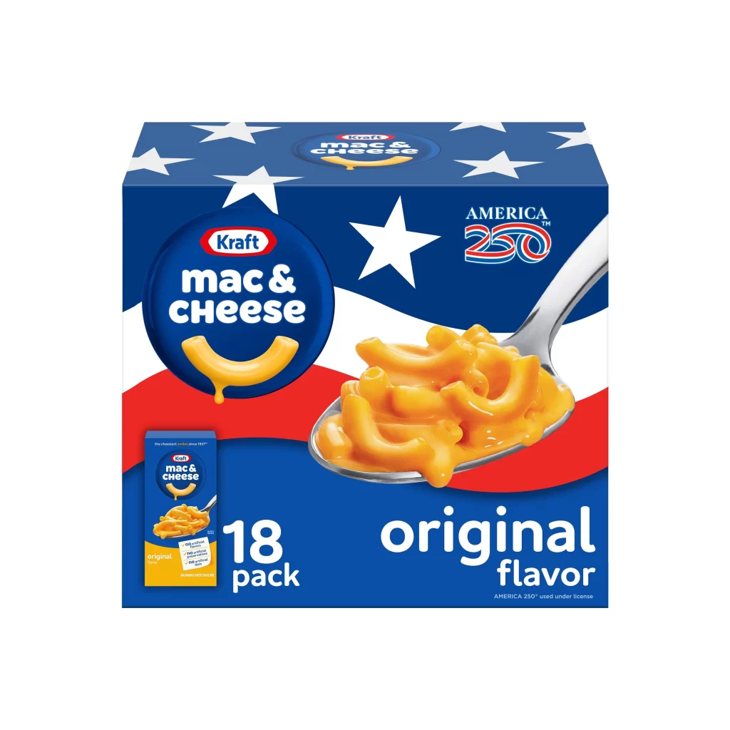
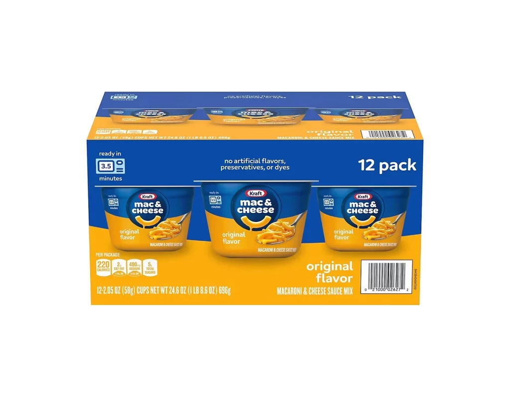
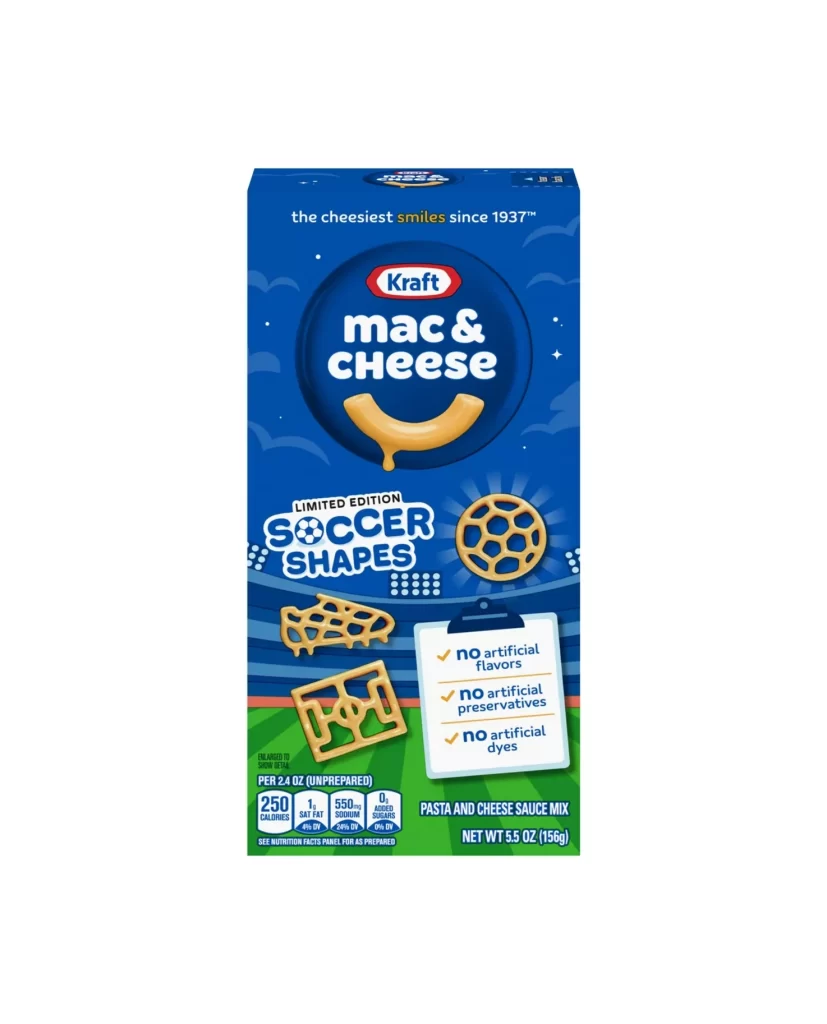
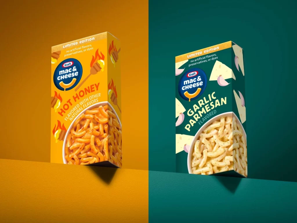
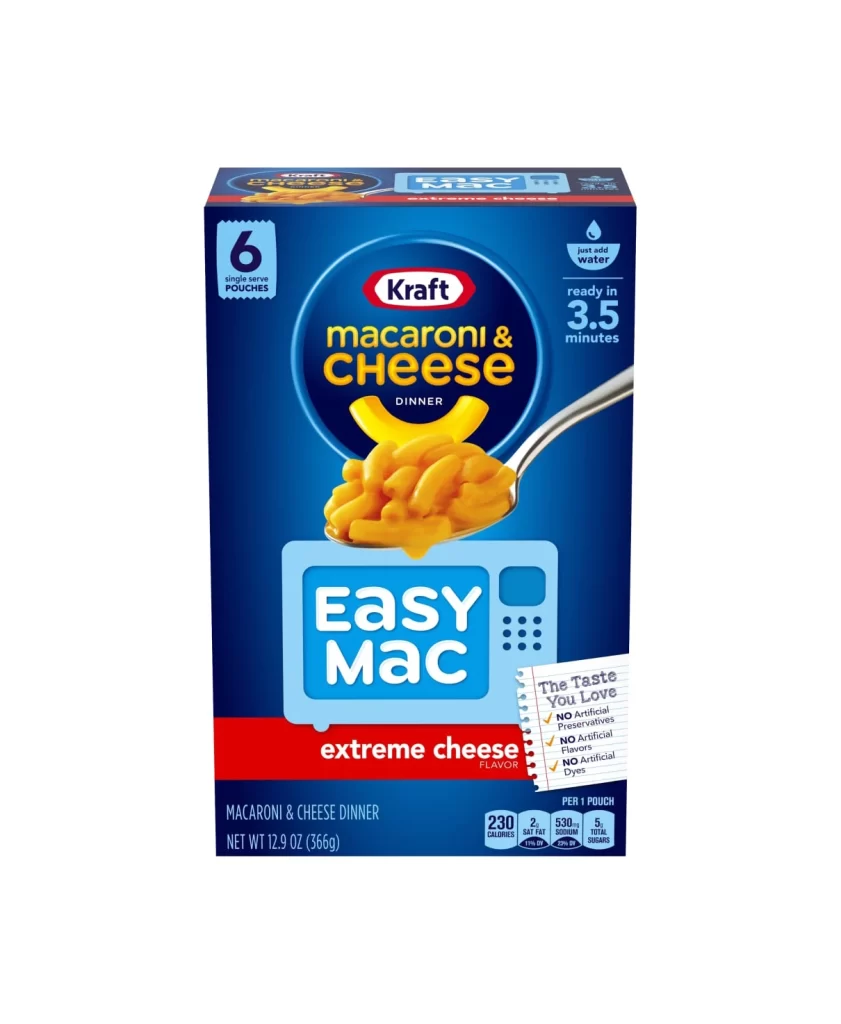
Centered within a stark white void, the rectangular carton presents a deep navy blue primary field that anchors the composition. A large circular navy badge dominates the upper half, housing the Kraft logo in white serif text above bold, golden-yellow 'macaroni & cheese' lettering. Below this emblem, a metallic spoon enters from the right edge, laden with glossy, orange-hued pasta that catches the light against a stylized light-blue microwave graphic containing the words 'Easy Mac' in heavy white type. The lower third features a saturated red band announcing 'extreme cheese flavor,' while a torn notepad graphic on the right lists product claims in handwritten script.
Visual hierarchy relies heavily on the contrast between the cool blue background and the warm yellow and red accent colors that draw the eye to key branding elements. The spoon's diagonal placement creates dynamic movement, leading the viewer's gaze from the product photography down through the instructional graphics to the nutritional information block at the bottom. Notable is the integration of functional data—such as the '3.5 minutes' cook time icon and the '6 single serve pouches' count—directly into the aesthetic layout without disrupting the commercial appeal of the packaging design.
Brand strategists might examine this packaging to understand how established food products communicate convenience through visual shorthand like the microwave iconography. Packaging engineers could reference the spatial distribution of mandatory nutritional disclosures versus marketing claims when planning retail shelf presence. Students of commercial illustration would find value in studying how the metallic sheen of the utensil and the texture of the rendered macaroni contribute to appetite appeal in mass-market food photography.