Rana Ravioli Pouch
Topics
Details
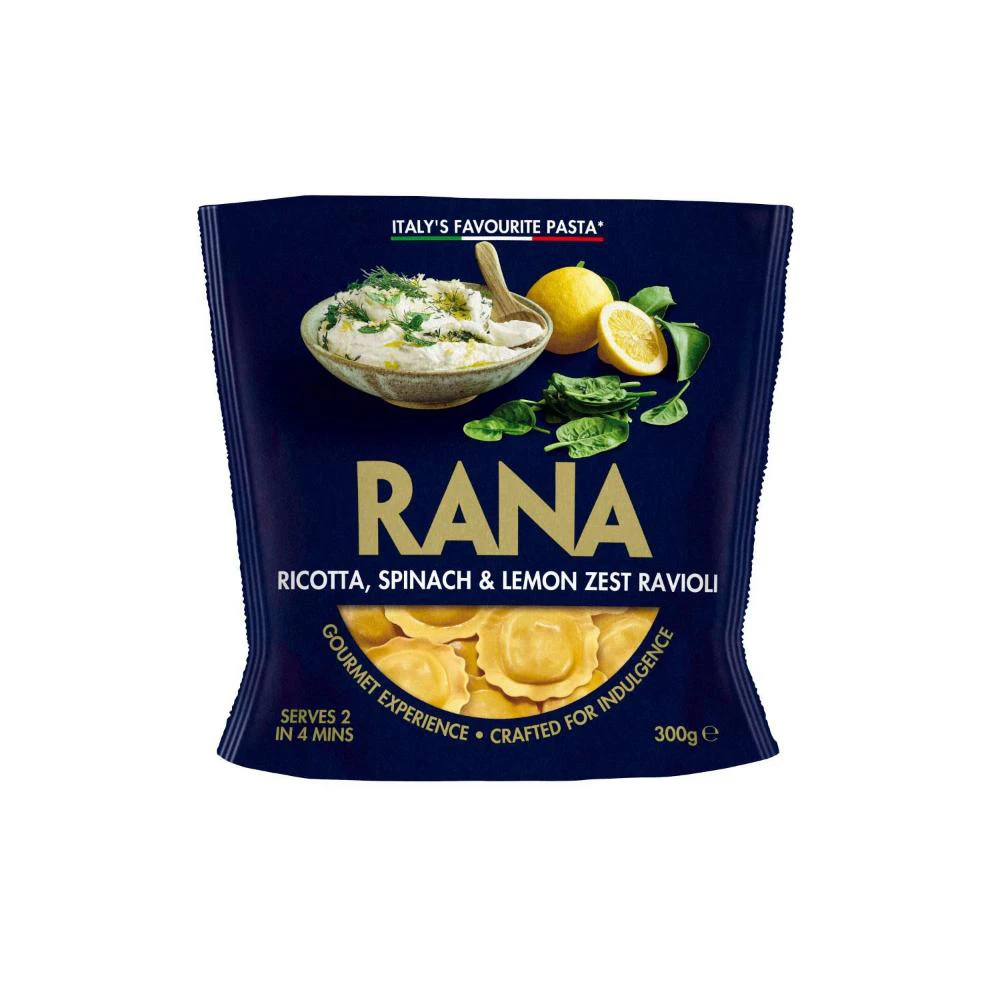
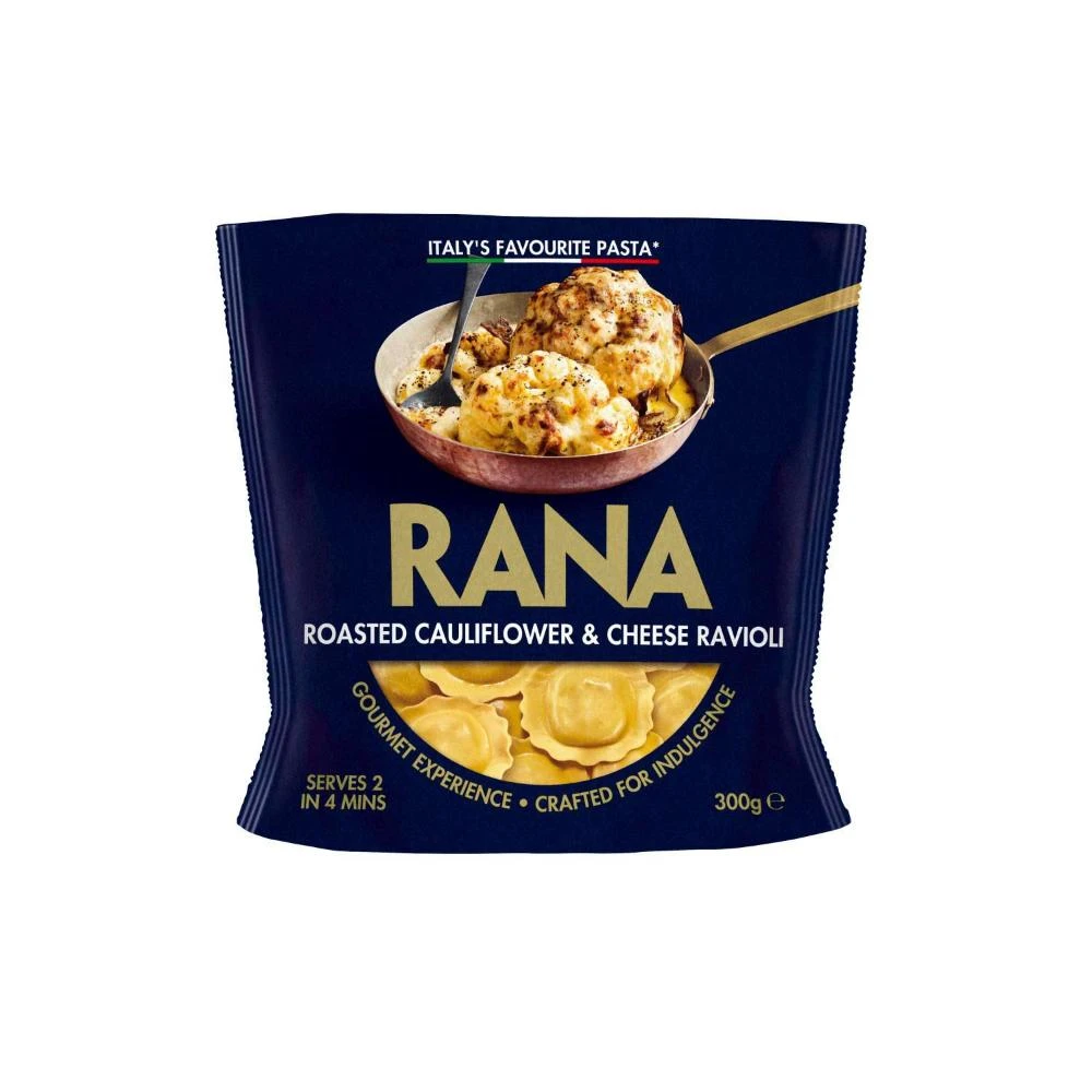
A dark blue flexible pouch displays the RANA brand in large gold serif lettering, with 'ROASTED CAULIFLOWER & CHEESE RAVIOLI' printed in white beneath it. The upper half features a photographic image of golden-brown baked ravioli in a copper-toned pan with a metal spoon, while the lower portion shows uncooked pale yellow ravioli in a semi-circular arrangement. White and gold text at the bottom indicates 'SERVES 2 IN 4 MINS', 'GOURMET EXPERIENCE • CRAFTED FOR INDULGENCE', and the weight '300g e', with 'ITALY'S FAVOURITE PASTA*' appearing at the top above an Italian flag motif.
Visual hierarchy is established through the strategic contrast between the matte navy substrate and the reflective gold accents that draw the eye to the brand name. The photographic element of the prepared dish sits above the product name, creating an aspirational anchor that suggests both comfort and sophistication. Notably, the Italian flag motif integrated into the ‘Italy’s Favourite Pasta’ header adds cultural authenticity without overwhelming the minimalist layout. The curved text path following the bottom image window introduces organic movement that softens the otherwise rigid rectangular format.
Packaging designers studying premium food branding would find value in analyzing how color psychology is employed here to signal gourmet quality. Marketing teams developing positioning strategies for imported goods could reference the balance between traditional Italian cues and modern typographic choices. Culinary photographers might examine the lighting techniques used on the plated food to understand how texture and caramelization are highlighted for appetite appeal. Art directors working on retail shelf presence could assess the legibility of information architecture from various viewing distances.