Rana Fresh Pasta Pouch View
Topics
Details
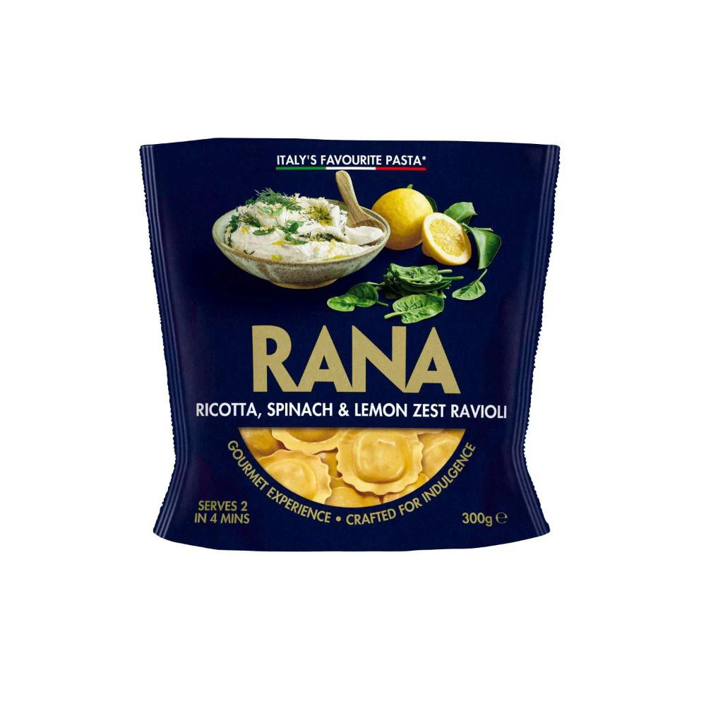
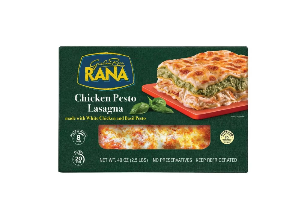
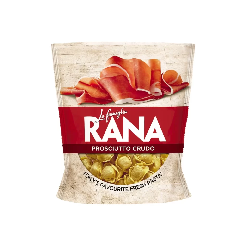
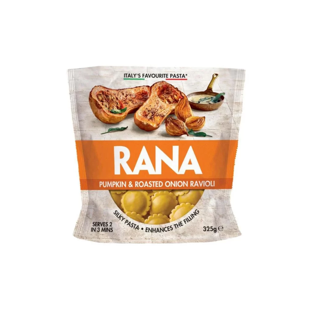
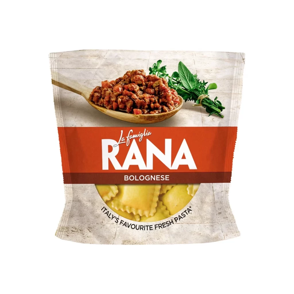
Centered against a neutral, textured off-white backdrop resembling aged parchment or stone tile, the Rana Bolognese pouch presents a clean frontal view. A vibrant terracotta-red horizontal band bisects the composition, housing the brand name 'RANA' in bold white sans-serif capitals above the cursive 'La famiglia' script and the word 'BOLOGNESE' in smaller white type. Above this band, a wooden spoon laden with chunky meat sauce and diced tomatoes rests beside a sprig of fresh green herbs, while below it, a circular window reveals golden-yellow ravioli with crimped edges, encircled by the claim 'ITALY'S FAVOURITE FRESH PASTA'.
Visual hierarchy is established through the stark contrast between the warm red banner and the muted background, drawing immediate attention to the product identity. The photographic elements of the spoon and pasta provide tactile realism and appetite appeal, while the circular cutout creates a sense of transparency regarding the contents. Typography varies between elegant script and authoritative block lettering, balancing artisanal heritage with modern retail clarity.
Packaging designers might study this layout to understand effective use of color blocking for brand recognition on supermarket shelves. Food photographers could analyze the lighting techniques used to highlight the texture of the Bolognese sauce without creating harsh shadows. Marketing teams developing Italian cuisine products would find this a useful case study for communicating authenticity through visual cues like wooden utensils and fresh herb garnishes.