Rana Tortellini with Parmigiano Reggiano Pouch
Topics
Details
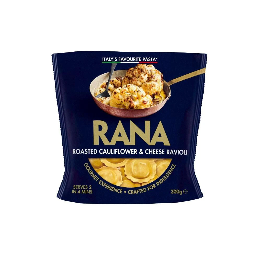
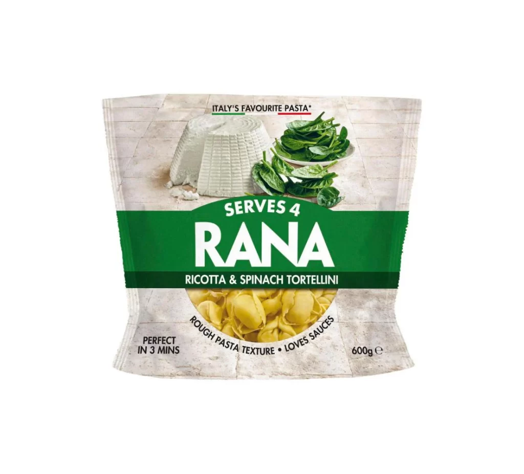
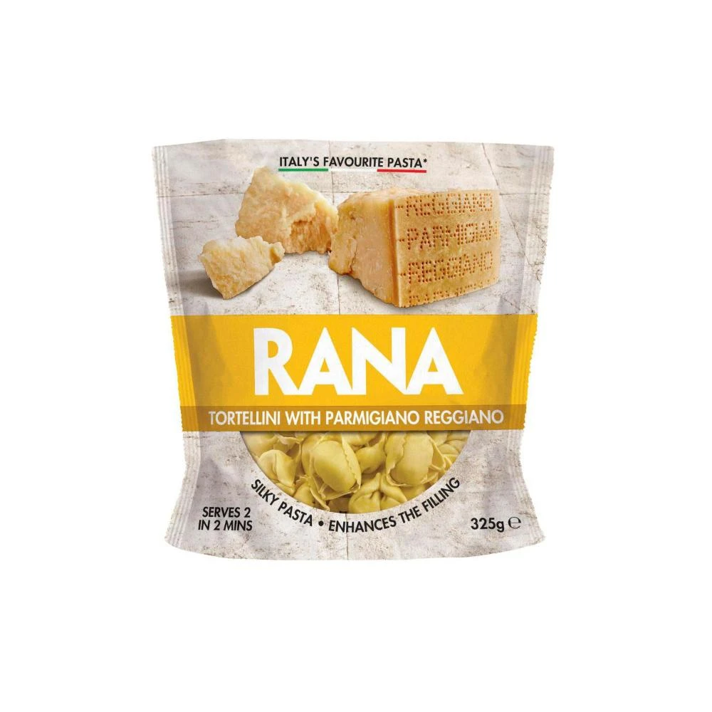
A bold yellow band cuts across the center of the packaging, displaying the brand name 'RANA' in large, white, sans-serif capital letters. Above this vibrant stripe, a photographic image features chunks and a wedge of hard cheese set against a textured, off-white background that resembles aged parchment. Below the brand name, the product is identified as 'Tortellini with Parmigiano Reggiano' in smaller black text, while the bottom portion reveals the actual pasta shape through a circular window.
Visual hierarchy plays a major role here, as the eye is immediately drawn to the high-contrast yellow section before exploring the realistic food photography at the top. The inclusion of the Italian flag colors in the 'Italy's Favourite Pasta' tagline adds a subtle patriotic touch that reinforces the product's origin. Furthermore, the mix of typography—ranging from the massive brand logo to the delicate print detailing serving size and cooking time—creates a balanced yet dynamic layout for retail shelves.
Food photographers might study the lighting on the cheese wedges to understand how to highlight texture and crumbly details in their own work. Packaging designers could analyze the color palette and font choices to see how premium ingredients are communicated through simple graphic elements. Even illustrators looking to practice rendering different materials would find value in the contrast between the matte paper feel of the background and the glossy appearance of the pasta.