Rana Ricotta Spinach & Lemon Zest Ravioli Pouch
Topics
Details
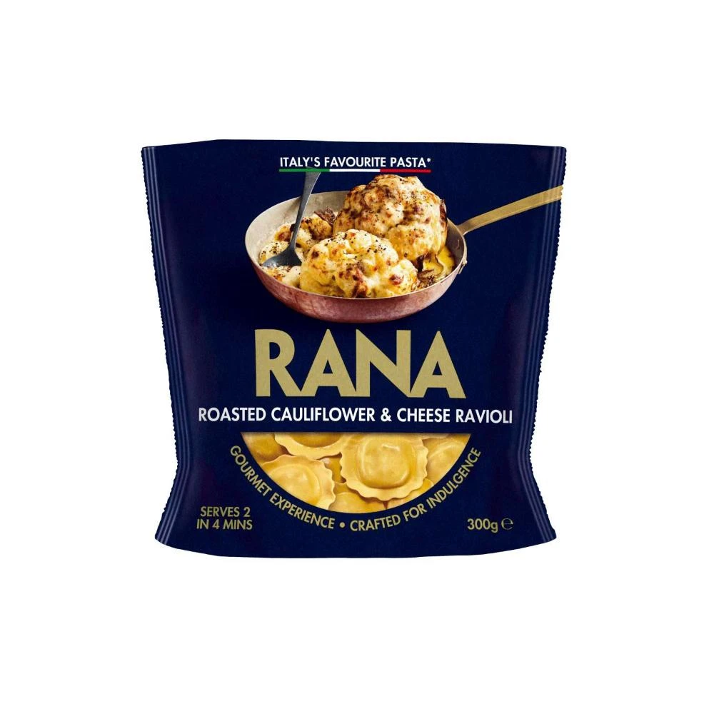
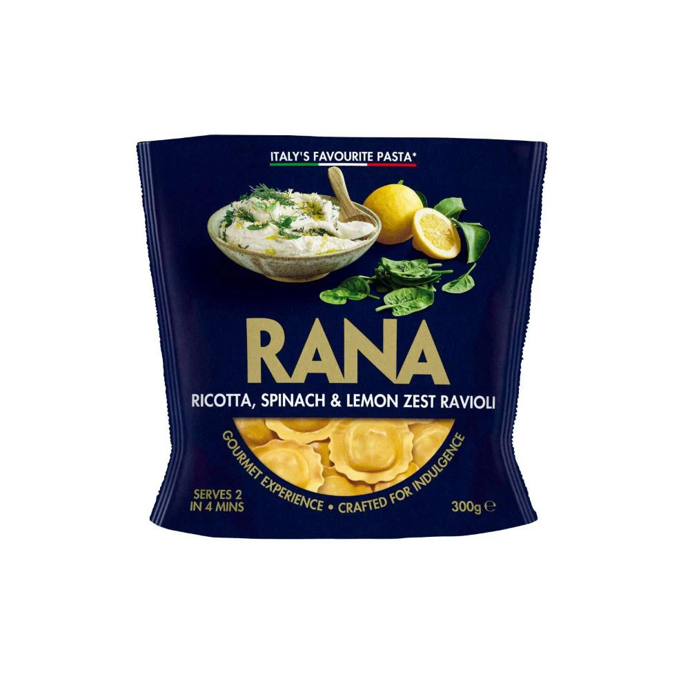
Deep navy blue dominates the packaging, creating a sophisticated backdrop for the golden 'RANA' brand name that sits centrally in bold serif typography. Above the logo, a ceramic bowl filled with white ricotta mixture, garnished with fresh dill and accompanied by a wooden spoon, rests beside a whole lemon, a sliced citrus half, and vibrant green spinach leaves. At the bottom, a semi-circular window reveals the pale yellow ravioli shapes within, while smaller text indicates the product serves two people in four minutes and weighs 300 grams.
Visual hierarchy relies on the stark contrast between the dark background and the metallic gold lettering, which immediately draws the eye to the manufacturer's identity. The food photography employs soft, natural lighting that highlights the creamy texture of the filling and the glossy surface of the lemon zest, suggesting freshness without artificial enhancement. Curved text elements following the window's arc add dynamic movement to an otherwise rectangular composition, balancing the rigid block of the main title.
Packaging designers studying premium Italian food branding would find value in the color palette choices and typographic scale demonstrated here. Culinary photographers might reference the arrangement of ingredients to understand how to style dairy products alongside acidic elements for maximum visual appeal. Marketing teams developing copy for gourmet convenience foods could analyze how the phrase 'crafted for indulgence' complements the imagery to convey quality.