Rana Chicken Mozzarella Tortelloni Box
Topics
Details
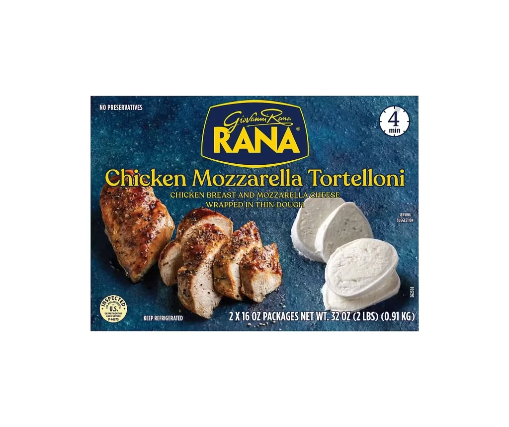
Against a deep, textured navy-blue background that resembles a stone or slate surface, the packaging presents its contents with a straight-on, frontal camera angle. The dominant visual elements include the golden-yellow Rana logo set within an oval shield at the top center, flanked by 'NO PRESERVATIVES' in white sans-serif to the left and a circular '4 min' cook time indicator to the right. Below the brand name, bold yellow serif typography announces 'Chicken Mozzarella Tortelloni,' while the lower half features a cooked, seasoned chicken breast alongside sliced mozzarella rounds, all illuminated by soft, even lighting that highlights the food's texture without harsh shadows.
Visual distinction emerges from the strategic contrast between the cool blue backdrop and the warm golden and amber tones of both the typography and the prepared chicken. The composition balances informational hierarchy with appetizing photography, using the oval logo as a central anchor that draws the eye downward through the product name to the ingredient imagery. Notable design choices include the circular badge for cooking time, which breaks the rectangular grid, and the subtle texture of the background that adds depth without competing with the foreground elements.
Food photographers studying commercial packaging layouts would examine this for its balance of text weight against photographic elements, while brand designers might reference the color palette integration between logo and product photography. Culinary illustrators could utilize the lighting setup on the chicken and cheese as a guide for rendering realistic food textures in digital paintings. Marketing teams analyzing competitor positioning would find value in how the 'NO PRESERVATIVES' claim and cooking time are visually prioritized relative to the flavor description.